CONTRASTのTwitterイラスト検索結果。 435ページ目


Something different than usual, a collab with my friend @YunggMoze
A doodle of his that inspired me and turned into a collab.
I'm honestly really proud of it and he did a really great job with the lineart.
(included a higher contrast ver and also x2 res images)


my mind is about to explode with contrasting ideas and I hate asking you guys all the damn time BUT,
I really wanna know this, so if you have any suggestions for voices (or just personalities) for any of these characters (or the ones in the pinned tweet) please let me know


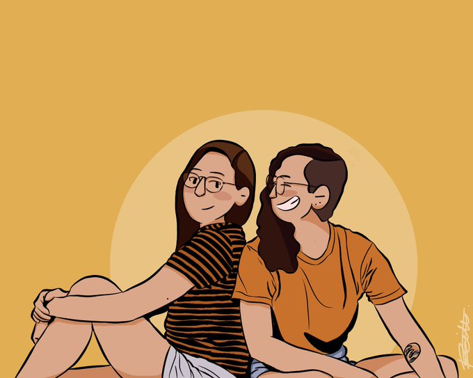


Makata (ult fave), #RoTin, Dahyun in different contrasting hues, and a comic panel of Yeojin putting tiny ponchos on snails.
Not bad for my first months :)) https://t.co/gJYaw7nEoN

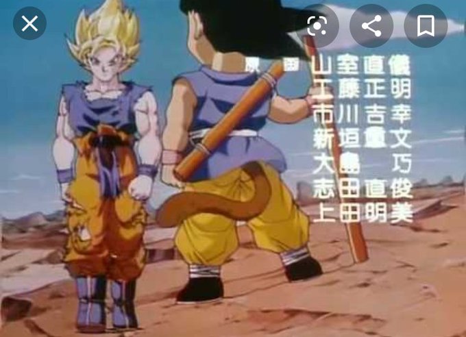

@Ninja81997 @DetectiveX I went took screenshots of where I noticed it first, in dbgt, then i took another screenshot of where it presumably happened up until the ToP. The thing that's weird about it is where the thighs begin in contrast to his gi. And then wherever the belt is, his 4 pack is above it.


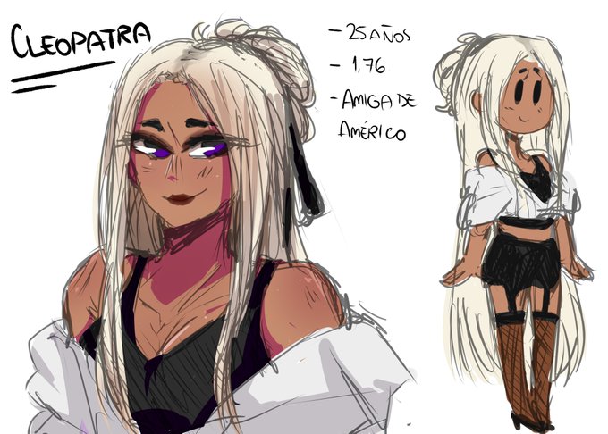

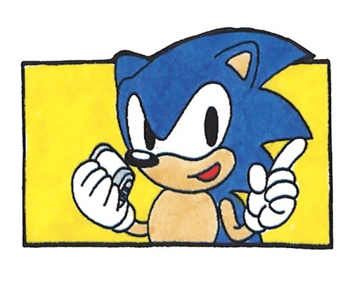
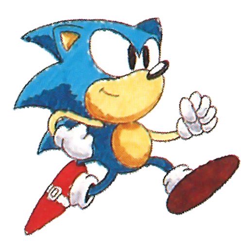
Indeed, in contrast Ohshima-san - Sonic’s actual creator - has been far more supportive of how he’s used as a character, and I think I have more interest in said actual creator’s take than anything. Even if it’s not the handy “Sonic must always be 110% cool” quote people want


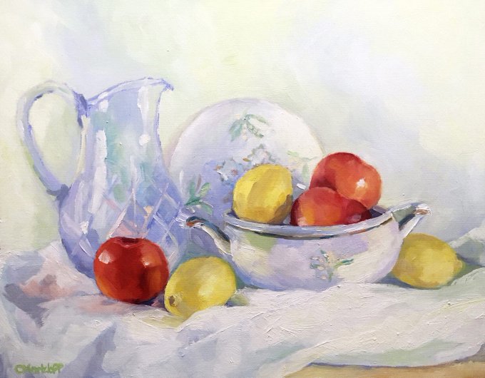
Life is a series of contrasts! #etsy shop: Rendered Impressions https://t.co/4stNJKds4B
#paintings #impressionism #stilllife #love #light #white #home #peace


French artist Jean-Claude Chaillou. A great master of watercolor painting.Amazing sense of color harmony, contrast of warm and cold colors.


Still a long way to go with this piece, not quite hitting the colour contrast yet so going to take a few more texture passes, especially on the landscape - before I start adding trees and vfx
#polycount thread up :D #gameart #b3d concept by @randomspirits


Does anyone know where I can get brown faux fur a smidge darker than howlfabrics antelope rust / fursuitsupplies brown bear? (They’re a similar shade)
#fur4sale #furforsale
It’s for this character, the darkest color, and it needs to contrast well with howlfabrics saddle tan


compare and contrast with Konami's Xexex, another shmup that came out around the same time with similarly impressive visual effects, though this time used to create beautiful yet bizarre and alien landscapes.
I always love it when older games pushed the boundaries of 2D tech!


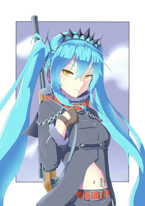
I edited/tweeked my last month fanart of #HatsuneMiku , coz I'm not satisfied with it...
Make the shading more contrast,
Make her face smaller/slim


Finally finished all of the matching icons I made for my boyfriend @DragoShift17 as a Christmas gift! I compiled them all together to make it more neat. Characters belong to us!
From left to right:
Winter Wedding
Royalty
Contrasts (Angel and Devil)
#vulpix #snivy #flareon


@MrWillHastings @mega_shepard @BrianNiemeier Then here's a few that should offer a quality contrast.


On 21st December there was a splendid sunset and I rushed outside to catch the colours with my brush and watercolours. I must have looked crazy ahah
In the end, I painted this Jonghyun with those sunset colours I really liked.
They're not super strong, but I loved the contrast


This could also serve as an interesting case study in the economical class system—note the stark contrast between the two cats’ living arrangements.