FontのTwitterイラスト検索結果。 5,217 件中 46ページ目


Sometimes, it's just as simple as that
(hey, a new Ask the Cast, featuring the new version of Nari's handwritten font! Due to...er...PC issues)
#raisondetrecomic


@noubelea Alternatively try to find a nice narrow font that reads well. Here's a five-minute mockup with Upright 31 pt bold and non-bold versions


The only ship dynamic that comes to my brain ...
Font: Bakso Sapi
#BaeRyS
#illustrayBAE
#IRySart https://t.co/mDq29F5kfq


It's why I love the gold eyes so much. The Sunwell isn't just a new font of arcane power, it's a font of *holy* power, and that's the only power that can cleanse the fel from the blood elves.
Gold eyes represent the blood elves continuing to move forward, in a healthier way.


@promienisonca I asked a friend of the author today about his work. The text has been edited down to the font. There was no permission, he did not even know about the existence of the translation. And these are works for the largest groups in VK on fandom
Original/Translate


@pokemas_game @PokemonMasters #PokemonMasters : Les développeurs nous font part aujourd'hui de leur 36ème message !
Détails : https://t.co/7ZQJ58Jl8P
Notre dossier sera mis à jour avec les nouvelles données et vous pourrez retrouver le programme du mois sous peu !


Kotei Condensed is a #sansserif #typeface and display font perfect for short-length titles. 👊
Test & buy ➡️ https://t.co/0B173YYWp3
#typedepartment #type01 #typedesign #typedesigner #typeface #typefacedesign #fonts #font #designer #design #graphicdesigner #graphicdesign


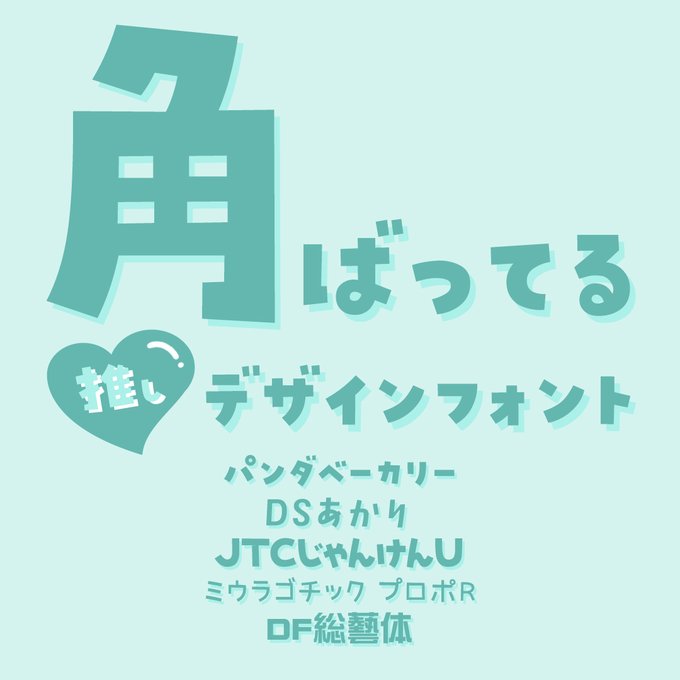
【本日のメルマガ おさらい】デザインポケットがテーマ毎に推せるデザインフォントをご紹介
https://t.co/eHyBtnHztB
#書体 #フォント #font #デザイン #デザインフォント #かわいいフォント #テロップ #ロゴ #YouTube #動画編集 #同人誌 #canva #フォント好きと繋がりたい #dpnews_font


قعر - depth - 深
TYPOGRAPHY POSTER NO.24
Size: 2000x2000 px
Digital art, created in Adobe PS
Per font: Nastaliq
Jap font: Seibi shiba
HQ in Behance (linkinbio)
photography by @ dalbjornphoto on Unsplash
.
.
#NFTCommunity #NFTs #NFTartis


UNDA series font (img 1), another example of the popular pixelated billboard look I remember seeing on quite a few websites back then.
Img #3 has that classic Vectorheart/GXSC arrow, along with an ad for the amazing Bionic Systems website (search them on the Web Design Museum)


Love the B.Positive font, with a Vectorheart-style 'digital billboard' effect & the 'Techno-Set' flyer with 'Dr-No' font.
Image #4 showcases the very popular-at-the-time barcode motif


Soutien aux #pompiers 🚒 qui font un boulot de dingue… toute l’année. #incendies


i know pubs are enamoured with swirly font over some darkened leaves and maybe a photobashed hand but i think people would read more books if they looked like how middle grade and light novels look


Moonassi
La lumière et les ténèbres, ne font qu'un / Light and darkness are one