compareのTwitterイラスト検索結果。 451ページ目


QRT showing an oc’s first design compared to now!
it was hard to choose just one oc, but Rongo’s been there proooobably the longest. he’s bigger now, his design’s a lot less cluttered, and still full of love <3 https://t.co/nMihUgUwMz


I needed to get an extra image for the calendar
This one is simple compared to the rest of the illustration, but I love how colourful it is!


@thoru_c I’m doing quite well surprisingly
And definitely, I can tell I’ve gotten better at anatomy and gained a better understanding of colors, I’ve just gotten lazier
Oldest Twitter post compared to most recent post of full color and shading


i finished three more teeth/tears icons!
they've been really fun, and i'm proud of how they look compared to how i used to draw them!


@eldiegod_ @VVildhart @Momaru81 @ProZD Did this mf just compare slavery to getting mild pain in your arm for a sec?


I started re-reading #MushokuTensei #無職転生 LN in TW version recently. Naturally, I'm going to compare it with the EN version.
One thing that I noticed is that the TW translators put in extra effort when it comes to translating references.
(Thread)

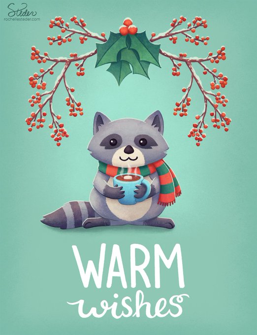

Lately I've been wanting to revisit some older illustrations and redo them in my current style. The original Christmas card design was done a few years ago in 2017. It's fun to compare and see the improvement! 😁
#MerryChristmas #christmascard #happyholidays #warmwishes


Man,,,
went to school for an ID pic and met up with my classmates.
I'm taller and larger than some dudes, and the ladies are basically very smol compared to my humongous gay ass.
i feel like ,,


Recently finished a commission for my Feral Heart YCHs ❤
I think you can see the improvement of the latest piece compared to all the others from back when I first offered them last year (along with my new logo, haha) tho I did try to keep the style somewhat consistent.


happy #tartaliday 🥳🎉 ( and pocky day too…haha i stuck with my final 🥲 )
I still surprise that I draw them for one year now.
Time passes very quickly 😭.
Compare to my first and my latest fanart. my lineart has changed a lot lol.


Woops Nevada time first
[Imadetheirdesignbeforeiwasrevealedtalon'splsdonotcomparethanku]


Unpopular opinion:
I prefer Haruka’s Cleavage Window outfit compared to her other outfit with Underboob.


Much as I'm glad to have Dynamo in DiVE, I do have my nitpicks about his character model. It's proportionally very wonky compared to his concept art. #ロックマンXDiVE #rockmanXDiVE #MegaManXDive


#Onepiecefanart #onepiece #LUFFY #LuffyDMonkey #monkeydluffy #fanart #art #arte #digitalart #DigitalArtist #digitaldrawing #Digital
"If you want to compare ambitions, mine is bigger!"
❤️+🔁


@jper415 I actually tweaked it a tiny bit compared to what was posted. Just fixed a weird shape on the jawline that was bugging me. 🙂


@conormcl2021 Great game I enjoyed a lot on my Amiga back then. Totally different compared to the 1st & 2nd game.
RoboCop 2 is also one of my fave RoboCop games 👌