ContrastのTwitterイラスト検索結果。 10,535 件中 497ページ目


Wow thank you so much for all your replies!
I'm trying to mixx the A and C to have a green/red ; Nature /owl contrast which is maybe more in the druid theme than the purple one as some of you suggested.


Compare and contrast:
Left: The Sierpinski triangle- famous fractal https://t.co/vBinbi5kr4
Right: The Serpent-Ski triangle- what happens when sneks hit the slopes


“To contrast the sweet and sensitive nature of the song, we came up with the concept of a bold, frantic, yet tender landscape." @mothanimation
#animates new #musicvideo for @thisissigrid @IslandRecords
https://t.co/hKFKQ92C0F #animonthly #motiongraphics @stash_magazine


“To contrast the sweet and sensitive nature of the song, we came up with the concept of a bold, frantic, yet tender landscape." @mothanimation
#animates new #musicvideo for @thisissigrid @IslandRecords
https://t.co/i4xeIUe3wI #animonthly #motiongraphics @stash_magazine


BOOTHで黒髪ちゃん本のダウンロード販売を開始しました!よろしくおねがいします💞
CONTRAST. | ししょ亭 https://t.co/Fh787I9UJ0 #booth_pm


Throughout his career, Rembrandt painted masterful studies of single figures, conveying character through dramatic costume and lighting. Here the craggy features of the old man contrast poignantly with his worldly trappings.
See “Old Man with a Gold Chain” in European Art.


ignore the anatomy on this but here's the general map of where this guy's LEDs are (he has some on his back too but he wears that backpack so much it doesn't matter)
more on the upper half since that's what people pay attention to/for contrast


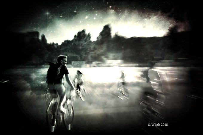
This one'll probably be done by tomorrow, so I'm not gonna share the whole WIP, just a crop, so as not to spoil it -all- early. I got a few critiques the past few days and they all mentioned contrast, so I'm trying to be better about it with the next two grayscales. Happy so far~

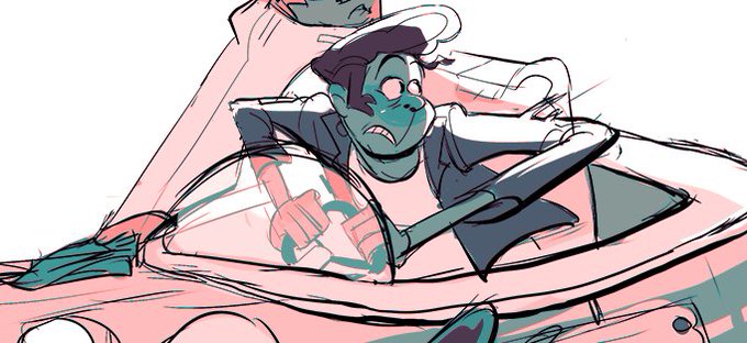
He's actually this fellow here! He sure has changed. I just thought he might have a funner visual contrast to Sasha if he was a beefcake. (I was right)


From Savage to Subtle; God of War's Tonal Contrasts
https://t.co/i6zT6a7U21

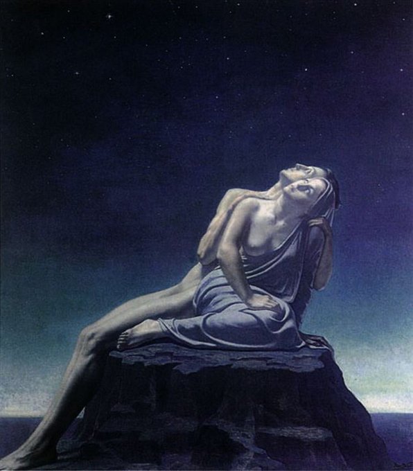

Love the contrast of these two together - Forgetting Passions, 1913, and Satan’s Treasures, 1895, by Jean Delville (1867 - 1953)

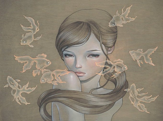
Audrey Kawasaki is a Japanese-American artist. She lives and works in Los Angeles. Kawasaki’s work contains contrasting themes of innocence and eroticism, conveying the mysterious intrigue of feminine sensuality https://t.co/zQ0iJkQxxy


Art by Julian Regino // The composition from each of his pieces showcases a combination of contrast, depth of field, negative space, as well as unique detail and orientation // Apply online to exhibit your work at https://t.co/1hMvu7oof4 #artvancouver


#王夢深夜の60分一本勝負
【秘密】Secret.
I tried to make something sickeningly cute to contrast the tone of all of my current work, but it ended up looking rather sinister instead;;;;