CaslonのTwitterイラスト検索結果。 10 件


Rejigging my 'Waterton's Park' booklet. Out goes Viners Hand, one of my favourite typefaces from my early days of desktop publishing and I've stuck with Caslon for text and headings.
#waterton #waltonhall #watertonpark #InDesign
https://t.co/1QU0HxZVLL


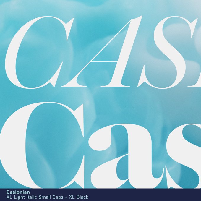
Let’s compare Caslonian XL in romans and italics. This family will feature four optical sizes, multiple weights, in roman, italics, open face, borders & ornaments. Not yet available, but don’t hesitate to ask for details if interested for your current project.


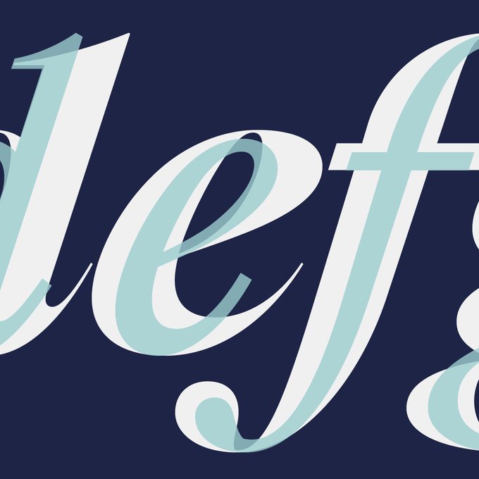

Even if the tradition of Caslon is visual irregularity between glyphs, ensuring consistency between weights of the same family is a necessary evil, here Caslonian.
— — —
#typefaces #fonts #glyphs #typography #logotype #typedesign #typedesigner


I am unable to define which one is the real Calson. With that in mind, I might as well let my imagination run wild. Be influenced by some of the uses of Caslons in the 70s. That’s the short summary of this project, which is currently being finalised. @jfporchez


[👋] #LEEHIfonts
💋 LEE HI Red Lipstick Fonts 💋
▫️ Caslon CP Swash : https://t.co/HKf4nT644u
▫️ Abstract Groovy (mod) : https://t.co/jtadUBrhpr
▫️ The Bold Font : https://t.co/BppuYrpxCm
@leehi_hi #LeeHi #4ONLY
#빨간립스틱 #RedLipstick


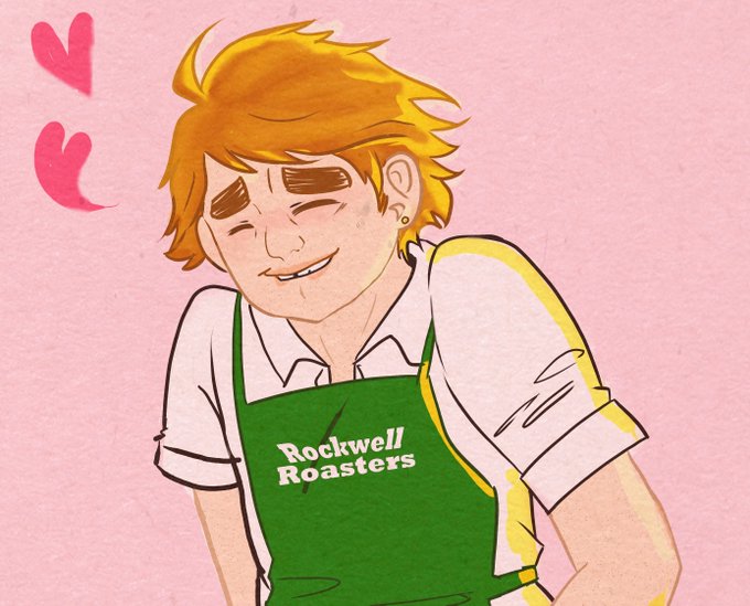
Caslon gay af I would’ve gone crazy
#oc #originalcharacter #ArtistOnTwitter #art


We are lucky in France, because the Latin conjunction et remains in use in French, so the ligature & of e and t is clearer for us. Drawing an ampersand is the cherry on the cake for any type designer! Here from our not yet launched Caslonian family.