compare XP's tileset to VX era or MV
yeah sure xp was desaturated but I think it makes the tileset blends well to the surroundings.

MV and VX era kinda felt garish/bold. I think the more realistic texture it had, the more uncanny it looked with grid/non parallax maps

0 2

Found some time to continue work on the tileset (Ft. Gunvolt). Still have some polishing to do for the ground tiles.

1 7

im slowly getting more work on my game, and with that i've been doing some tilesets and some player sprites

3 10

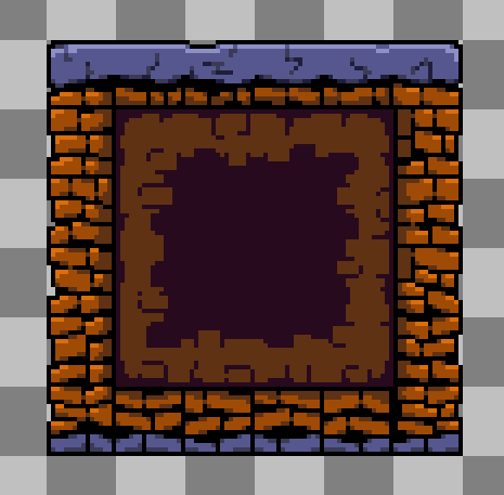
today on parteon I'm showing off some cave biomes for an upcoming tileset pack 🤫

4 36

Oh yeah, baby. Tileset Thursday.

I really like how the chests turned out!

8 27

doing storefronts and stuff for an outside scene, still a wip done in using the tileset layers its still messy it will look better soon hshs

0 1

Sketch vs Final.

I made a quick weird shape and i turned it into some sort of slimy tree???????????
Might use it later, expect another beautiful yet useless tileset :D

1 7

Hey! I've released a new card (plus a bunch of tilesets and a monster animation) in my patreon!

Link in the comments ❤️

18 94

Been experimenting with some interior tileset design for some time now... Will probably make a few more demo rooms to show off some more of the stuff I've made for it but here's the first room

3 7

Yesterday I've made some adjustments to the color palette of this tileset. I tried to make it a bit easier on the eye

32 245

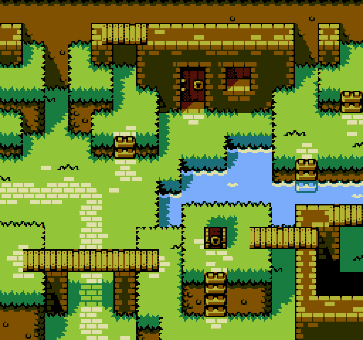
Tileset test for something i've been working on (+ NES inspired version)

68 532

¿Os gusta el pixel art? Os presento entonces “El arte de “Neo Utopia Project” – Vol.2 Escenarios. Centrados en Caldea (primera mazmorra) y la casa de Ryoga.

Créditos como siempre a por los tilesets.

2 12

Do you like pixel art and detailed maps? I present the The art of "Neo Utopia Project" - Vol.2 Landscapes. Focused in Caldea (first dungeon) and the Ryoga’s home.

Thanks for the tilesets.

Link in HD: https://t.co/tRPFHmlWQQ

3 8

I really like making maps with this tileset

30 183

Updated JRPG tileset in authentic graphics. The sideways ladders were dropped in favor of adding water and brighter detail.

232 2176

Final shmup ship design, wanted to make it more beetle like with the front and the wings.

Palette:#pear36

| | | |

7 20