datavisualizationのTwitterイラスト検索結果。 88 件中 4ページ目

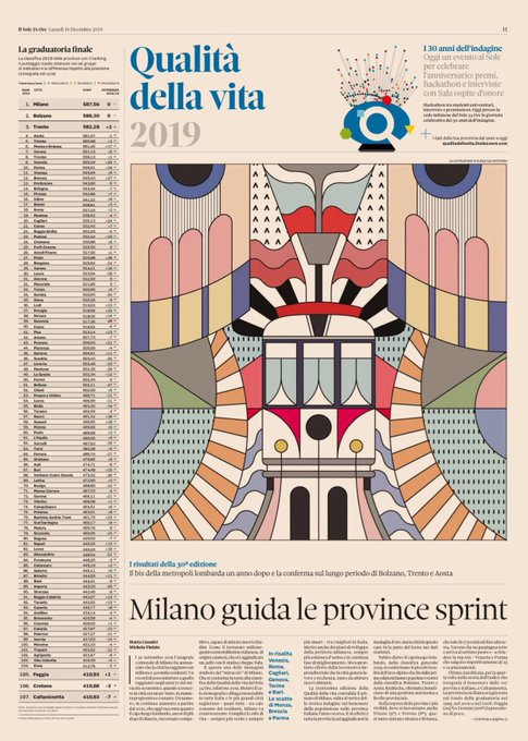


90 indicatori e 30 anni di dati. Torna la classifica di #Qualitàdellavita 2019 del @sole24ore, l’indagine che fotografa il benessere nelle province italiane.
Su carta e web, un lavoro #DataDriven con #Datavisualization top https://t.co/PLOwepeB1s


Hey all! I've created an article/data visualization on the appearances of X-Men over the past 56 years, inspired by the recent design work of @hellomuller and @JHickman. I hope you all enjoy! https://t.co/VYRh1hGIRI
#xmen #datavisualization #ineedajob


Really looking forward to speaking on Sunday @ASA_CSSA_SSSA Annual Meeting (Nov. 10-13)San Antonio, Texas... #infographics #SciComm #scicomms #Datavisualization #agronomy #science


How to Master #DataVisualization https://t.co/3nVSUryFon
A few rules of thumb for designing with charts and graphs.


What a stunning work of art, don’t you agree? This is a visual representation of flights paths in USA over a 24hr period by #AaronKoblin. Data IS beautiful #DataVisualization #dataart #simplicity


Meet #DataVizSociety member Stephanie Coker (@st2coker), experienced in #datavisualization & applied research & thinking critically about how orgs can efficiently advance the common good. Her work is shaped by principles of social justice, cultural relevance & sustainability.


Hey #datavizsociety members check your emails for this special #Easter gift: data-driven eggs! Thanks to @martintelefont for the inspiration. #datavisualization


Meet #DataVizSociety member Tim Cady (@tiivn), who holds a role in his organization's enterprise-level Visual Analytics COE (Center of Enablement) in addition to co-leading the North Texas Tableau User Group. #datavisualization #tableau


Meet #DataVizSociety member Cameron Yick (@hydrosquall), a software engineer making dashboards and data exploration tools @datadoghq with React + D3. He's interested in historical-viz and #creativecoding, and blogs at https://t.co/jt0gufBb0T #datavisualization


Meet #datavizsociety member Bridget Cogley (@WindsCogley)! A consultant specializing in #Tableau (3-time zen master) & #Alteryx. She's most interested in data visualization, ethics, philosophy, the brain, and anything language-related. #datavisualization
https://t.co/VoVMNJRoOh


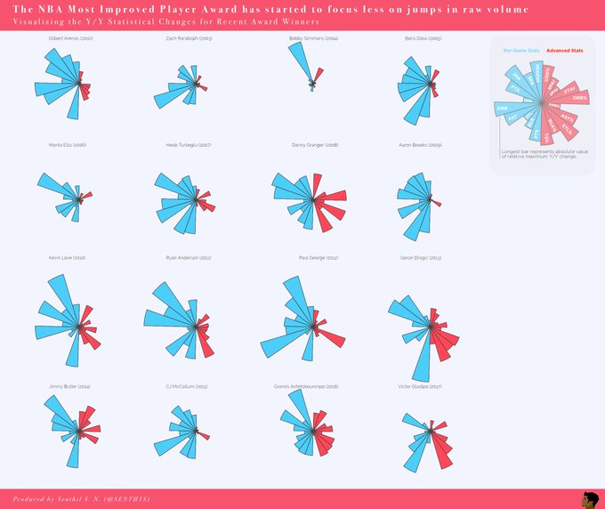
Meet #DataVizSociety member Senthil Natarajan (@SENTH1S), who combines data analytics and data science with visual communication across sports, startups and Fortune 500 companies. #sportsviz #Datavisualization


Meet #DataVizSociety member Guillermina Sutter Schneider (@gsutters), an Argie 🇦🇷 Data Science student based in Washington, DC! She co-authored a dataviz stylebook you can find at https://t.co/2ESA61DmCM and is passionate about best practices & terminology in #datavisualization.


La Visualización de Datos es el resultado de la combinación de Tecnología, Ciencia y Arte para conseguir contar una historia basada en datos fiables y contrastados. #visualthinking #visualnotes #datavisualization #visualizaciondedatos


Some details from my #dataviz for @sciencefocus: the #periodictable and the elements under threat. https://t.co/G2K6HwT06H The full printed #infographic will be on BBC Science Focus March issue! #Datavisualization


A portrait of our 1700 current members (badges based on your responses designed by Data Visualization Society founding member @AmyCesal). #datavisualization #datavisualizationsociety

Human rights violation and protection by country: a detail from my new #dataviz for @La_Lettura, out this week. #Datavisualization #ddj #Infographics

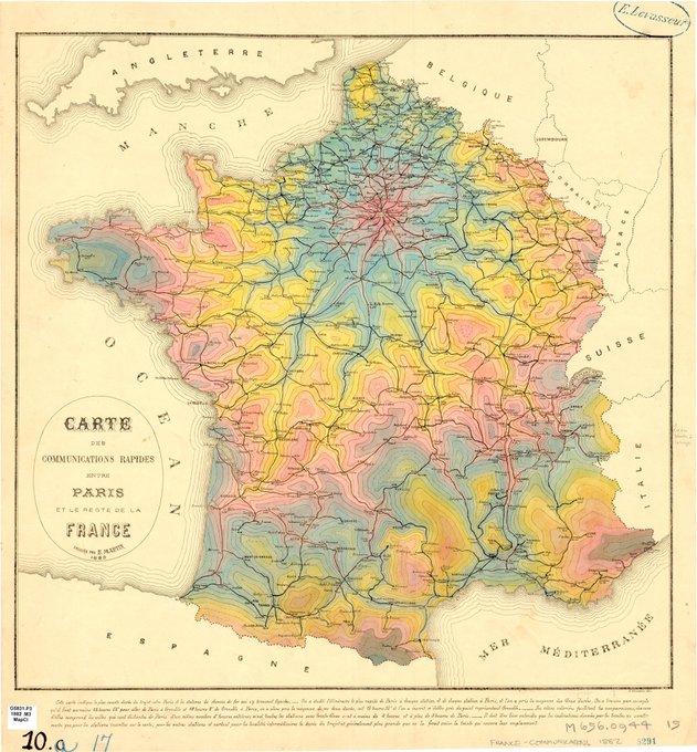
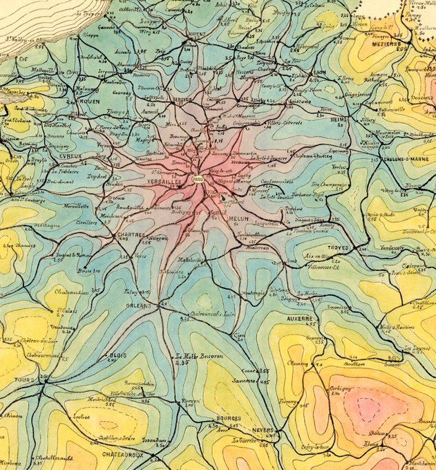
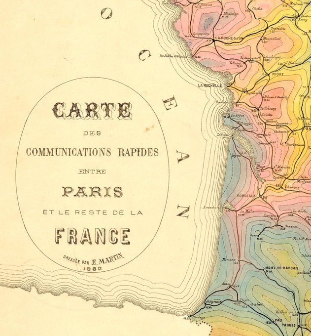
This is my new favorite French #map. Found this one in the University of Chicago map collection. The color choices are not what I expected from a #datavisualization made in 1882, but I'm here for it. This shows the travel times from Paris radiating out into the country.

#Dataviz narrative layers and #illustrations for The Map of Remote and Literary Islands: https://t.co/pMpo3cJhgD #infographics #datavisualization @La_Lettura


My new #dataviz for @La_Lettura is a visual exploration of the world of #MaryPoppins (and it's full of umbrellas! ✨☂️) #datavisualization #infographics


Which #Datavisualization do you like best from the Information is Beautiful Awards?https://t.co/qLeHl6H7ir @verge #vizlitforall #Visuals #dataviz #visualthinking #vizlit #drawtothink