gradationsのTwitterイラスト検索結果。 34 件


I've said more than once that the way for me is to search, to experiment, lately there have been fewer drops, I decided to concentrate more on quality and ideas, everyday_arts will continue to come out no matter what.
_gradations_ owned by great @AdventurousTez


A little sketch of Stanley so I could play with colour gradations :)


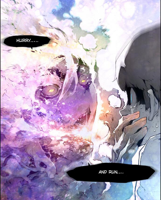
Starting Terror Man and I'm liking the shift in color gradations. Some panels there's a black and white comic feel. The next moment signature scenes have a vibrant array of brightly adjusted intonations ranging from impressive yellow to picturesque explosions.


Along with this, the chromatic variation with unique gradations associated with the play of lights and shadows, gives the project different perspectives and depths, in continuous and complementary cycles of fragmentation and defragmentation.
https://t.co/KDSQ4OuVM3


Portrait practice! Really working those skin gradations to get something I'm pretty happy with. Based on a photo by Martin Schoeller.


🟨🟥🟦 Gerhard Richter "I worked out a system which starting from the three primaries, plus grey made possible a continual subdivision through equal gradations. 4 x 4 = 16 x 4 = 64 x 4 = 256 x 4 = 1,024" - Brussels, 1974
🧠Are @TheHashmasks pixel backgrounds inspired by him?


1/2 @Spiderman, as designed by Alberto Mielgo, was a "graphic" design. What does that mean really? It’s actually very similar to "normal" painting, but each shape is discrete from the shape next to it. NO blurred edges. There can be gradations INSIDE a shape.


I will be livestreaming tonight on #twitch! I'll be finishing a poster I was asked to do for an upcoming event. Here is a sneak peek. I'll be doing gradations, more shadows, touch-ups, etc. The pic below is at maybe 85% completion.
#art #anime #magicalgirls


@DeePeeArts I'm not proud of this one (anymore), because I wanted to capture sunlight and it doesn't work well. Except for in the guy's face, the gradations are too subtle and would work better for diffused light. Sunlight needs a much bolder & clearer separation of light & shadow areas.


Through trial and error, artofcarolinegaudreault (on IG) ended up developing an acrylic technique - involving the application of many successive layers of paint - that enables her to achieve beautiful gradations of color.
https://t.co/Y9U6CCrDsy
•••
#beautifulbizarre


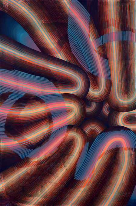

Theresa Daddezio’s paintings are filled with sinuous lines and pulsing gradations of color. Her abstracted patterns resemble the natural realm (tree trunks, petals, channels of water) as much as physical infrastructure (bundles of cables, shiny machinery): https://t.co/lEV8p9wnah


Crystal shinobi gradations
#art #pixelart #ドット絵 #illustration #characterdesign #animated


Crystal shinobi gradations
#art #pixelart #ドット絵 #illustration #characterdesign


Justin Morin's work comprises draped curtains in various gradations of colour.
https://t.co/aI84tDLswR
via @Sight_Unseen


Speaking of Joker, Fun Fact
Joker (JOKER's Persona) from Persona 2 Eternal Punishment has a Base Form, used by JOKER, and 3 Degradations, used by the people who caught the Joker Infection.


Cover Illustration of Dragon Ball's 15th volume (1988/12/06)
Toriyama flexes with his clever characteristic of line gradations between lines in this piece. That aside, I wonder if Goku woke up in that Bugatti?


#Fiction #ReviewoftheWeek "Displacement" by @kikuhughes (@01FirstSecond/@MacKidsBooks): "The skillful illustrations, with muted colors and drab backgrounds, emphasize the degradations of prison life and the efforts people took to make it livable." https://t.co/ncu6CMrj28


Color printing would have been too expensive in the first book, but it could be done with this one at a relatively cheap cost through the use of three-color printing. Using the three primary colors blue, red and yellow, all color gradations and tones are achieved.