matplotlib.のTwitterイラスト検索結果。 6 件


Where do the world's carbon dioxide emissions come from? Darker areas indicate areas with higher emissions. How does your area look on this map?
This map was made with #Python using #matplotlib. #DataScience #Data #DataVisualization #ClimateAction #ClimateEmergency


This Cube Monkey is a Data Scientist for sure. Trying to get everyone in the office to understand the power of matplotlib.
"Take the red pill, python is the way"
#nfts #nft #nftart #nftcommunity #nftcollector #nftartist #crypto #cryptoart #art #freenft

Where do the world's CO2 emissions come from? This map shows emissions during 2019. Darker areas indicate areas with higher emissions. Day 27 of the #30DayMapChallenge This map was made with #Python / #matplotlib. #DataScience #Data #DataVisualization #ClimateAction
#Climate

Mapping the world's flight paths.
This map shows 67,663 routes between 3,321 airports on 548 airlines!
Made with #Python using #matplotlib. #DataScience #DataVisualization #Travel #travelban #Map #COVID19

Where do the world's CO2 emissions come from? This map shows emissions during 2019. Darker areas indicate areas with higher emissions.
This map was made with #Python using #matplotlib. #DataScience #Data #DataVisualization #ClimateAction
#ClimateEmergency #carbonfootprint
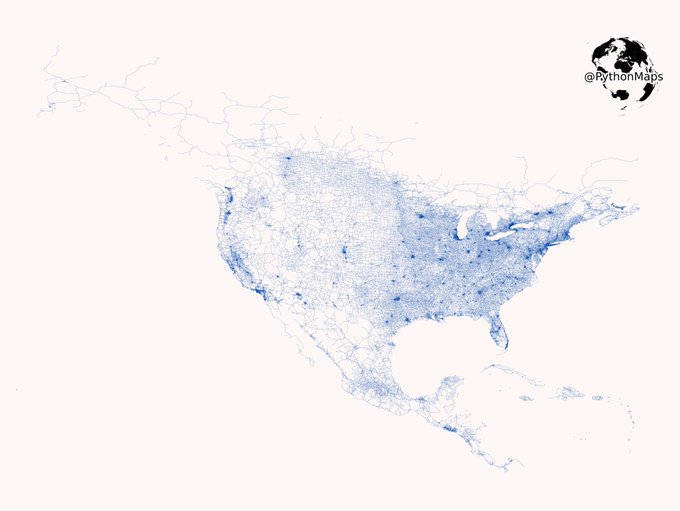
Vroom Vroom. Today’s map shows the public, tarmacked roads of North and Central America. Zoom in! This map was generated with #Geopandas, #Numpy and #Matplotlib.
#USA #Python #Maps #DataVisualization #Data #DataScience. 1/2