39 件中 31〜39件を表示
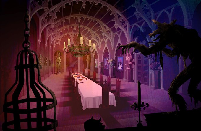
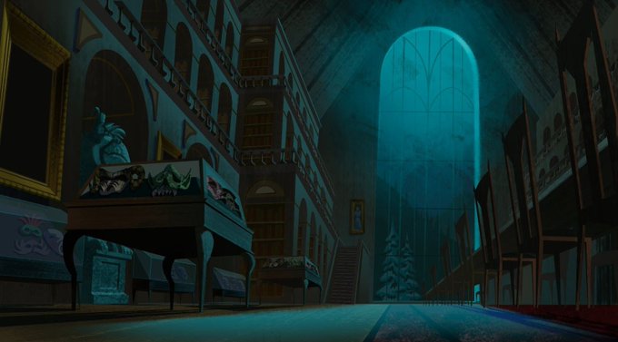
@DoctorWolfula Feel like they hit the right balance with Mystery Inc- more saturated but with darker underpainting and grittier textures, kind of a early days haunted mansion thing goin on, 60's looking as all hell too
0
6
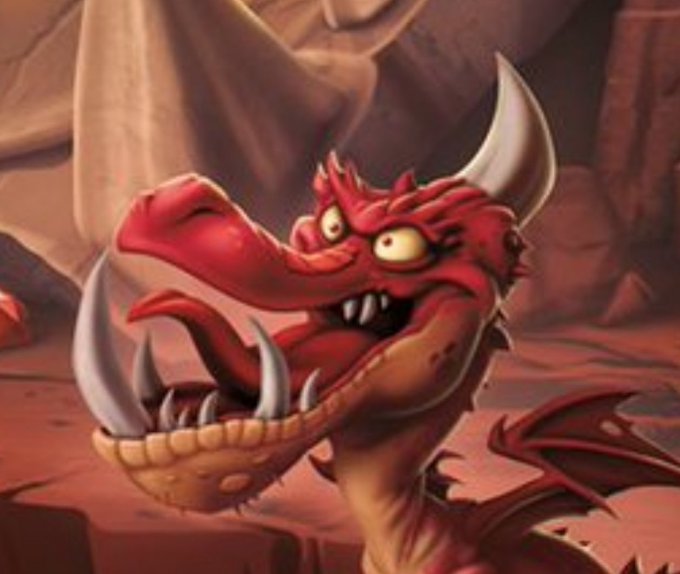
@Aldermaine That'd be a shame to me- at the moment it feels very restrained/limp and there's the potential to really lean into the loony, hand drawn look Crash was aiming for to begin with. @PCaldora's explorations are a great example of where it could go visually.
0
6


