

#18: Moon
I love the idea for this. Backlighting from the moon could've been so cool, and I like how I made the background overall. Umbreon just don't look right though¯\_(ツ)_/¯

#17: Collide
This one took me a long time to make, and I like it okay. Queen looks strange but the other two and the background I like.
The only problem with this is that with the direction the car is facing the ferris wheel should be ahead of them... oop

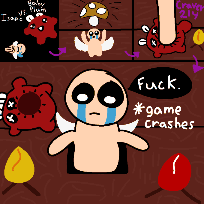
#16: Compass
A shame that both my Isaac drawings look so terrible. I like the idea but everything just looks so strange and I didn't put any effort into a background.
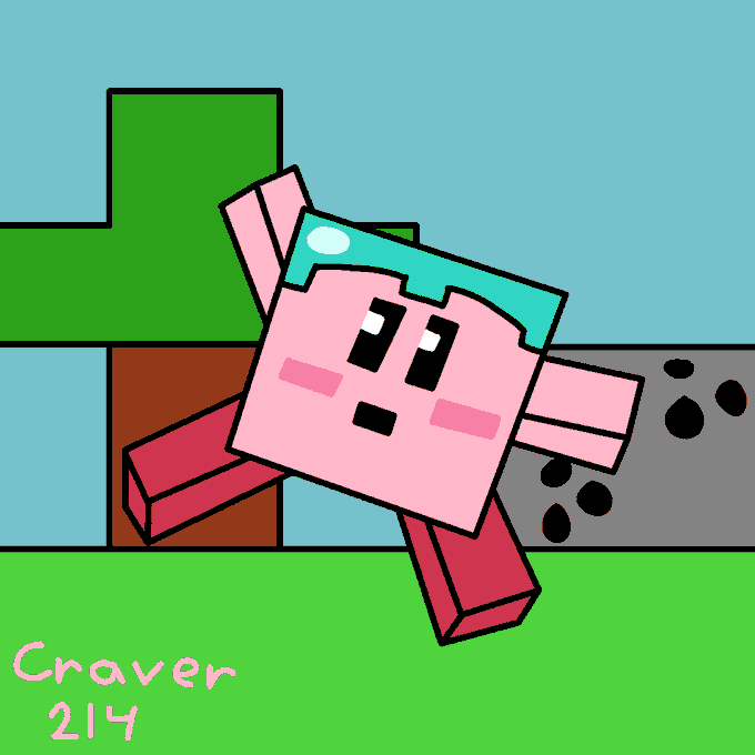
#15: Helmet
There are no interesting parts to this at all. Kirby looks like a copy from smash and the background has nothing in it. One of if not the most uninteresting drawings.

#14: Tick
I really like Joltik here, everything else sucks hard. Spinarak and Surskit look really bad and there is a nonexistent background. I really should've drawn the two spiders in the same style as Joltik, it would've looked much better.

#13: Roof
This one's okay. I tried fitting as many catapult plant projectiles as possible here, and I think the zombie came out okay. ¯\_(ツ)_/¯
#12: Stuck
This one just looks terrible. I tried to do too much and it makes the the whole image have inconsistencies in style, outlines, etc. Also I did the weird texturing again.

#10: Pick
I have no idea why I did this texturing with all the lines but I do it a couple more times. It just looks bad straight up. Besides that I like everything okay.

#8: Watch
I thought the slanted perspective would make it look scarier, but my execution was really lame. Kris' slant doesn't match the door and it bothers me like crazy.
Also the watch is just a bunch of random Christmas colors I wish I had thought of an actual design.
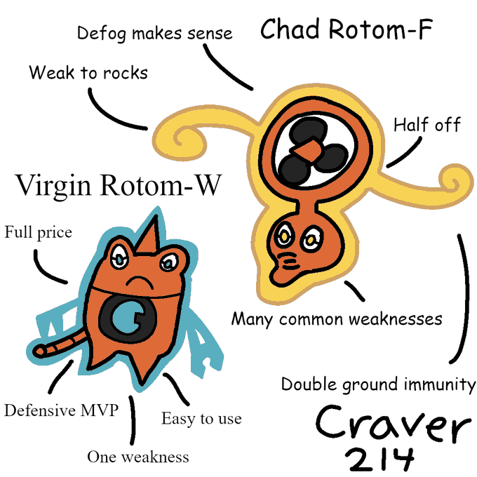
#7: Fan
I really like how I drew Rotom-F here, and I really hate how I drew Rotom-W here. Wash just looks wrong and I wish I had drawn it differently.