#6: Spirit
This one's okay. I like the background besides the torches and the green I used for the teleporter, and I like how I drew the hollowpoint. Meh.
#5: Raven
For a meme image, this one's okay. That's about all the thoughts I have on it
#4: Knot
The first of my "Wow, this looks awful!" drawings. Groudon looks deformed and Infernape's position makes no sense.
The background is supposed to be the one from Omega Ruby but I didn't put enough detail to make it look interesting. Just an L all around.
#3: Vessel
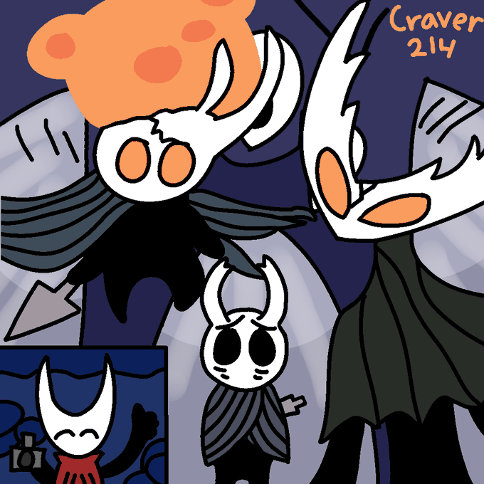
I really like the idea for this one, and I think the characters and background came out fine. I wish I could've shown more movement happening from the vessels but idk how I would.
I never realized broken vessel's legs were different sizes so oops
#2: Suit
It's... okay. The background isn't anything and ralsei himself looks okay, I just think it's boring. Nothing really special about it.
I forgot to color in the top-left part of his suit with the rest, so that's an L. I also should've probably drawn swatchlings but idk.
#1: Crystal
The idea that made me wanna do this. I really like this one cause I got to mess around with slight shifts in color. I think it's one of the best here.
The only problem is that I forgot to color the legs the same as the arms so they blend in with the bench.


