
GrandGuerrillaさんのイラストまとめ
@GrandGuerrillaFollow @GrandGuerrillaさんをフォローする
フォロー数:1698 フォロワー数:54952


@Komegatze CG in Part 5 was mostly just Aerosmith which is a static prop, not a fully rigged character or animal in this case. What I hope is that the horses will look more like characters in Beastars and less like clay with celshading


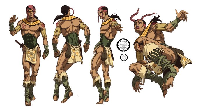
I redrew Diego's front facing body refrence becouse I didn't like how stiff old one looked. I've also tweaked some details like anatomy and folds on his pants.
#jojo #jojo_anime #SBR_animation https://t.co/rdbOKOzPRc


I have also a separate version without the braids so that the facial features and shading isn't covered


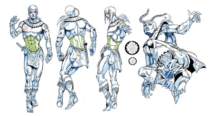
Sandman Face and Body Refrence Sheet
#jojo #jojo_anime #SBR_animation https://t.co/ju3YaQdcMW

My old design for Wekapipo was also blue 🫡
I'll change it with the redesign but I'll still try to stick to blue/purple I think, even if yellow/orange is really good

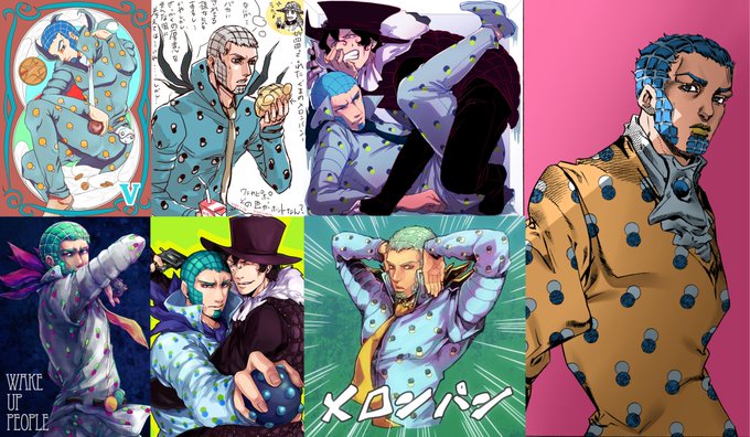


I really like how fresh Wekapipo fanarts are with their colors. Majority of them don't reuse the same yellow/orange palette from Shueisha and lean more into various interpretations of blue and purple which are based on Araki's covers