
Jill Hubleyさんのイラストまとめ
@Jill_hubleyFollow @Jill_hubleyさんをフォローする
art + code, information + design, slime mold, maps. data viz @verainstitute opinions my own
jillhubley.comフォロー数:1317 フォロワー数:1863
17 件中 11〜17件を表示

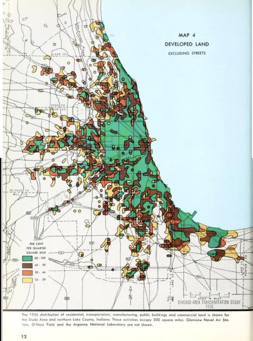


alright, I lied- not done. the 1956 Chicago Area Transportation Study is a work of art: https://t.co/a2ENBjNcbk
2
23

Some really gorgeous work by @mtaylorlong for @Team_eBird, great to explore. This is the abundance map for the golden-crowned kinglet.
11
66


discovered these this morning while looking for something else - as it usually happens - maps from the 1943 County Plan of London by Patrick Abercrombie. like cells under a microscope, or a Calder sketch
214
574


reminder: hot dog projection is the best projection.
(Agnes Denes, 1974)
8
39

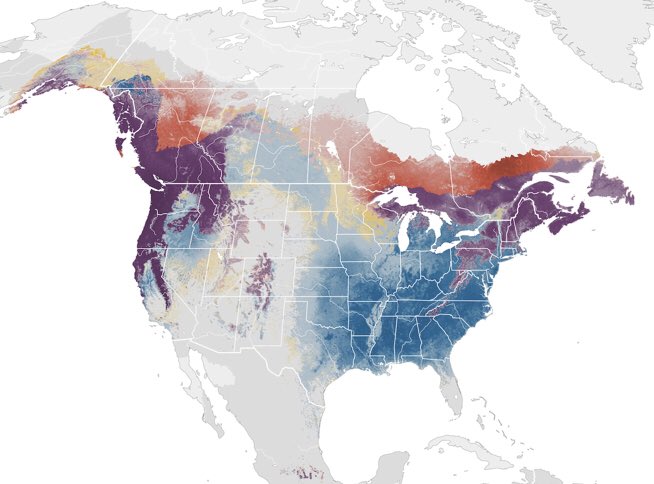
A+ map by @dan_majka for @nature_org looking @ species migration as result of #climatechange https://t.co/xChQY2qzz3
1
4