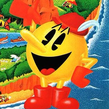
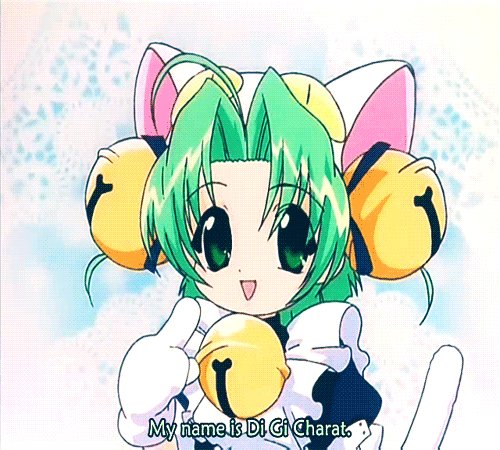
@YinyangGio14 The Mario Equivelant to this
@OnTheDownLoTho @KingGeoshi64 I just want a sequel to this with Klonoa in it
@x_khou It's also worth noting a lot of these spin-offs using 2D artwork still maintained the GCN-proportions akin to M&L Mario and typically tried giving him a "cooler" vibe.
Say what you will about the 2000’s vectors, but a lot of the more original ones oozed charm.
@MilesFox10 @SThebulbmin I think out of all his designs, either his PM2 or PMW1 designs are my favorites.
The PM2 design feels more like a “Pac” subspecies, though. It’s basically the cartoon design, but yellow.
@EchoSaefir I doubt they went through the effort to edit her appearance in the cutscene, but we’ll just have to wait and see…
Trust me, as someone who tried to edit graphics in 2D retro games, manual tile editing and disassembly is a headache.
I genuinely hate how this quoted bit and this other drawing I found on DA are the closest I’ve found to anyone translating Mario to Sonic’s anime style. Not to mention all the unholy stuff you have to endure just inputting “Sonic X Mario”, for obvious reasons. https://t.co/I3eirWgtFy
Every time I see the concept art for Mega Man 9 and hear how they were going to continue in more of a modernized direction, similar to 7 and 8. (presumably meaning no core gameplay/control regressions)
...to say I feel robbed is an understatement


