A tiny pork in the rain.
"The Wearing of the Grin" (1951)
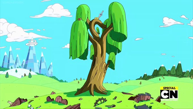
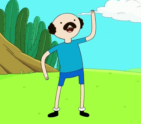
It's not an especially new trend. I'd say something that's been creeping in during the last decade as color design moves away from paint to digital. It showed up in Adventure's often bright daytime color palette.
Compare the designs to the film. You'll see those (☝️) aren't just loose concept drawings. They are clearly formed design ideas put to direct use in the film.
The episode these (☝️) source from is called “I wish I could speak french”. You can watch a great color print of it here:
https://t.co/8hgcak8m4l
(Umbrella tangent.)
I'm borrowing these two frames from @_ibcf_ 's breakdown to show you just how intentional design tangents can be.
The designers were having a blast and knew exactly what they were doing.
The various groupings of the 3 boys begs for it to happen. Sometimes intentional, I'm sure. Other times, probably not. But who cares, they're flat!
He's an easy design to pick on. "How could that head possibly work?" "Come on, really? A triangle for a head?" "Jesus is that ugly." "Where is his nose???"
"It's so flat, sooo garish."
Millions of kids and adults would disagree with you.
(including me)
You know what, let's talk about Phineas. Phineas makes for a good litmus in character design — in terms of what people think should work and shouldn't work.
Spoiler: Phineas works.
@lucadrawfren You could make the same grid for 2020. Of course there is diversity within trends.


