That's exciting: I'll give a 4.5h workshop about colors in #dataviz at #ISVIS2022 on Sunday, May 8th – my most in-depth color workshop yet!
Join us for lots of hopefully useful information (and help me to build a giant data vis color wheel): https://t.co/fiPqrL2Zk1
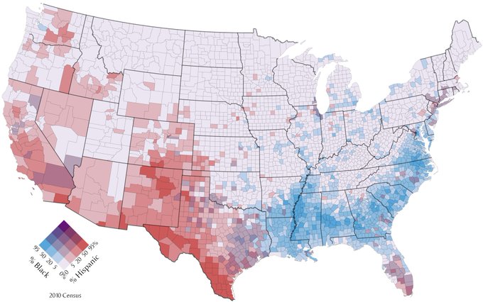
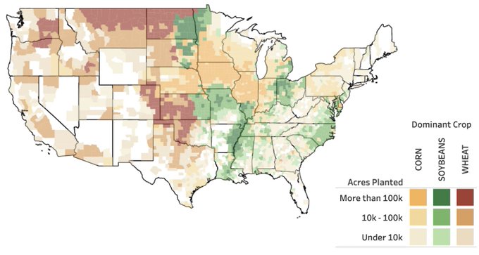
Today: A few musings on bivariate choropleth maps and when I think they work; showing maps by @jscarto, @mapsOverlord, and @John_M_Nelson. (I'm sure @jhilden has some really good opinions on that.)
👉 https://t.co/gA3VeQOSjS
We published a new Data Vis Dispatch yesterday! It's our weekly collection of the best of small and big #dataviz. Have a look: https://t.co/AMWOTPgQGZ
In the thread 🧵below, I show screenshots of the four visualization-heavy articles that impressed me the most this week:
I'm impressed by the quality of the IPCC visualizations – most newsrooms changed very little when rebuilding them, which is always a good sign.
If you haven't seen it, I can recommend playing around with the IPCC Atlas, their great, new exploratory tool: https://t.co/kOe8ebYUyO
While I was hosting the @datavisclub yesterday, my coworker @rosemintzers published the latest Data Vis Dispatch we put together – with incredible graphics by @flowingdata, @correctiv_org, @nytgraphics, and others. Have a look: https://t.co/UHKGjasaI5
Thanks for the nice feedback, everyone! The second dispatch came out yesterday, full of interesting charts & maps: https://t.co/0OLwpNMDYs
(If you know where we can find great #dataviz from Asian/African newsrooms, please let us know. We'd love to make it more international.)
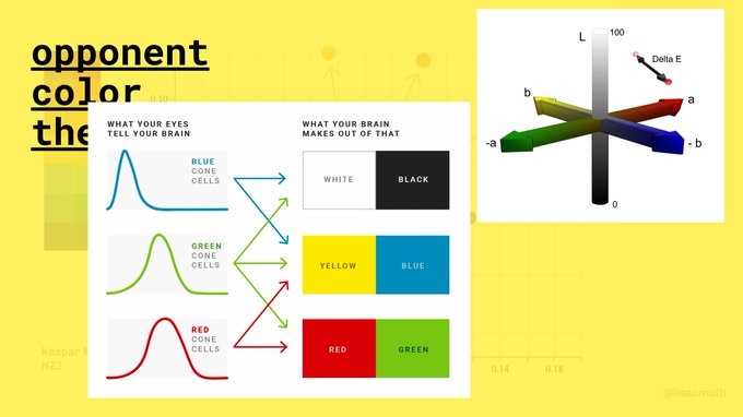
@SandraSchugens It's very similar because the cones that are sensitive to red and green are super close together (https://t.co/p5ijwykQ3O).
But it's not 100% the same: You can see this in the last picture where I moved red-weak and green-weak closer together. Especially the orange is different.
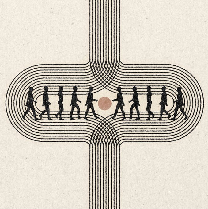
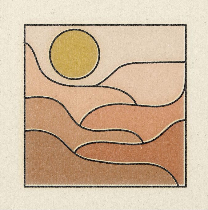
Really like the illustrations & logos by Daren Thomas Magee: https://t.co/8CiY8AbI6f I'd love to see #dataviz in that style.
I truly like the #100daysofandnotor series by @ktzhuTo: https://t.co/UwSWAWLqAe It shows how often we feel like we need to put ourselves in boxes, to feel like we make "sense". And that it's really not necessary to do so.
@funkeinteraktiv Ich krieg es nicht weg :( Sieht bei mir in mehreren Browsern so aus.


