dataviz.のTwitterイラスト検索結果。 7 件


We published a new Data Vis Dispatch yesterday! It's our weekly collection of the best of small and big #dataviz. Have a look: https://t.co/AMWOTPgQGZ
In the thread 🧵below, I show screenshots of the four visualization-heavy articles that impressed me the most this week:


On July 30th @BlackInNeuro is celebrating #BlackNeuroArt as part of #BlackInNeuroWeek! Share your favorite brain facts and images, whether of you working in the lab, your microscopy or your artistic endeavors and #dataviz. Tag @BlackInNeuro and use the hashtag #BlackNeuroArt.

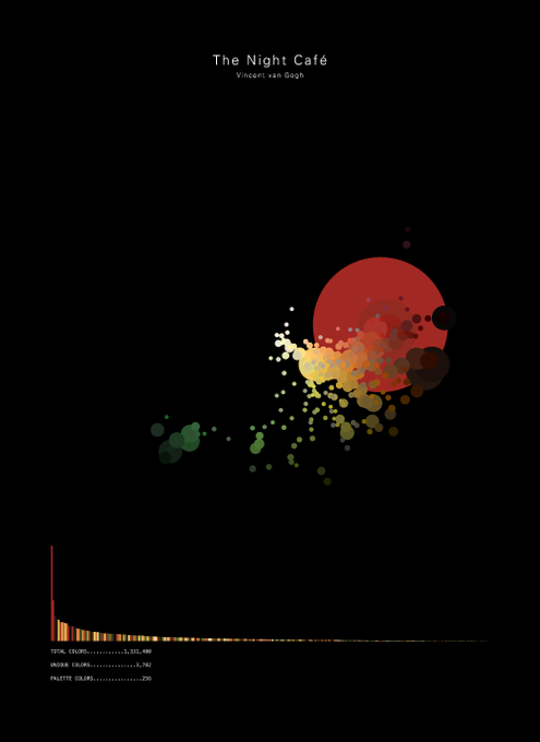

Awesome idea for a #dataviz. The visual shows an adaptive colour palette for a specific piece of art. Here we see van Gogh's night cafe. How great is that!? Source: https://t.co/qOp8lxLhoJ


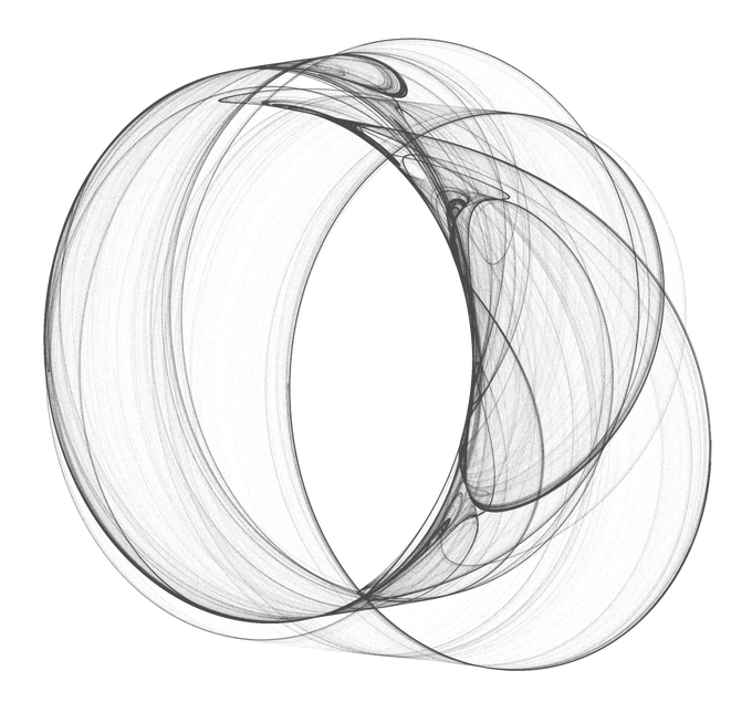


Meet #DataVizSociety member Will Chase (@W_R_Chase), data scientist at Upenn researching epidemiology of tuberculosis in Africa, focusing on dataviz. He works mostly in #rstats & is currently learning #D3js. In his spare time he also makes generative art.
https://t.co/mJYTKJL7dv


"This isn't a matter of taste, or opinion. We know — for sure, with science! — that the rainbow is a bad choice for #dataviz."
Great post (with #python code) by @kwinkunks: https://t.co/L01DNwzt4o #endrainbow

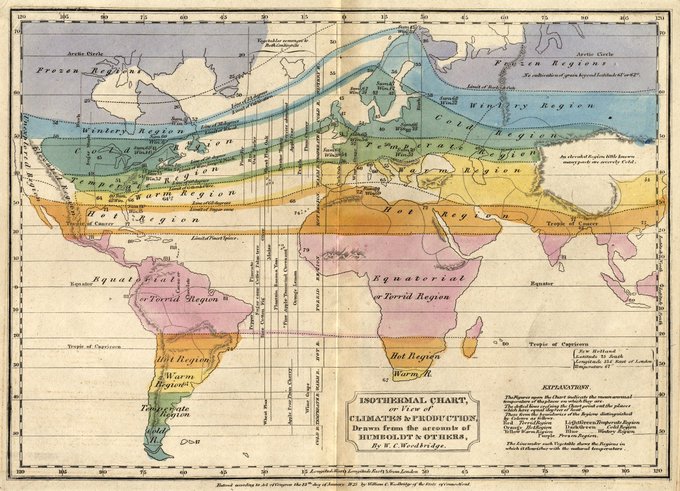
may have found patient zero for rainbow🌈 palette dataViz.
William Woodbridge, 1823. Guilty.