
Christopher Piperさんのイラストまとめ
@miiyouandmii2Follow @miiyouandmii2さんをフォローする
フォロー数:545 フォロワー数:383


*Fully Realised
My tweet cut off mid sentence!
There's a cool mix of an expected gritty mid-late 2000s game art style and a more daring and surreal colourful approach.
The gritty stuff is neat but man oh man does the colourful stuff really appeal to me.
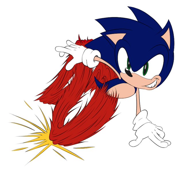
He'll be part of a bigger piece but here's a WIP Sonic.
Been a while since I've drawn Modern Sonic!
Need to fix his right arm a bit, I'm used to drawing Classic Sonic's noodle limbs.
Gotta finish another piece for a friend first though!


Let's mix it up with Modern Sonic!
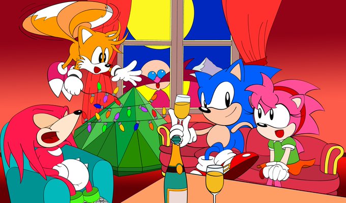
This is a Christmas wallpaper for GameSpot Japan. Probably from 1999.
Knuckle likes to decorate his dreadlocks.
Tails' pose is super awkward and he looks weirdly angry.
Check out Amy's mobile phone! That's how you know it's 'Modern Sonic.'
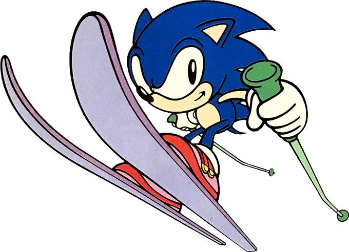


Crazy how these images are only 1 year apart!
Classic - 1998.
Modern - 1999.
Both from a Ski magazine.
Some may now find it odd that Sonic's redesign was rather polarising. Many even hate it today.
But when you consider how drastic a change it was, it makes a little more sense.


Spyro was redesigned to be cuter on Japan's box art.
But today I learnt about the other Japan redesign for Spyro Orange on the GBA.
It's like going from one extreme to the other.


Things that freak me out:
Mega Man's/Rock's weird dog noses.
This is a conscious design choice all the way up until Mega Man 11.
Proto Man and Bass also have dog noses.
Not sure why they have dog noses. But it's odd.
Roll has a normal nose.
I guess she's was the freak all along.

East and West.
Mario Edition!
Gonna try Mega Man next. Trying to replicate these different styles is fun.