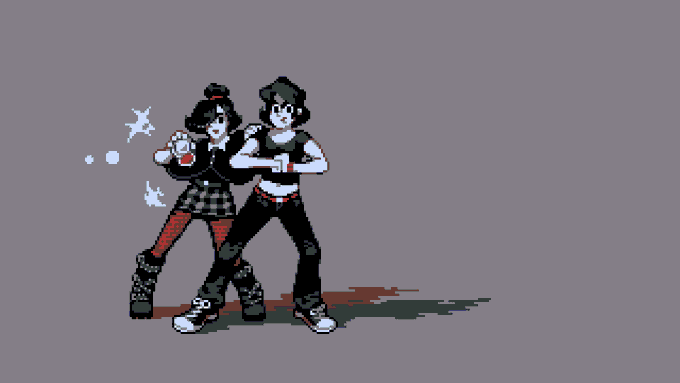
Of course I don't mean that in a desperate or dramatic way. It's honestly Not That Deep.
But you spend years writing girls that turn into dragons. Girls that turn into tigers. Girl versions of boys. Girls who play rough. And you start to think hey...she looks familiar...
Today is the #TransDayOfVisibility and this year I've resolved not to miss it.
A lot of people know me for my landscapes, but my #pixelart is also a diary of sorts. A weird diary full of bad puns and video game references but also images of how I see myself, or wish to.
Ahhhhh I just realized the character both Dian and Bo'Sun have been creeping towards.
I didn't use Scias in either of my complete playthroughs, but now that I look at them all together the subconscious influence is pretty obvious.
Now to decide whether I care 🤔
The basic character won't change much and in some ways this brings us closer to some of the oldest designs.
I mostly want to make sure Dian doesn't look too close to Bo'Sun, whose updated designs also now features an olive green top with wide sleeves which I like a lot for him.
I personally like a more chonky, almost bobblehead approach with fewer slender shapes...but I worry these proportions won't apply in all situations - e.g. tense/dramatic exchanges. (Thinking the player cast would have a few variations, but the basic style can't be THAT plastic..)
Messing with portrait styles. Very messy, really just thinking shape and color, but interesitng.
Today, dialog is on a plain ribbon, and honestly kinda bland, so hopefully portraits, while potentially a huge time sync, can add a bit of interest to the wordier sequences.
Works surprisingly well as a lazy, 2-frame rocker.
Could be a lot cleaner, but considering this game has a budget of like $0 I might just leave it here...at least until the other animations have placeholders?
This is common for pixel art sprites, but isn't unique.
It's devastating to me that this sequence - from a show I have never even seen - gets called out so often for "breaking the bones" - it's about a 6-frame transition (the gif is misaligned) that works great at normal speed.
Something many low-spec animators learn (or re-learn) the hard way:
Fewer frames doesn't always mean easier.
Here we have 2 frames to sell the transition from charging to casting. The flames go out, the tail flicks, the trunk twists 180 - it's a very hard smear to get right.
One thing I never do early enough is test assets to see if the colors and contrast work well in-game.
Forgetting leads to a bunch of things that being out of whack, usually in the wrong register... and adjusting indexed palettes can be a PITA.
Not making that mistake this time!


