
Phosphenomenaさんのイラストまとめ
@phosphenomenaFollow @phosphenomenaさんをフォローする
Any depictions of actual angels are purely coincidental.
フォロー数:1338 フォロワー数:453


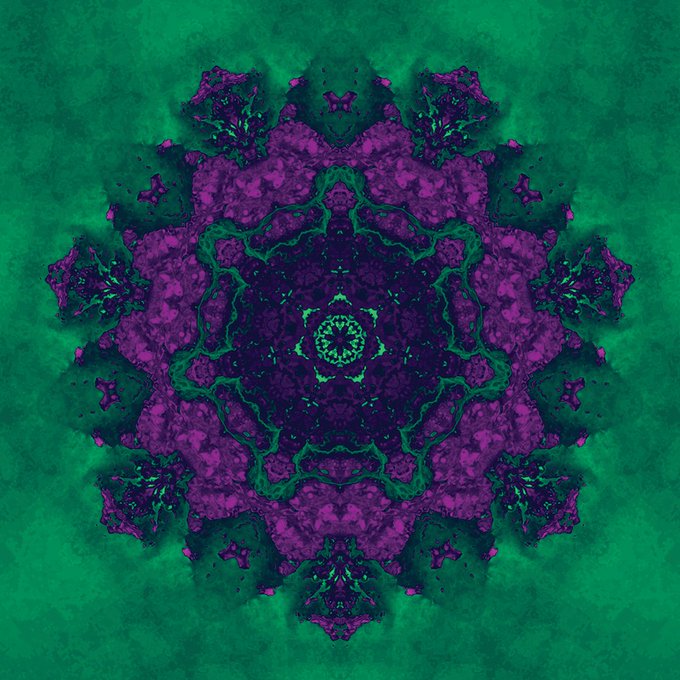
Started the day off making blocks for color layers. This is step two, setting the color. These are often really creepy when mirrored because our brains want to recognize pattern and shape, and mirroring plugs right into that mechanism.
#mirroring #patternrecognition #symmetry

"He says he wants to talk to our leader."
"Did you remind him that he already ate two of them?"
"I did, but he says he's still hungry."
#aliens #negotiations #diplomacy #dinner #almostthesamething #humor #artasastory #blue #purple
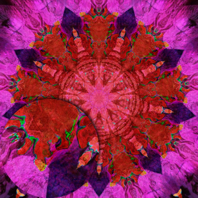
This guy was going to be a thing, and then he wasn't. So he lives here now. Just for you all. Enjoy.


There's always good reason to go through a cool teal phase.
Lots of cool things are blue. Oceans. Skies. Some eyes. Some jazz. Some jokes.
#abstractart #Kaleidoscope #generativeart #organicart #digitalart #legsfordays #idontknowwherethatcamefrom

"As the sun got darker, the people's art continued to change."
Orange and blue remain one of my favorite color combinations, even though it can be overused. This is one that I'm tempted to get a test print of to see how the colors hold up.
#orangeblue #radial #kaleidoscope

This design and the next one are both using the same shape layer, but different color overlays. It's a good example of how much a difference the colors make.
Also, I have a new kaleidoscope file in the making. The only number of mirrors from 5-12 I didn't have yet.
#colorlayer

I try to avoid the "collage" feel where lines interrupt one another, but there's also a beauty in the "fuzzy" overlapping of shapes. This one looks like a flower, but also like the inside of an abandoned asylum.
#darkart #asylum #thatpalegreen #putrid #DigitalArtist #growth
"How happy is the blameless vestal's lot!"
Some colors are anything but comforting, but are enervating or frightening. Once we know that, then we can use that with intention.
#catscan #mriscan #brainwaves #memory #artintention #migraine
It's amazing how often macro photography end up looking like something large and imposing. This particular piece ended up looking like a canyon, but somehow more imposing. The very little and the very big are more connected than we think.
#canyon #blueorange #gipsydanger