Daniel P. Huffmanさんのイラストまとめ
@pinakographosFollow @pinakographosさんをフォローする
フォロー数:69 フォロワー数:10714


My first #30DayMapChallenge piece (Day 9, Space) is secretly just something I already made and tweeted out a week ago. But, I made it mostly within 1 day, and I technically finished it in November, so it sort of counts.

@infowetrust @recifs @kennethfield Distortion does not vary by scale, at least in absolute terms — this is why projection choice tends to be more critical for small-scale maps. Instead the distortion increases based on your distance from certain critical areas that the cartographer can (often) specify.

Maybe others are already doing this, but I don't recall seeing anything like this in the wild.
Besides Tissot's indicatrix, another visualization option would be the gradients output by daan Strebe's Geocart.


@AntonThomasMaps Reprojecting to some variety of polar azimuthal would look interesting, but probably not in the intended way =).

New on the blog: Landforms of Michigan Mini-Tour. Stealing a good idea from @AntonThomasMaps, I'll take you on a quick, semi-educational jaunt through a few interesting places featured on my map of Michigan terrain.
https://t.co/cHQrKkL3B2

#30DayMapChallenge Day 3 (polygons): Forest cover around the Great Lakes, binned by Penrose tiles.
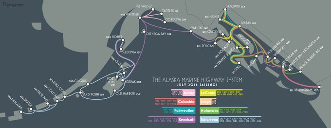


Just thinking this evening about how I am a big fan of getting to draw swooping curves on maps.
(Extracts from https://t.co/UPzYloDuPy).

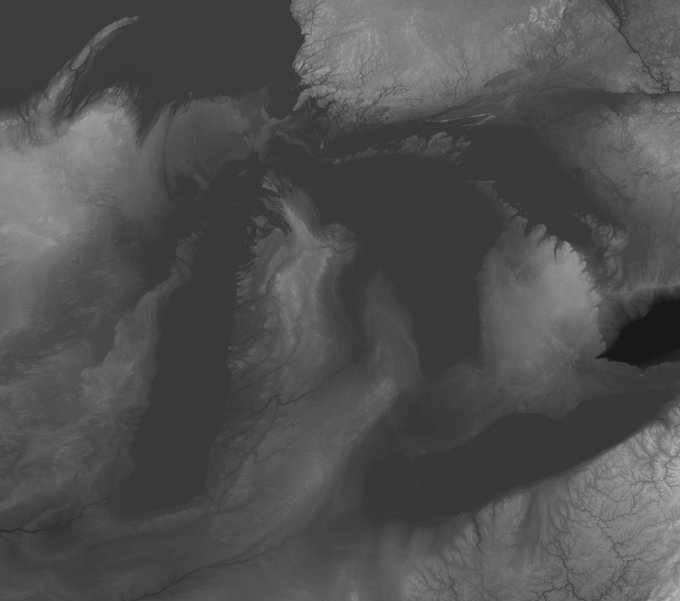
Once I had a good correspondence between new and old, I reversed the transformation, taking a modern elevation dataset and warping it into the space of the old map.