Daniel P. Huffmanさんのイラストまとめ
@pinakographosFollow @pinakographosさんをフォローする
フォロー数:69 フォロワー数:10714


@rgdonohue It depends on what you think of as "large scale" — but these maps I hurriedly prepared for a class years ago seem to have been effective (and are now being used by others).


@TheMapSmith The noise, both before and after halftoning, is helpful. Otherwise things look a little too perfect and flat.
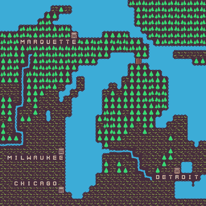
Ok, this is the last one I think, as there are probably other things I'm supposed to be doing. Changed the tile & palette for crop/grassland, added Chicago. Thanks again to @KenneyNL for the free tileset! https://t.co/2BKX8gr1wV


I was working on this map for a client, and then I wondered what it might look like if I made it in 1940.

Accidental art suitable for the season: the blood waters of Alaska.
(I was in the middle of applying a gradient map, and apparently Photoshop decided to start with a red-black scheme by default).

New in the portfolio: an airline map. Might also blog about its construction on some future day. https://t.co/yoSGs4g7lJ


Stealing from the best (work in progress). https://t.co/3bFOt82Zlk

For US census block data, I think assigning the populations to the polygon boundaries makes a lot of sense (vs. a choropleth), since these people usually live on streets.