datavizのTwitterイラスト検索結果。 255 件中 6ページ目


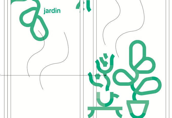
Following the great @SonjaKuijpers & since it's #PortfolioDay I share some details of unpublished #dataviz I designed. From personal projects, other that aren't public yet or designs that didn't make the cut.
Hi 👋, I'm Maxime, let's connect !
check out > https://t.co/ERyNIwOR5B


When opting for a xenograph, teach your audience how to read it: @fedfragapane does this beautifully in the #dataviz "Democratic Deficit Countries" through both a visual key & explanatory details.
Check out Fedrica's portfolio for more inspiring work: https://t.co/vhkIqIRz8L


Basically how most of my #dataviz projects start—awkwardly. Thank you to everyone that tuned into my twitch this week too 💖
Here's the archive ICYMI/are interested: https://t.co/U7KYyhU4S7


Absolutely stunning work from @ian_bott_artist in this fascinating article by @clivecookson and @AnnaSophieGross on how bats can help us understand immunity to the #COVID19 virus
https://t.co/VLf8Mf9F08
#dataviz

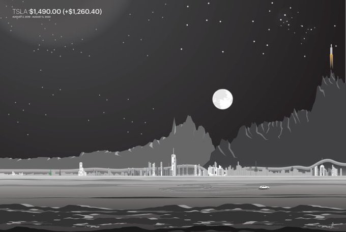


Artist Gladys Orteza turns stock market data charts into nighttime landscapes https://t.co/FWmWRiNxiO #dataviz


Recent work: Ellipsys vascular access, a faster and less invasive access for hemodialysis. Art in Illustrator and Photoshop. More of our samples
https://t.co/Zym487vm8g
#Infographics #dataviz #informationdesign #adobeillustrator #scientificillustration


I’m speechless! I won 4 medals at @malofiej!! Silver medal for Space Junk for @sciencefocus and Bronze Medal for The Geography of Human Rights for @La_Lettura, Elements in Danger for @sciencefocus and The Menstrual Cycle for @sciam!!
#dataviz #ddj #infographic #malofiej28


On July 30th @BlackInNeuro is celebrating #BlackNeuroArt as part of #BlackInNeuroWeek! Share your favorite brain facts and images, whether of you working in the lab, your microscopy or your artistic endeavors and #dataviz. Tag @BlackInNeuro and use the hashtag #BlackNeuroArt.

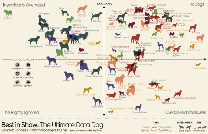
Best in Show. Is yours the perfect pooch? The #dataviz dog-lovers have been waiting for: https://t.co/YPI9eEs2Oc

Brains of the world. One of our graphics in the book The Zoomable Universe, by Caleb Scharf. Published by Scientific American / Farrar, Straus and Giroux #Infographics #dataviz #datavisualization #informationdesign #graphics #graphicdesign #visualization


My next 5 dataviz-themed wallpapers (#26 - 30).
(Credit to
@allitorban
for the amazing idea!)
For each decade, I pick a chart type & a New Yorker cover for design inspiration.
Here’s my 1977 Node Link Diagram #DataVizWallpaper.
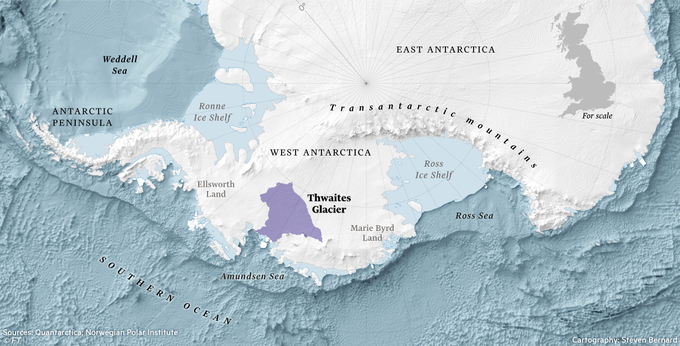
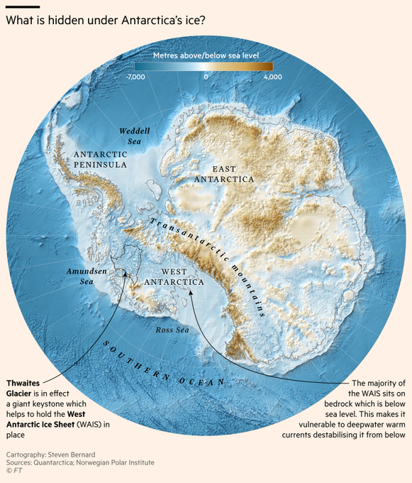
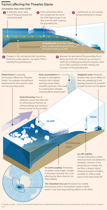
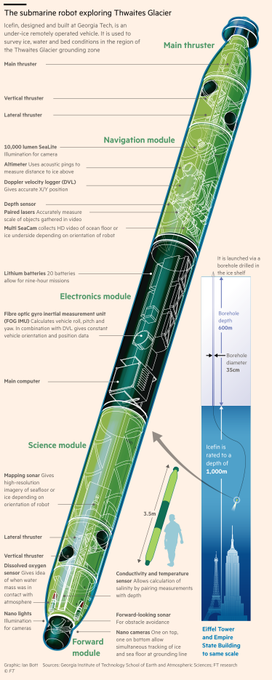
ICYMI: @lesliehook's fascinating if unsettling piece on the melting Thwaites Glacier in Antarctica, and what it means for global sea-level rise.
Beautiful @ian_bott_artist illustrations and #cartography by me
https://t.co/kC9l630xy4
#gistribe #ClimateChange #mapporn #dataviz


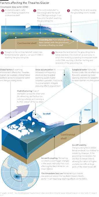

GRAPHICS-FEST in this fascinating article by the brilliant @lesliehook about the Thwaites 'doomsday' glacier in Antarctica. This was a real labour of love, beautiful illustrations by @ian_bott_artist and maps by myself
https://t.co/kC9l630xy4
#gistribe #dataviz #ClimateChange


#DataVizWallpaper in 1987
Earth and comet orbits in the style of an 80s bubble 💫🧼
#the100dayproject #DataArt

#DataVizWallpaper in 1981
Theodorus Spiral with a bit of rock n roll👨🎤
#the100dayproject #DataArt


All the World #Languages in One Visualization🗣️
https://t.co/gFwVkfsm9D via @VisualCap
#Culture #Globalization #DataViz
@alvinfoo @chboursin @mvollmer1 @NevilleGaunt @DrJDrooghaag @JoannMoretti @kalydeoo @Victoryabro @Dahl_Consult @labordeolivier @Fabriziobustama @fogle_shane

NEW: Jun 3 #Covid_19 streamgraph
• After weeks of contraction the daily death toll is steadily increasing
• From 7-day average low of 4,029 on May 26 to 4,173 today. Still well down however from 6,766 peak on April 16
Interactive chart...
https://t.co/YTOT7BLtou
#dataviz

One of most stunning illustrations I have ever seen from the @FinancialTimes supremo @ian_bott_artist explaining the @SpaceX and @elonmusk's first manned commercial space flight.
Read @RichardWaters fascinating article
https://t.co/kDgbabzBwc
#dataviz #illustration


It is an honor to be featured as a trusted data provider by @latelier (@BNPParibas) in their amazing DataViz about #Virtual #economy
Discover the breathtaking report here
👉 https://t.co/AsKatNWP3d


Awesome dataviz shows all 23 languages with over 50m native speakers and the countries where these languages are spoken. I think it's funny that Austria is missing in the German section. Great piece of work though! Source: https://t.co/vbU18sYOQo