FontsのTwitterイラスト検索結果。 75ページ目


The Bix Beiderbecke Story - Volumes 1, 2 & 3 (1950 - 1952) @DesignMuseum @Dazarbeygui #FontSunday #Vinyl


Dear Everyone:
ALL CAPS fonts in large amounts are hard to read. Not to mention it seems like I have to read everything while shouting.


Today I had a very important and helpful design lesson from @blackwoolsays to help with making pesky fonts more interesting.
#ArtGapChallenge #design #inkscape


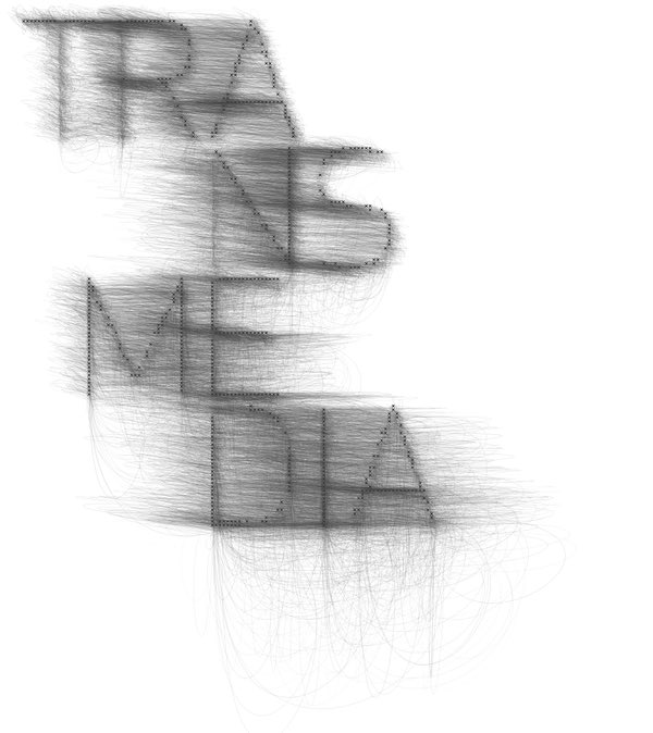

.@DesignMuseum’s fading fonts #FontSunday — Experimental typography found via @CMUSchoolofArt


Practicing my sketchnoting skills thanks to #SKETCHNOTEFEVER and @sylviaduckworth I’m loving the Procreate app and excited for many more days to come of icons, fonts, and more!

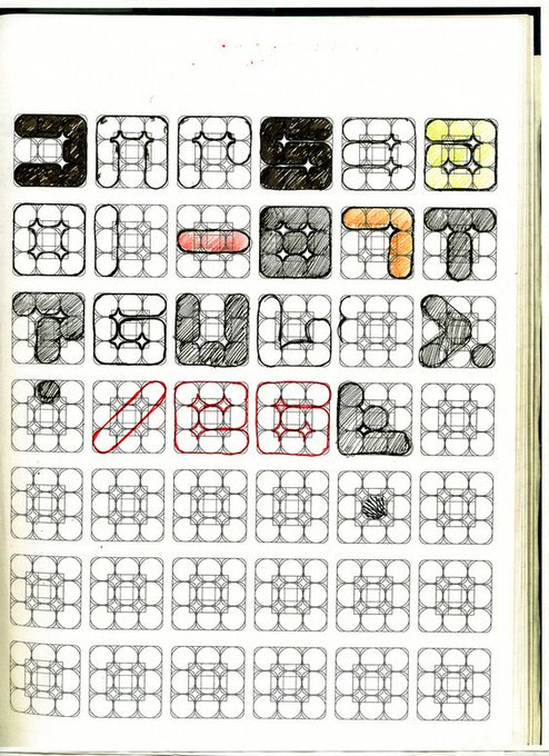
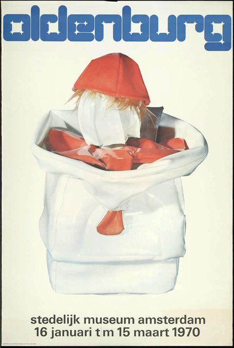
"I always used one word to make an image, a kind of image-based typography." – Wim Crouwel
'Soft Alphabet' Concept Grid & Poster designed by Wim Crouwel for the Claes Oldenburg Exhibition, @Stedelijk Museum 1970.
#FontSunday #Design #HomeFutures #modularfonts @DesignMuseum


Another page for this little short comic. No script, but I think it will be 4-5 pages. I dig playing with some more lettering and sound effects. Thanks a bunch to @blambot for all the fonts he provides to aspiring artists!
#makecomics #webcomics #viking


.@DesignMuseum’s #fontsunday is fonts from 90s pop 🎶 — @MTV logos from the 1990s


Soviet space program poster. @DesignMuseum #FontSunday #WorldSpaceWeek #design #psoter #soviet #cosmonaut


Typographical Error
#typefaces #fonts #typography #kerning #dresscode #tshirt

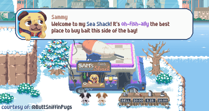

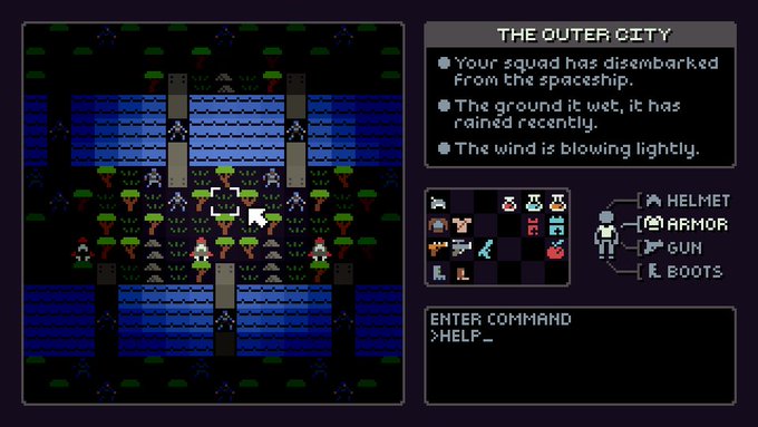

Reminder: I’m selling a pixel font pack you can buy over at https://t.co/uJ73ydG5UU!
~*~
For a mere $25 US you get —29— fonts! (+11 variations)
~*~
Please share with your game dev, youtube, and streamer friends! Licensed for use in both free & commercial projects.

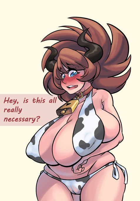


So I gave a Ella a lil bell to help make her more *fitting for her role* (btw if anyone can point me in the direction of actual appealing clip fonts that'd be great thaaanks)

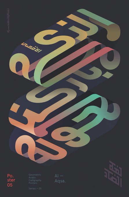

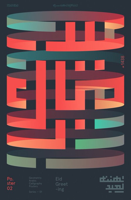
Arabic typographic posters by Mohamed Samir @DesignMuseum @wayneford #FontSunday #NonLatin


https://t.co/YjGKgPYGoQ rest is there. Messing with fonts now, the old pages of this are quickly becoming unreadable.


Thanks to all who have posted and followed this hand-painted fonts themed #FontSunday and to guest host @better_letters. The signwriting theme continues in London this week with #LondonLetterheads at @OXOTowerWharf
Pictured: C by Harry Fieber (@utilestudio)

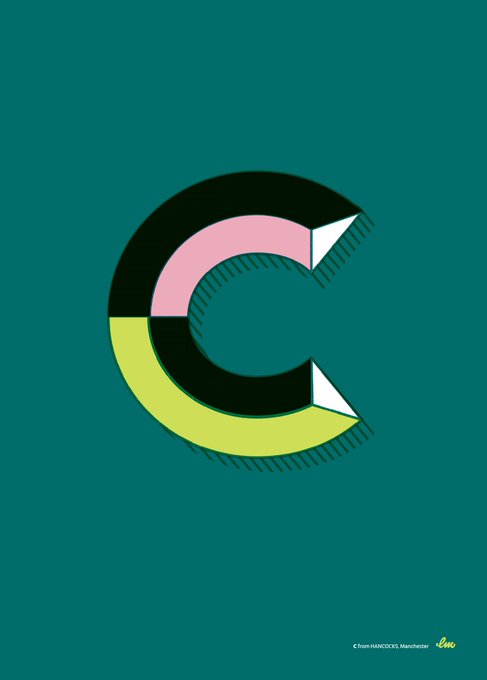


#FontSunday @DesignMuseum Personal recreation of three letters from signs in Barcelona and three from Manchester designed by @laurameseguer
Absolutely adore her work #typography

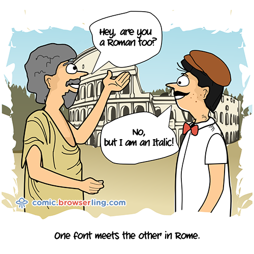
Two fonts meet in Rome. ... https://t.co/6UHJwTCv3F - nerd comic by @browserling.


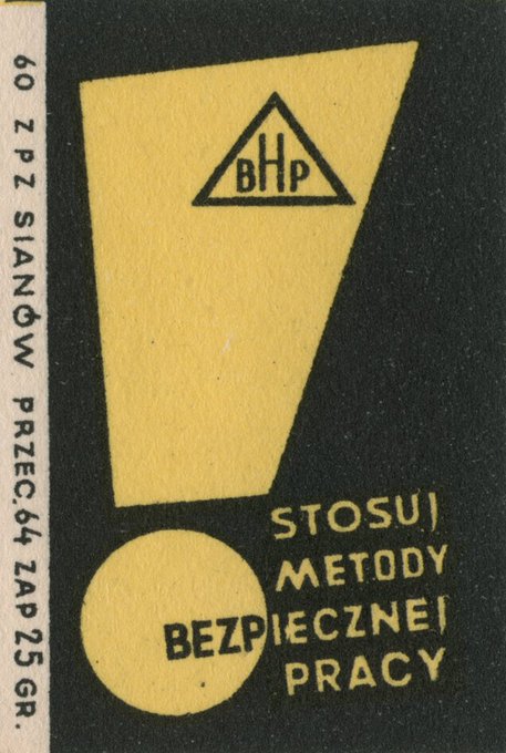


#FontSunday Some great examples of exclamation marks on vintage matchbox labels. #punctuation @DesignMuseum @nikki_vz
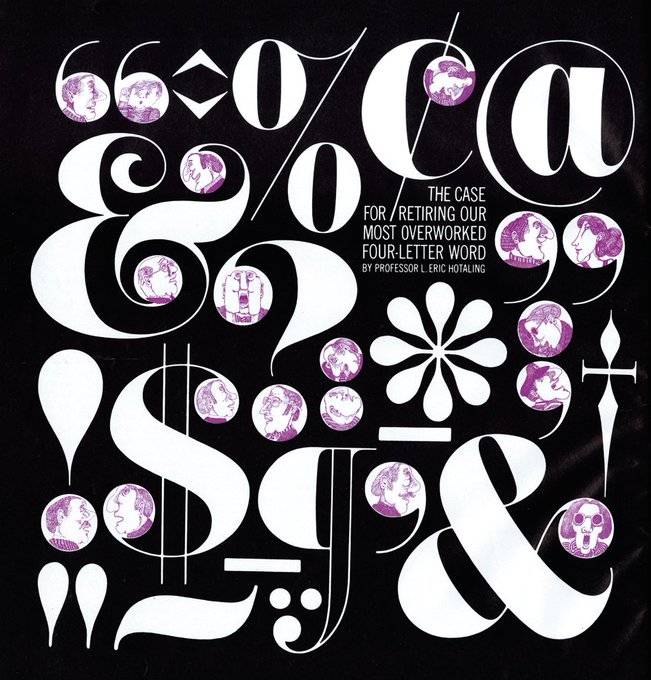
#FontSunday 'The Case For Retiring Our Most Overworked Four Letter Word' which featured in the first issue of Avant Garde Magazine – January 1968. Design by Herb Lubalin. @DesignMuseum @nikki_vz
#Design #Punctuation #Type #Typography


Time flies when you’re having a type foundry!
This summer we celebrate our 10 year anniversary by offering a 30% discount on all fonts for 10 days: 17–27 July 2018.