datavizのTwitterイラスト検索結果。 255 件中 11ページ目


Awesome #dataviz shows all 23 languages with over 50m native speakers and the countries where these languages are spoken. I think it's funny that #Austria is missing in the German section. Great piece of work though! Source: https://t.co/Yi17uPSGCg


Had a terrific run of technical graphics for @FT over the last 2 months, ranging from possible causes of and solutions to Alzheimers, 3D projectors, autonomous cars, the RAF's new F-35 and the space achievements of private companies like SpaceX and Planet. #dataviz #illustration

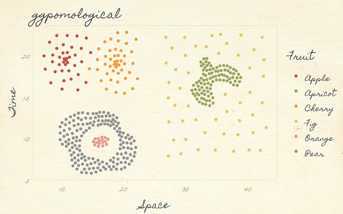


😍 pomologically-inspired plots…
"🍑 ggpomological: A Pomological ggplot2 Theme" 👨🎨 @grrrck
https://t.co/Bqj6ZibwwM #rstats #dataviz

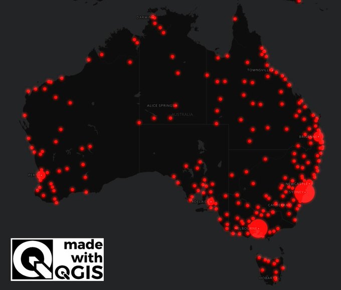


Have you read my blog? Step by step guides on using #QGIS for #dataviz: https://t.co/TbCpq6zcRA
As recommended by some of Europe's finest dataviz tweeters: @maartenzam @tjukanov @charley_glynn
More posts coming soon!


Got the watercolor effect going with @tylhobbs+@taylorbaldwin's help and this is the first iteration with the data plugged in ✨ I'm not sure if I like the data attribute the 🎨s are derived from so will have to keep playing with it~
#wip #dataviz #dataart

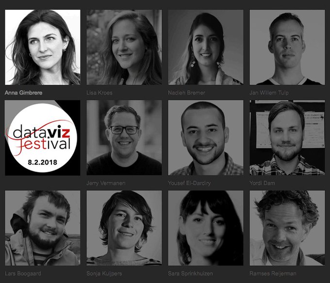
Sprekerslijst #DataVizFest bijna compleet! Ontmoet 8 feb. @JerryVermanen @JanWillemTulp @NadiehBremer @LarsBoogaard @YordiDam @SonjaKuijpers @RReijerman @YousefED eva. Doe mee met je laptop op schoot. Laatste kaartjes met vroegboekkorting via https://t.co/1VTgAU6suM


"This isn't a matter of taste, or opinion. We know — for sure, with science! — that the rainbow is a bad choice for #dataviz."
Great post (with #python code) by @kwinkunks: https://t.co/L01DNwzt4o #endrainbow


😂 & true- #dataviz must-read! “Look (what you made me do): I illustrated 10 of my professional sins” by @xocasgv https://t.co/uMBfmzBT5u


Space probe #Cassini meets its fiery end by crashing into Saturn #infographic @theipaper #NASA #Space #dataviz #cassinigrandfinale

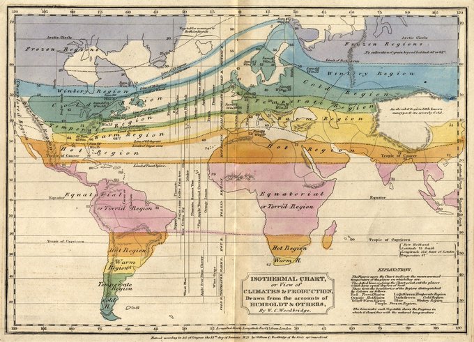
may have found patient zero for rainbow🌈 palette dataViz.
William Woodbridge, 1823. Guilty.

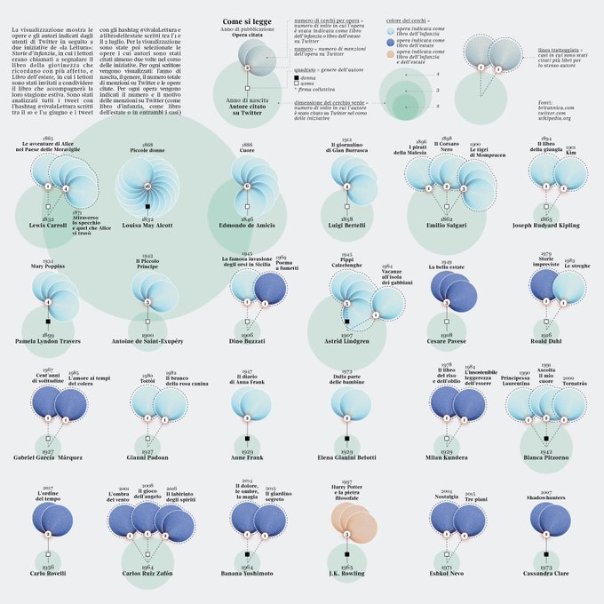
Childhood books mentioned by @La_Lettura readers on #Twitter: my #dataviz on #Behance https://t.co/AVNrdJlR0c


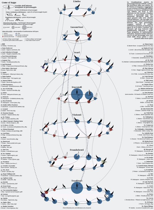
Villains in #literature: my #dataviz for @La_Lettura on #Behance! https://t.co/PAyFhD1H2H #datavisualization


An Exploration on Coloring t-SNE Embeddings in Python https://t.co/H6QzANtbRm #DataScience #dataviz


The @WIRED has brought together designers who do wonderful hand-drawn visualizations: https://t.co/PTzPrVzI0E #infoviz #dataviz #dataArt


(N) Playing around with my February #dataviz 😁 Anybody dare to take a guess what kind of data (topic) is (somewhat) guiding these lines? 😅


Code-through fun continues: "Introduction to ggraph: Edges" by @thomasp85 https://t.co/69VjIM5V9c #rstats #dataviz #ggraph


When Data meets Art — Series of abstract data-visualizations #generative #dataviz #IBM #throwback
https://t.co/giRNNcvCNC


⚡️ICYMI⚡️
We're wrapping up 2016 with a special awards themed ICYMI.
#dataviz #contentmarketing
👉 https://t.co/Q1imQsZ7x1