ProportionのTwitterイラスト検索結果。 9,822 件中 171ページ目


I just wanted to draw something with a cup of noodles, while also trying to draw something while disregarding proper proportions, haha.
The outfit was pulled from some fashion photos I saw, though the colors are different.


also i drew the panther shit from earlier but with the actual original design proportions because i'm a fucking idiot and stuff


No 😢
I mean I don't hate it, I just wish I could do something more consistent in quality and better in proportions https://t.co/CHKkD6Urrc


Just like Professor, made a character based on Almond
no name for em yet
hes the same species as Ruavu but more evolved (also fixed Ruavu’s proportions)

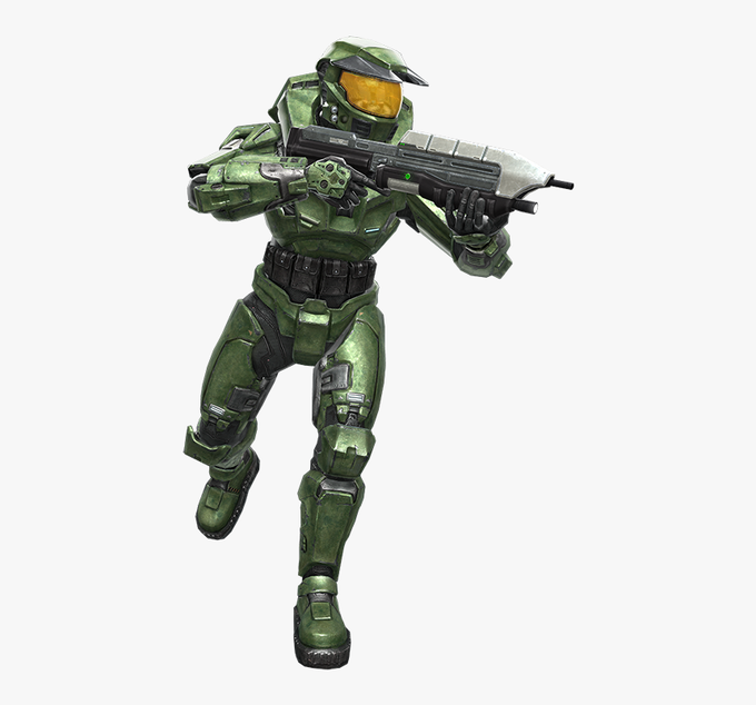

@ArtN_Film_Sam @IsannKeket cant believe you two are saying the CEA Chief is terrible
i can understand the dislike but after a while it grew on me
plus his fixed proportions on Fireteam Raven makes it look way better ( SINCE ITS NOT ON THE CE RIG )

Perfecting the AU version of Tyr. More accurate velociraptor proportions and size but looked little too underage-y so I had to add some "pubic" feathers to make that distinction clearer. Sadly goes against the twinky look I wanted but I was a little scared >..>


@Skorne5 at the beginning of drawing Pot I did some kinda research abt his bodyshape and proportions , but i think time to reseacrh this thing again and base on it :'D


@23daemon Technically my first art piece was a map part but!! We ignore that
Anyways I know. I have definitely improved on shading and giving characters better shapes or proportions! These two don’t really give good insight on my improvement since they’re drastically different but yknow


.....i literally rushed in under seven hours? But I think it turned out okay??
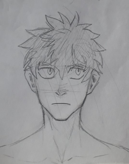
If you spot messy parts/out of proportion things, no you didn't ☺️
12/7 to Gojo Satoru~ #GojoSatoru #jujutsukaisen


@AdobePirate240 Even i consider my own art mediocre, i still have ALOT to improve upon such as shading, composition, color theory, and proportions mostly
all artists have trials and errors in their artwork, i’m no exception


I make a quick drawing for today's @pixil_art reindeer challenge. Though I think I messed up proportions here and there
#pixilart #pixelart


Maybe... I'm not that confident drawing them though. The proportions are shit https://t.co/mbhRC0wuUD


@AndeAlmighty yer right these proportions are fun. they givin' me.... ideas


From his hair. Gloves and shoes were also less defined shapes. In Partners in Time, body proportions and shapes were adjusted (look at Mario’s head and Luigi’s slightly slimmer body shape for example). You’ll also notice Luigi’s silhouette has high waters. (3/6)


The silhouettes have had numerous changes. In fact, they’re slightly different in almost every installment. In Superstar Saga, certain body proportions, such as the head, arms, and body, were a lot larger. As well, Mario’s arm had a white outline separating it… (2/6)


Glad that in many of her shots that are actually in the show, she looks a lot better proportioned (still kinda lanky though lmao). I actually think they purposefully toned it down a bit in season 10 because her head and waist is noticeably smaller and she generally looks better

This is for a school project I haven’t turned in for a few weeks now <w>
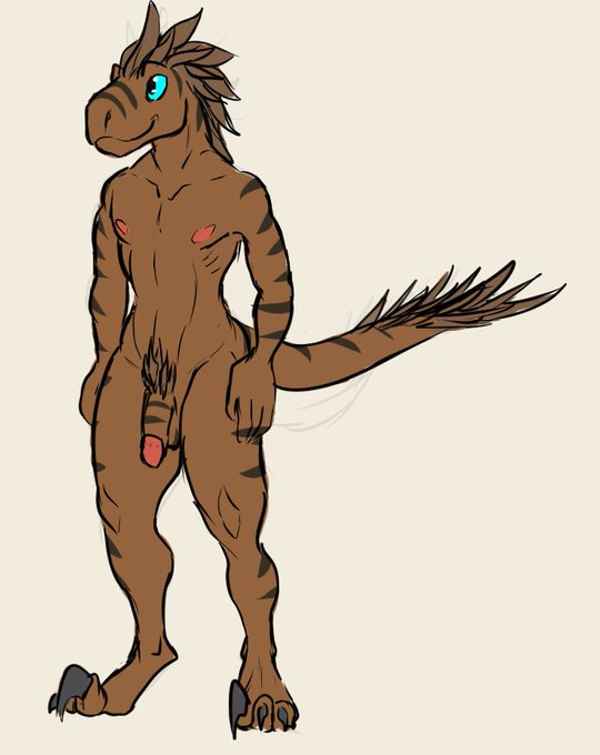
I generally don’t draw feral stuff, so my proportions may be incorrect, but it’s a species I had to make