TypographyのTwitterイラスト検索結果。 6,955 件中 272ページ目


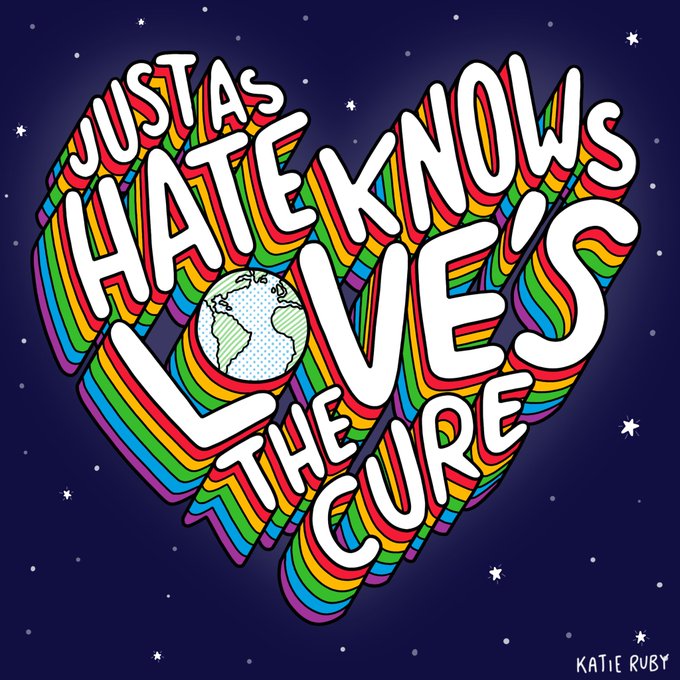


You’re a hella cool cat. 🐱🤪🐱
#graphicdesign | #typography | #hairlesscat | #sphynxcat | #drippy | #trippy | #shirtdesign | #art | #psychedelic | #psychedelicart

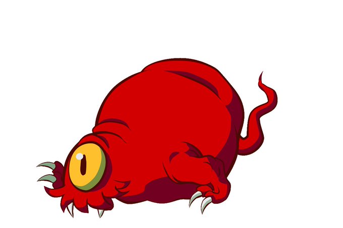
Taika! Is an odd red blobby Yokai that's always getting bullied by the hammer wielding Kanazuchibo.
Testing Jiggle Physics and manual Shading for work? Work prefers kinetic typography, but I may need this for some hand drawn looking effects.


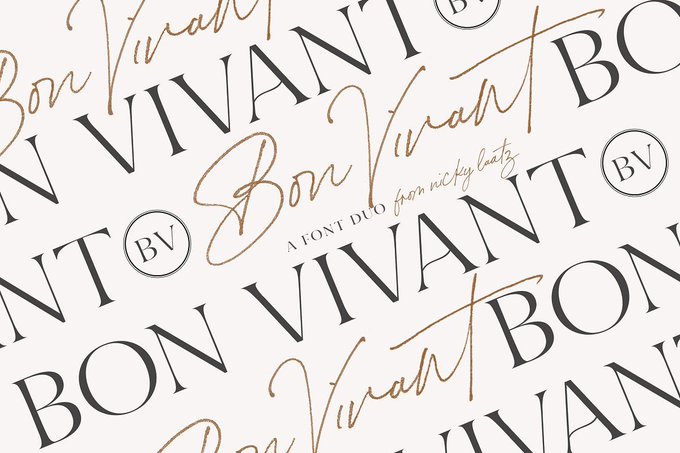


Bon Vivant Collection — https://t.co/7xAmych17L / #font #display #typeface #typography


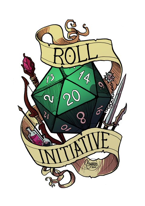

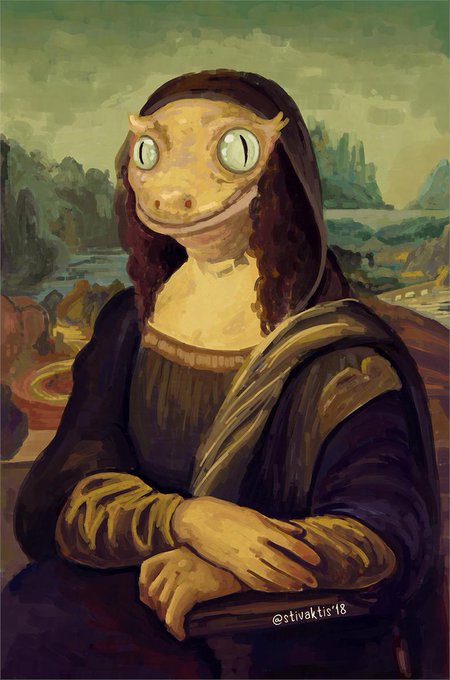
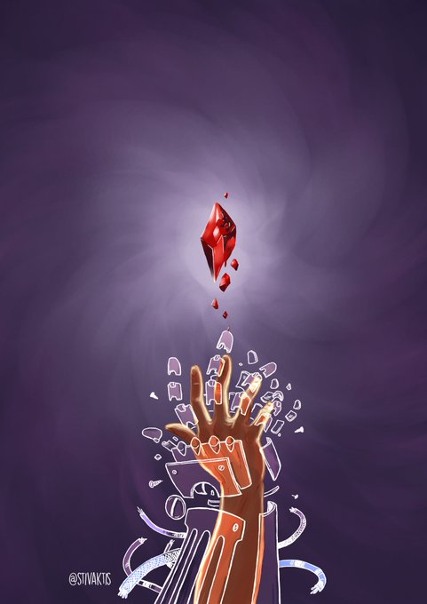
@kroovv I'm Steve!
I'm a comic artist and writer, illustrator, game master, and overall nerd from Greece. I like drawing typography by hand, queer and/or disproportionately emotional things, and visualisations of bad puns.
I'll interrupt any conversation to excitedly yell "DOG!!!".


We're back with a bang! Head to our blog to see the latest roundup of our favourite Briefbox designs so far this year. We'll be posting a brand new iconography brief on Monday too!
https://t.co/0dArHPlIsi
#blog #illustration #typography #webdesign #graphicdesign #briefbox


T®YPOPHOBIA 91
alphahead 京
#graphicdesign #typography #タイポグラフィ #タイポ #アート #漢字


Kerning type is arguably a very relaxing activity...
Unless hours have passed and that one letter refuses to cooperate and shifts where ever it wants to shift.
Aka the cat of letters.
#Designer #typography #RandomThoughts #kerning

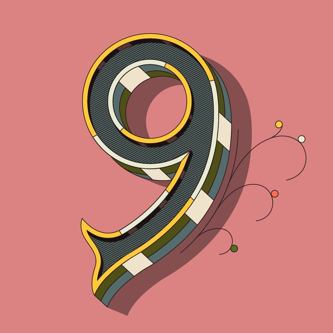
9 for my last 36 Days of tyPE #36DAYSOFTYPE #LOGO #vector #design #designer #typo #typography #font #dribbble #behance

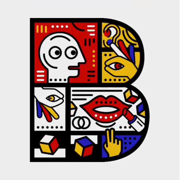
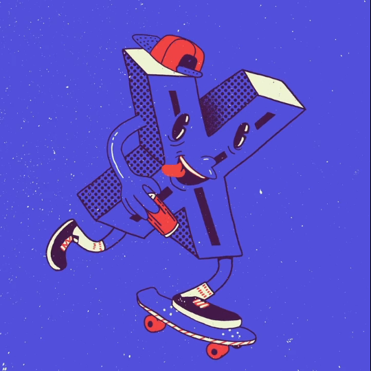

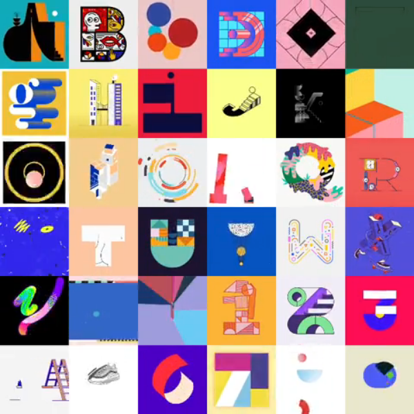
Motion man Albert Oriol animates the work of 36 #designers and #illustrators to create this joyful and vibrant contribution to the sixth edition of @36daysoftype
https://t.co/WGpQJBc6VS
#animation #motiondesign #typography #design @stash_magazine


Creative Typography & Lettering by Ana Mondragon https://t.co/ie0VzbnupA via @inspirationgrid


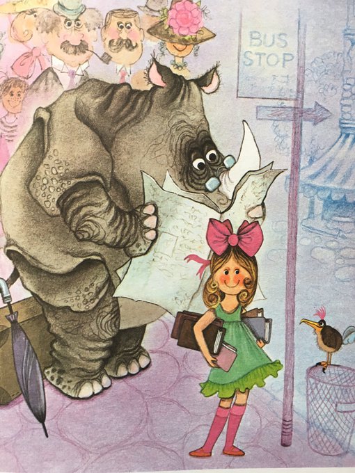


In my Typography class we got to choose a movie quote to create a Blue-ray illustration for. So obviously I chose Thor Ragnarok.
And yes, I'm aware I'm a traitor for not choosing a Grandmaster quote
#Marvel #Avengers #Thor #ThorRagnarok #Hela


A look back at this Shakespeare’s ‘Sonnets’ book cover design that didn’t go to print, although I still enjoyed working on all the botanical and typography elements. .
.
#shakespeare #sonnets #love #roses #botanical
#typography #type #letters #typespire… https://t.co/PdrTRnJF8I


Anything Is Possible #digital #drawing #illuminated #A #flowers #typography #illustration

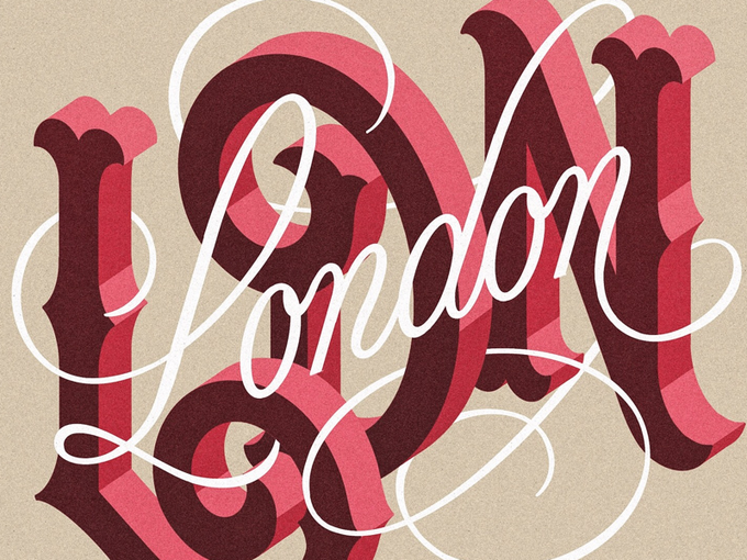
Lovely #lettering by Mark van Leeuwen https://t.co/TntlEnlbs4 #typography #type