30DayMapChallengeのTwitterイラスト検索結果。 76 件中 4ページ目


#30DayMapChallenge - 05 - Blue
Un peu de géologie (et un peu d'Arctique, ça faisait longtemps :D)
Données : @CAFFSecretariat https://t.co/rcPmDnhC0T & Wikipédia pour les termes


3. Polygons: #world countries as bounding boxes – looks a bit like the Death Star 🤪 Already posted one map today but I was preparing for tomorrow’s workshop and by accident created this, and it is just sooo fitting for the polygon theme, so I had to post it 😆 #30DayMapChallenge


#30DayMapChallenge day 3 – polygons.
Voronoi polygons showing the nearest (linear distance) tube station for each point in London.
Data: ©OpenStreetMap contributors
Tool: QGIS


#30DayMapChallenge Day 2: lines
I used data from @WFP and #QGIS to visualise global railways. I think the data comes from OpenStreetMap, the American Digital Cartography and Global Discovery.
More info in https://t.co/3MNh9EKe0r


Named storms of the 2020 Atlantic hurricane season.
#30DayMapChallenge #lines #Eta #hurricane
How it started: How it's going:


For #30DayMapChallenge I made 1 map on each day of November. You can find all of them in this thread, or with some more context on https://t.co/Rxq7W35yiD Thanks to all 30DayMappers, you were amazing! https://t.co/c1ndr9oyZ0

@f_l_o_u_r_i_s_h @Stad_Antwerpen @hnshck @igeolise @Runkeeper @karim_douieb @Datawrapper #30DayMapChallenge nr 30 (home): A map I've been wanting to make for a long time. Places I've called home throughout my life (circles) seemed connected to the river Demer (blue) and the E314 highway (pink). Looking at the map now, they definitely are


#30DayMapChallenge Day 9 - Yellow (I know it's 24th...)
I visualized the CERA dataset from @es_INE that lists Spaniards that are living abroad :) I consider it a personal dataset because I'm part of it


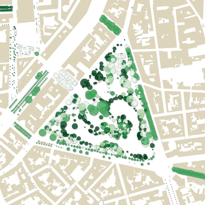
Airport structures for #30DayMapChallenge on built-environment theme 1/2


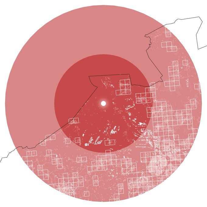
@f_l_o_u_r_i_s_h @Stad_Antwerpen @hnshck @igeolise @Runkeeper #30DayMapChallenge nr 17 (zones): some 820.000 Belgians live less than 20km away from the Doel nuclear power plant (not counting the Dutch to the north). Squares = 1x1km with pop > 500, Antwerp city center in lower right corner
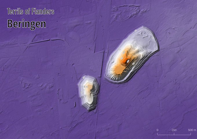


@f_l_o_u_r_i_s_h @Stad_Antwerpen @hnshck #30DayMapChallenge nr 11 (elevation): The Terrils of Flanders (that's how we call spoil tips or slag heaps here)
Very pleased with these ones

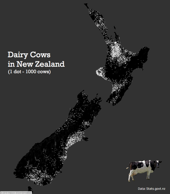
#30DayMapChallenge Day10: black & white. A simple dot density map (first one for me) of dairy cows in NZ (which are sometimes b&w:). Made with st_sample() from {sf} package #rstats, visualized in #Tableau.


briefly joining the #30DayMapChallenge party on a friday night 😊. been playing with 3D, overlayed colormaps for visualizing GFS cloud cover data.

#30DayMapChallenge Day 5: Raster
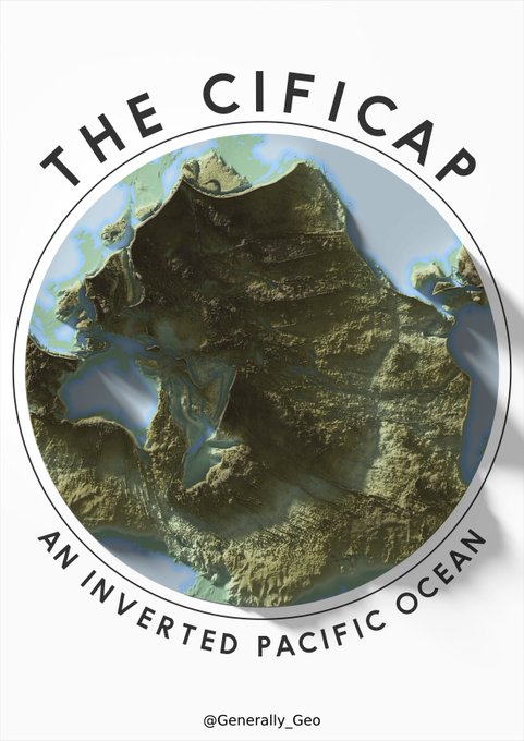
inverted dem using CleanTopo2, @pinakographos blender tutorial and a whole lot of open source software

#30DayMapChallenge. Day 1-st
Biggest urban areas in the world in 2050