SCiFiDailyのTwitterイラスト検索結果。 127 件中 5ページ目
#SciFiDaily Galen Dara's "Bubbles and Blast Off" brings a modern look to the traditional spacebabe. It's a bit busy for my usual tastes, but I love Dara's use of color. And, modern though it is, this image is thoroughly rooted in pulp science fiction artwork.
#SciFiDaily We're kicking October off with a laugh. A friend sent this to me. I have watched little Futurama, but I'm a huge John Carter fan. So this is right in my wheelhouse.
#SciFiDaily couldn't resist this send up to Escape From New York. I hope this provides a laugh as you start another Monday morning.
"Tengu" from #eveonline
Watercolour on 9x12" paper
.
#tweetfleet #spaceships #spaceshipart #lloydgeorge #artist #art #scifidaily #dailyscifi #starcitizen #elitedangerous #watercolor #contemporary #popcultureart #popcultureartist #artofagamer #arte
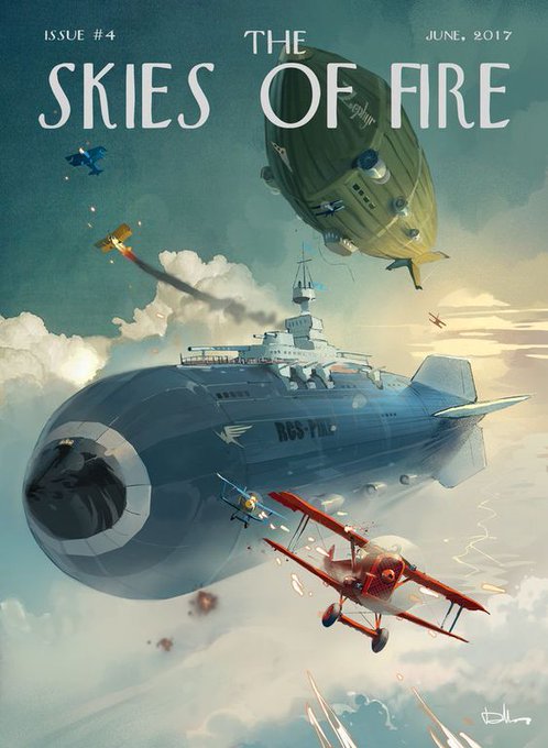
#SciFiDaily goes dieselpunk with this beautiful pulp cover from a comic book series I discovered through Pinterest. I love this kind of stuff and can't wait to read the first issue. If you're equally intrigued, check it out here:
https://t.co/gCi95yhuh1
#SciFiDaily Sandy Plunkett's "Space Girl" caught my eye and sparked my writer's imagination. My suggested caption:
Blonde babe with blasters-blazing in badlands battle. I thought about adding "beautiful" as the first word, but that's already covered with "babe."
An Archon carrier from #eveonline
Watercolour on paper
.
#tweetfleet #painting #spaceships #spaceshipart #shiptember #art #lemondevirtuel #scifidaily #starship #scifi #popcultureart #fantasy
#SciFiDaily kicks off September by highlighting favorite authors. This Freas piece for Lois McMaster Bujold's novella "Labyrinth" graced the August '89 Analog cover. It was my introduction to Bujold and her Vorkosigan saga. Within one year, both sat atop my list of favorites.
#SciFiDaily thinks CGI space opera artwork looks...samey. Dark backgrounds, a planet, some spaceships, maybe a nearby sun or wormhole or something. Individually, they're fine. Together, they lose their individuality. That's why I love pulp artwork. It's colorful and different.
Cool alien Landscape by AlynSpiller
.
.
.
.
#scifivisionaries #SFV #worldbuilding #alienplanet
#socialsciencefiction #biopunk
#dystopianfuture #dystopianfiction #Scifi #scifipodcast #scifigeek #scifibook #scififan #postapocalyptic
#kassmiththewriter #scifiworld #scifidaily
Boba Fett - art by Pablo Olivera
.
.
.
#bobafett #starwars #themandalorian
#scifivisionaries #SFV #worldbuilding
#socialsciencefiction
#dystopianfiction
#Scifi #scifipodcast #scifigeek #scifibook #scififan #postapocalyptic
#kassmiththewriter #scifiworld #scifidaily
#SciFiDaily returns after a busy few days with "Back to Atlantis" by Boris & Julie Bell. I don't know if this ties to Aquaman or sprang from the artists' imaginations, but the bright, vibrant colors and sci-fi elements appeal to me. I hope you also enjoy them.
#SciFiDaily researched this beautiful Gerald Parel painting and discovered it's... He-Man. Best guess is the woman is Teela. Masters of the Universe appeared a year into my marriage, so I never got into it. That will change if this version ever hits the screen (big or small).
The new wariors and the ancient hunting together.
.
.
Art by skaya3000
.
#scifivisionaries #SFV #worldbuilding
#Scifi #scificoncept #scifiordie #scififilm #scifipodcast #scifigeek #scifibook #scififan #postapocalyptic
#kassmiththewriter #scifiworld #scifidaily
#SciFiDaily and #SwordAndPlanet have merged. Finding just the right images and composing comments for them takes about an hour out of each morning. I don't have time to handle both anymore. I'll kick off the combined series with this image filled with things I love about sci-fi.
washing the mech by Francisco Badilla
.
.
.
#scifivisionaries #SFV #worldbuilding
#Scifi #scificoncept #scifiordie #scififilm #scifipodcast #scifigeek #scifibook #scififashion #scififan #postapocalyptic #fantasy #dystopianfuture
#kassmiththewriter #scifiworld #scifidaily
#SciFiDaily gets a Star Trek vibe from this image. I think it's mostly due to the saucer-shaped forward section, though the aft section bears a mild resemblance to the Enterprise D (wider and flatter than in TOS). It would make a good, albeit generic, space opera cover.
Monday
.
.
Art by Justin Oaksford
#scifivisionaries #SFV
#Scifi #scificoncept #scifiordie #scififilm #scifipodcast #scifigeek #scifibook #scififashion #scififan #fantasy #fantasyart
#kassmiththewriter #scifiworld #scifidaily


