ContrastのTwitterイラスト検索結果。 10,684 件中 487ページ目
sometimes you just gotta challenge yourself and paint with more contrast than you usually do #artistsontwitter #JIMIN #BTS #btsart
The Great Cold Distance, 2019, 50-70cm, graphite crayon on paper #art #girl #artwork #blackandwhite #creative #drawing #fineart #fantasy #graphic #illustration #monochrome #pencil #red #artsy #composition #amazing #love #beautiful #cool #contrast #dark #masterpiece #inspiration
This concept by @lalyetki has a fun, tropical, hipster feel; linking the fruity flavors with summer season advertising. In contrast, beneath the colorful matt paper wrap is a cool, clean, simplified white glass bottle, with a logo and motif linking it with the outer wrap.
Contrast to the cartoons I typically post online, I actually hold a deep love for traditional painting! This bad boy was done for my art class in school
i changed the contrast a bit, i'm still learning and i tend to go to very grayish colors for everything
Again some #tileset practice. struggled a lot with colours 🤔But I think I'm getting better in my colour choices. Sometimes I even have to adjust brightness or contrast only up to 5% and that's it (it's a great progress for me😅) #pixelart #gamedev #gameart #indiegamedev
I couldn't resist joining the #drawthisinyourstylechallenge
by @karamelliis because of this awesome character! Really loved the contrast between her hair and her jacket. I had a lot of fun, thank you! 💙💛
#traditionalart #watercolor #drawthisinyourstyle
Finally, I'm allowed to show my contribution to @bondsbeyonddim1!!!
Im really happy made Reiji and Ryoken in this crossover (the rich silver haired XD) try in watercolor media to contrast to light
you can get a digital copy of the zine at https://t.co/yTIBUUVp5M …
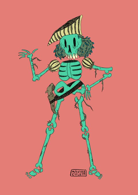
“No tengo ni idea de qué época soy”
#skull #skeleton #palette #contraste #bones #huesos #drawing #paleta #esqueleto #calavera
my name is dogi I have inconsistent artstyle and I love contrasting colors (red-green is my fav). Im from indonesia... Mohon bantuannya manteman #ArtistsofSEA
Wip still needs details, shine and more contrast orz
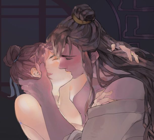
but look You XiaoMo is kinda glowing not in rainbow colors yet but he glows
#legendarymasterswife #lmw #dualcultivation #传说之主的夫
This piece is called "Mother Nature" by @TincekMarincek. The contrasting color palette and delicate lines make this piece especially beautiful. Created in #ClipStudioPaint.
gonna Hunt (fixed the contrast a bit)
#HunterXHunter #hxh #gon #killua
I started in red, but then I ended up in red-orange. Whooops.
I did two pictures to contrast my progress side-by-side, one I did with the normal 'waking up in the morning, feeling default' and one 'oh wait I'm doing colour theory work again!'
It's interesting seeing the results
Art trade finished for @Seclinette!! Since they both have contrasting colors, it was a bit difficult for me to coordinate them oof
Applying those concepts I just learned by doing my own palette based on the patterns I found during the palette tests. One is the one I did 'normally' and one is the other is one I did revisions based on Papyrus' contrast levels.
The difference is amazing, I must study more!
zzz
mouais bon j'ai mis des couleurs mais les contraste ptdr
du coup j'ai mis juste le line avec


