portionのTwitterイラスト検索結果。 13,293 件中 499ページ目


Following @DevilRpg's helpful feedback, I alternated the model to make it resemble the reference more. Changed the proportions, slightly moved legs, eyes, and spine. #Blender3d #anime #b3d #3Danimation #Sonico


@SSS_Stream This was me trying to draw without judging myself! Any proportion tips? 💓


chaos getting a modern render bc of sonic forces is much appreciated but they sorta lost the 'feral mutant chao' vibe and babyfied his anatomy to look closer to generic sonic proportions. idk he isn't quite the same character


@yuutayo I make a good amount of goblin stuff but I like most anything WoW, though a large portion of my work is NSFW


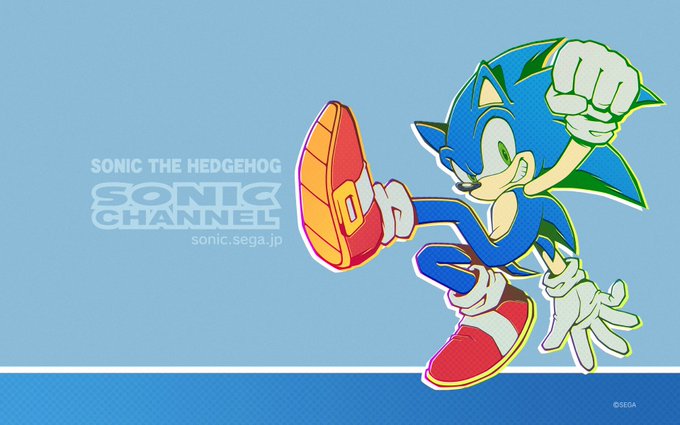
@melfinalremix @LoveyDoveyii Theres a big difference between this and this..over time Sonics limbs have grown longer and his core design proportions have changed. I don't hate the modern style, its just getting away from the core design proportions that made the character.


So i got some critique on my leotard jeanne's proportions, and i felt a few things were off in the original, so i fixed up some of the anatomy (shrank the chest and widened the waist), and I think it looks way better! Regardless, black leotards are still best civ
#FGO


Angel Dust and Sir Pentious drawing! I haven’t drawn Sir Pen in a while and the proportions in the hands are a bit awkward ;w;
#hazbinhotel #HazbinHotel #angeldust #sirpentious #HazbinHotelAngelDust #HazbinHotelSirPentious

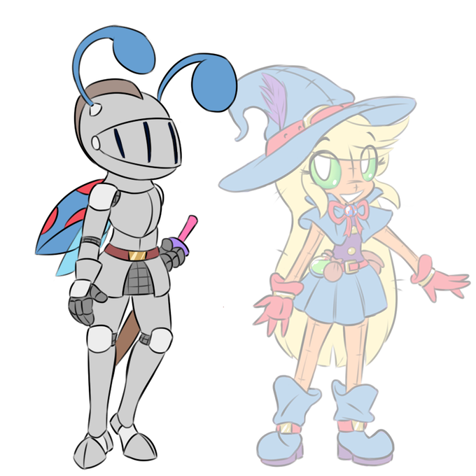
Gave that tall Jupa I drew a while back a knight companion! Who could this mysterious hero be...
Drawing these larger proportions is not something I'm used to, so I'm sorry if it looks awkward.


@ any artist struggling with anatomy and cant find good references online: consider trying out DesignDoll! I've been using it for years and its definitely helped me out anatomy-wise.
It also allows you to create+adjust multiple models, their proportions, and even objects!


My process for redrawing Yoshiko 😅
I know my proportions are still whacked but aaaaah... gotta improve 😁
#tsushimayoshiko #津島善子 #yohane #lovelive #FANART #lovelive_sunshine #aqours #art #anime #speeddrawing


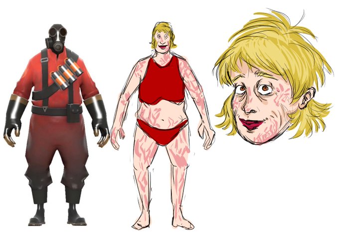
omg i kinda forgot i had a pyro oc
her headshot is more accurate to her face proportions, for once in my life i didnt want to make a character w a too long face but pyros mask demands it so i just disregarded


Don't you just hate IG for cropping everything in sad proportions? Here's the full pic of my latest work. #illustrationart #illust #Illustrations #originalcharacter #fire #sunset #SunsetFire

glad people liked this art! i was actually really shocked it was so well received, so I decided to show off some concept art for the design.
This was my first attempt at the redesign, but I was worried the pants and proportions made it too anthro and oddly sexy? so i scrapped it

Combining a few elements of nature, in just the right proportion, form and motion, gives us plenty of reason to rejoice with mother nature.
Recreate your life as a new work of art. Learn how!
https://t.co/fYA3BWTTFz


I noticed this post is blowing up so before it gets out of proportion here’s my shameless plug: I’m an artist that does digital, traditional and sprite art as well as animation. If you’re interested in what I do then please follow me!


Lil EMA sketch
THIS WAS SUPPOSED TO BE CHIBI
lmao
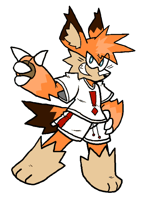
My brain refuses to distort proportions too much
Btw dont mind the clothing I literally did this out of fun in 30 minutes


Hallo, wer braucht heute ne Extraportion gute Laune?
Hab hier für euch noch mal die kleinen Kindheitserinnerungsbilder. Finde, die helfen da oft ganz gut ☀️