letterformのTwitterイラスト検索結果。 55 件


CATASTROPHIQUE! It's a Towering Inferno, a Poseidon Adventure, an Earthquake and a Sharknado of Devastating Proportions. Don’t Look Up -- these cracked and chunky letterforms are signifiers of a Magnificent Disaster!
https://t.co/qJeAc09zlA


Did you know you can buy with ETH on @objktcom ?
Here's 'Qalam'
2022 (10 Ed.)
Part of my 'Calligraphs' series which meditate on the nature of typography, letterforms and historical writing systems.
https://t.co/wAKPxtlcZJ


New work -> pushing on #letterforms #painting and composition, aesthetics & style whilst transcending through applied to digital mediums, use of human hand 🤚🏼 (haha) adobe fresco, photoshop, illustrator, maya & Ai
#art #forms #colors #shapes #3D #digitalart #design #graffiti


NEW RELEASE – Goldich by Jasper de Waard is a typeface family with letterforms that have crystallised into sharply cut shapes. Add an elegant sparkle to your next identity or advertising project, or use it for signage and stencilling fun.
https://t.co/bvwa7kKGXn

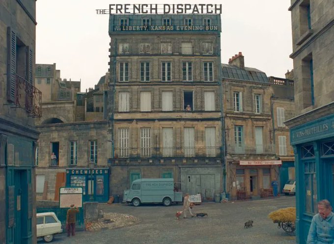
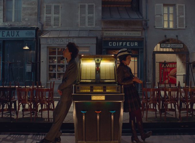
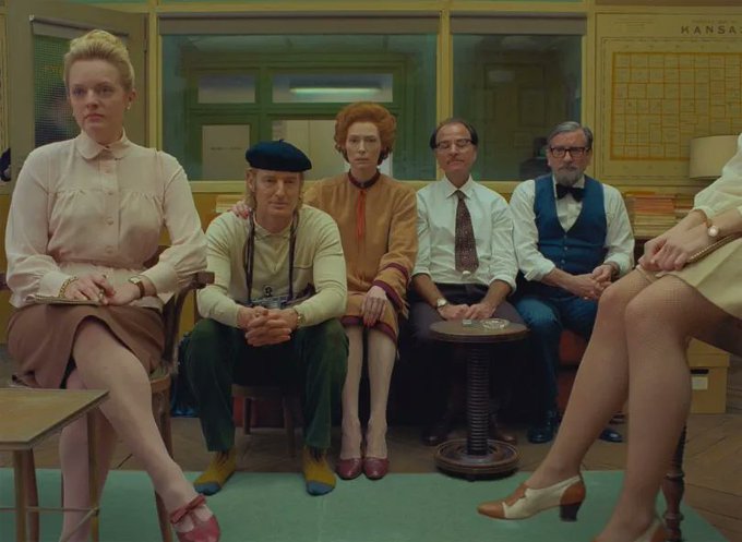
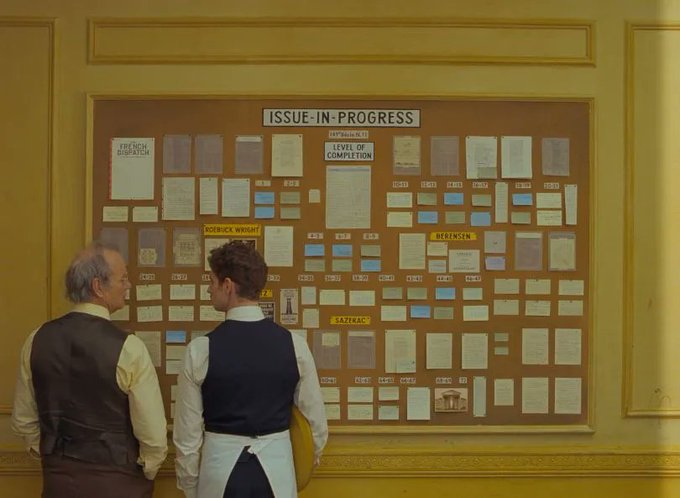
Nostalgic, artistic, & practically a character in themselves, the typefaces & letterforms in The French Dispatch also provide a window into the country's rich history. To unpack the film's type splendour, we spoke to type expert Marie Boulanger: https://t.co/Pq0YXi3Jh6


more prep for
#36daysoftype (&, which isn't one of the 36
characters used in the challenge)..maybe
circles will be my theme this year?
#illustration #vectorart #illo #assemblyapp
#vectorillustration #illustratorsofig
#letterforms #ampersand https://t.co/zqvS0OPqbx


Oh hey #PortfolioDay! I'm a comic artist, illustrator & graphic designer that just loves a good letterform. 🅰️
💻>>mancameron (dot) com<<📧
I'm booked this year, but any leads on a book design job/position for next year would be ideal! #GraphicDesigner #BookDesign


I don't know what sleep is anymore. Anyway, have some W's which I decorated for my assignment.
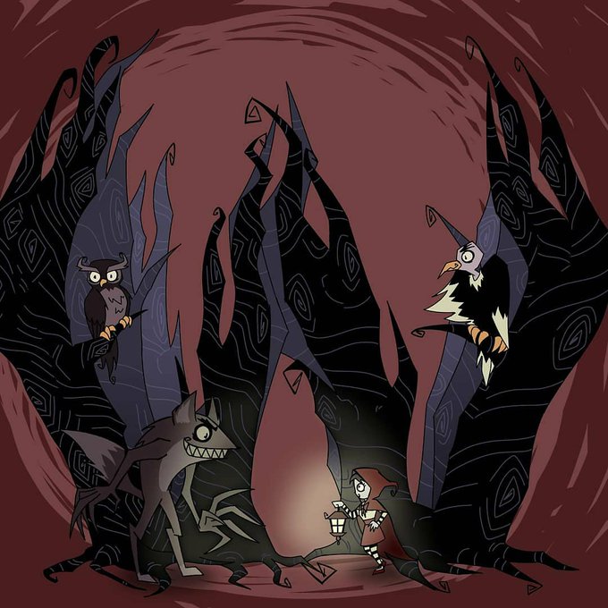
#letterforms #yokai #phantomoftheopera #danganronpa #Danganronpa2 #pacman #tetris #chiakinanami #monomi #spaceinvaders #donkeykong #Redridinghood #timburton


Prosaic by @aurelien_vret — The influence of the tool, the brush is revealed in the letterforms above: angular counter-forms contrasting to the smoothed external shapes. Prosaic is super legible in small sizes, and visually attractive in headlines.
https://t.co/TePwpSc9uV


🔥Three🔥 of life
@36daysoftype #36daysoftype #36days_3
—
⚡️ https://t.co/ytZdM6phLK
#36daysoftype08 #experimental #expressive #letterforms


This year I decided to do the 36 days of type challenge. I made the decision to combine each letterform with an icon using negative space. Follow along over at https://t.co/qELf6MUe6o
#design #typography #logodesign #logotype #logos #logodesigner #customtypography #typography

Make every 🔥J🔥 count
@36daysoftype #36daysoftype #36days_J
—
⚡️ https://t.co/jnP5XBFsrp
#36daysoftype08 #experimental #expressive #letterforms


I’ve never gotten an 🔥F🔥 until now
@36daysoftype #36daysoftype #36days_F
—
⚡️ https://t.co/1q65jVj3j8
#36daysoftype08 #experimental #expressive #letterforms

All eyes on 🔥C🔥
@36daysoftype #36daysoftype #36days_C
—
⚡️ https://t.co/ljFCxuZHIe
#36daysoftype08 #experimental #expressive #letterforms

New 🔥A🔥 just dropped
@36daysoftype #36daysoftype #36days_A
—
⚡️ https://t.co/GIqevCPK94
#36daysoftype08 #experimental #expressive #letterforms


@davescook It's exactly this kind of letterform I was thinking of when I was making the title treatment for this bogus arcade flyer a few years back! :D

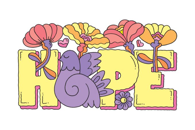


Hope springs eternal. Agency Rush il... https://t.co/55ZelnXmHB
#hope #hopespringeternal #lettering #letterforms #decorative #decorativeillustration #illustration #positivevibes #positivethoughts #loveandhope #hopeandlove #editorialillustration #conceptualillustration #agencyrush


Letterform Design by @nubikini
⟶ https://t.co/NNYgziKQ6v
For More Inspiring Graphic Design and Visual Culture
.
.
.
#grafikmedia #graphicdesign #typography #lettering #visualart