serifsのTwitterイラスト検索結果。 22 件


Are you looking for visual impact? Nothing better than a contemporary Slab for powerful titling that bring much more style than usual sans serifs.
➽ https://t.co/abk2hkMJJL
Mislab by Xavier Dupré.


[3]
6. Tybalt - DON’T scream at me young man. you don’t even have your grandpa’s humongous serifs for that kind of attitude
7. Juliette - ohhh girl that’s a fancy name, are you italic???
8. Hermia - try and tell me that if Rockwell font was a chick, she wouldn’t wear motor boots


Sham! We were a bit under the weather when we read New Defenders #130, but we did our best. Topics include: Beast's reading habits, serifs, Seraph, god's ham, a regional hair replacement commercial, and why Hub is like a goth in a Jazzercise class. Enjoy?
https://t.co/fFn6zafWPg


me !!!!! but in the serifsona (silly form)
creature (species) belong to @USuprised !!


Aliénor Display seeks to convey elegance in its purest form. The connection of stems to serifs gives it an original, sophisticated identity...
Download FREE trail ➡️ https://t.co/feanhZasip
#type01 #typedepartment #font #fonts #typeface #typefacedesign #typefacedesigner


Eliptico v0.1 by @typeji has extreme thick-and-thin contrast, sharp cuts, and triangle serifs that give this typeface a contemporary, elegant look with a strong and unique personality. https://t.co/lSgteuPu7c


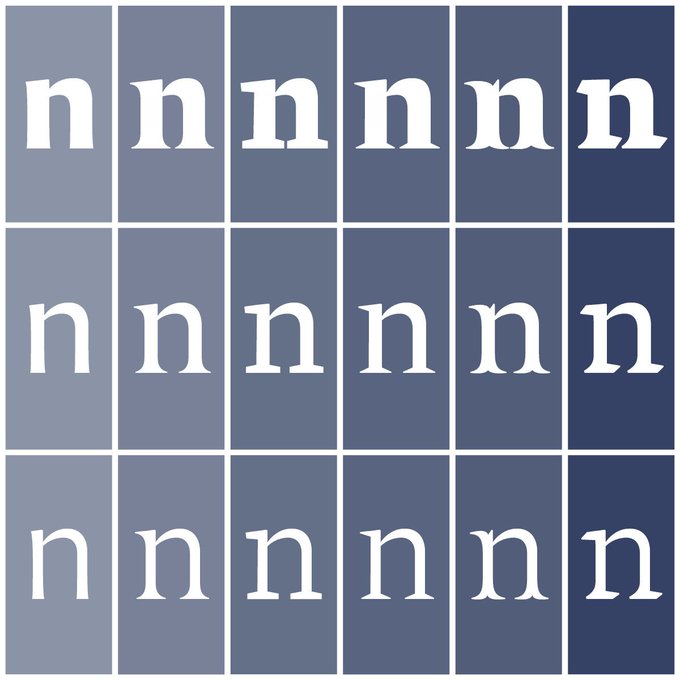
Serifs: Affinity Desinger
The alternative Goat.
This has no monthly subscription costs. Lifetime access for 900/- for ipads. 5000 for Macs. This just lets users to design any types with its mood tabs. Seamlessly switch btwn vector n pixel layers. Export n import multiple formats.


Testing and re-testing a typeface (here Le Monde Livre) in unexpected combinations in order to verify the overall coherence. Beyond the weights, serifs, it is the spirit of the forms in their totality which marks a style. https://t.co/IatbPFLGtL


One of the ideas of Le Monde Courrier is to play up the surprise effect with certain serifs in order to improve letter recognition, such as C and G. Nothing very scientific, just visual! Rounded low contrast fonts are pleasant to read on screen. https://t.co/qbaHESHjsZ


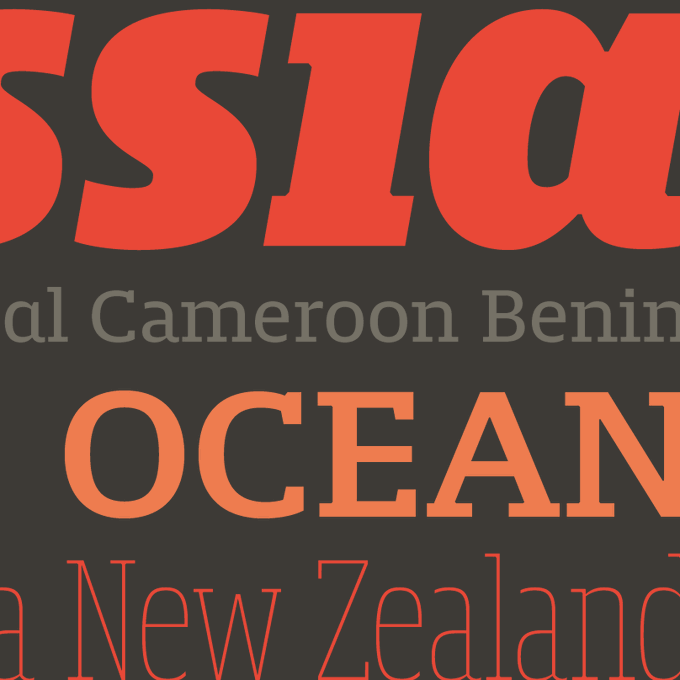
“Antica” (https://t.co/w9L4L27NxY) by @alepaul for @sudtipos is a typeface w/ triangular serifs inspired by Scotch Modern typefaces of the industrial revolution, when type became a distinguishing factor in advertising mass-produced goods competing with each other. #366fonts (217)

Bold and thick serifs make for strong impact in display uses while performing extremely well under the most stressful body text conditions. A slight cursive feel adds spice to the text while its delicate rounded rectangular structure is naturally adapted to screen displays.


At one point this was a YouTuber so i had to edit it to be my Ocs instead hope you enjoy serifs cock
Support me on Patreon for a Dollar a month
[ https://t.co/TDLyAZIlcs ]


“Plaisir” (https://t.co/IDikd3fv7H) by Dusan Jelesijevic for @tourdefonts is a serif font family with sharp edges and long, pointy serifs. Quirky details like the warped /o /O, the almost-toppling /s /S and bent terminals in the italic make for some personality. #366fonts (53)


Wenn Du etwas ganz Besonderes für Dein Unternehmensimage suchst...schau mal bei @zartherb und https://t.co/o4xUn7Bcbn vorbei! Design und Ästhetik für visuelle Feinschmecker 🥰 #produktpräsentation #grafikdesign #design #serifs #proudlypresenting #collage #fotokomposition


✨NEW VERSION✨Madtown by @rxbn_studio is now available for web. Also, the spacing has been improved and there are helpful alternates with shortened serifs, as well as other improvements. https://t.co/1Cx1884Azw
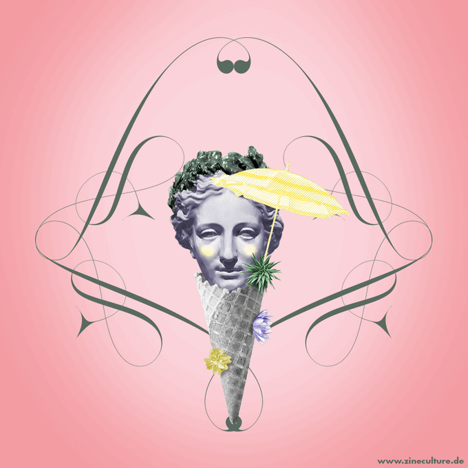

Trickse einen Vampir aus: Gehe heute Blut spenden #Weltblutspendetag #typoart #blood #collageart #worldblooddonorday #blutspende #blooddonor #chili #syringe #bloodsucker #bloodday #giveblood #blutspenden #splat #typography #typographyart #serifs #zineart #zineculture #composing


🎛️NEW RELEASE🎛️ Seraphs by @berndvolmer is an ambitious variable font, with six distinct terminal styles and three weights. And it can be fine tuned to your pleasure! Serifs too thin? Beef em up! Maybe tomorrow you'll want a sans! All for $40 🤯 https://t.co/ChmuW2LCMT


A fanart from the last chapter of "A new rhythm" by Inkyserifs 💓💓💓
#DetroitBecomeHuman #dbhconnor #gavinreed