
SHINTAB | シンタブさんのイラストまとめ
@SHINTAB_44Follow @SHINTAB_44さんをフォローする
フォロー数:3661 フォロワー数:1025


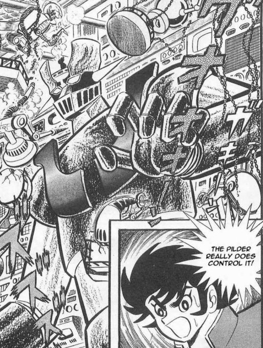
@HaloGuyChief @AhabStudios @180223 As far as I can tell,
it's mostly leftover details from the concept design that bled into the initial one.
That said, it wasn't consistent and one could write it off as simply design inconsistencies with how often it would flip-flop between this design and the one we're used to.


@HaloGuyChief @AhabStudios @180223 I probably should've clarified that I meant the initial manga design and not just in general.
The eyes are more upturned, the nose is beneath the faceplate,
and the faceplate is a bit taller with wider vents than in the anime.
The OVA version is a little closer to this design.
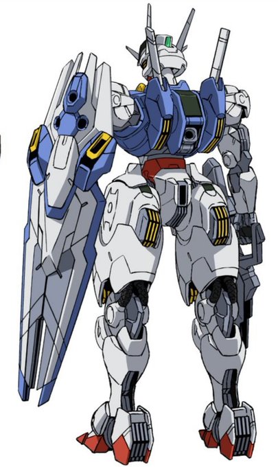


@ShinMoondaze I can also see some Turn A-like bits to it the closer I look at it.
The vent looking things on the backpack and legs make me think of a miniaturized Minovsky Craft.

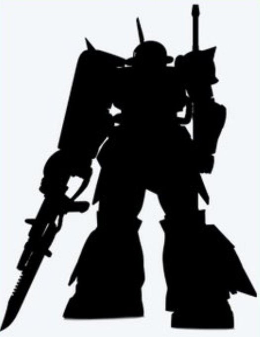
@LaneAim2 @suguremashita @YGuncannon It's probably based off the High Mobility Test Type now that I look at it closer.
The inner calves are a dead giveaway.


@FlywheelKnot @GundamLet I meant about what it is you can't help,
but I think my question answered itself after that
Goddamn

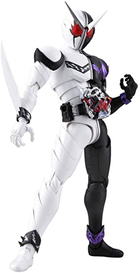
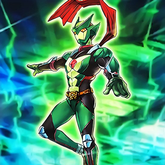

I hadn't really thought about it before,
since I just assumed the designs were just supposed to be Sentai inspired in general.
Looking at M-HERO designs though,
it makes sense that their E-HERO counterparts would be based off specific tokusatsu characters too.


It only just clicked in my head that Elemental HERO Core,
along with the other element-based HERO fusions,
are supposed to be based on Rainbowman's designs
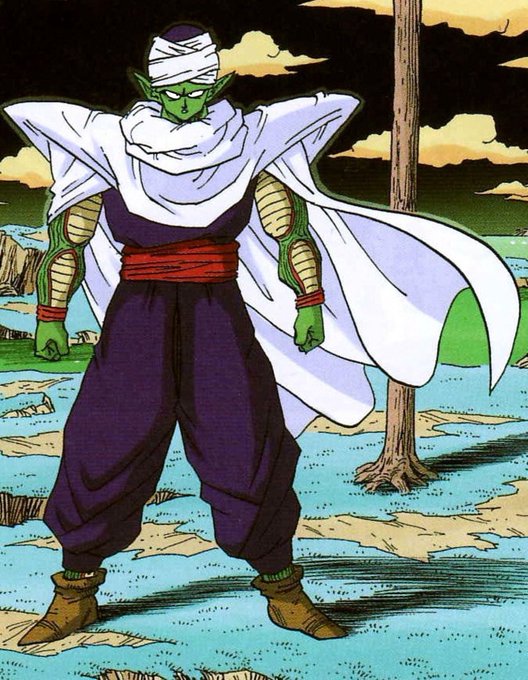

@SquidMechanicus Yes, but his obi is red in the manga,
and the purple is a lot darker.
If they were going for manga colors that'd be one thing,
but it's pretty apparent that they weren't


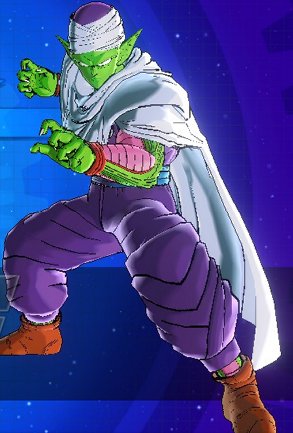

I sometimes wonder why Piccolo's gi is depicted as purple in a lot of video games,
when it's usually a really dark blue or indigo in the anime