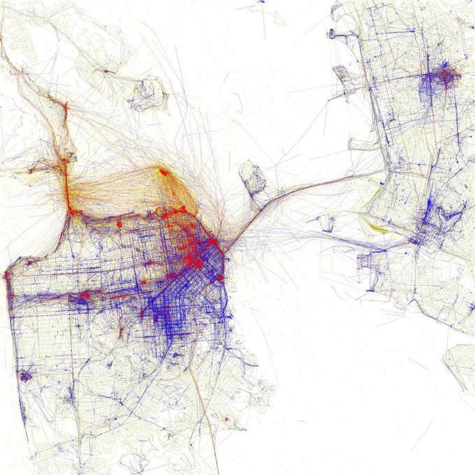
January: Where pics are taken in San Francisco by tourists (red) and locals (blue) #dataviz
https://t.co/w6WsLE7zKR
Country boundaries in #Europe reworked according to the closest capitol. #dataviz
https://t.co/xeINtIMRkQ
The World Online: countries scaled to their respective # of Internet users in 2013. #dataviz
http://t.co/VLyVYVbYfz
Interactive map of #obesity across the USA. (Color = estimated % obese) #dataviz
http://t.co/pbcNo7uWqA
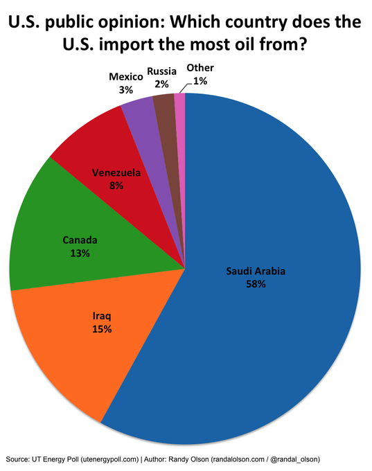
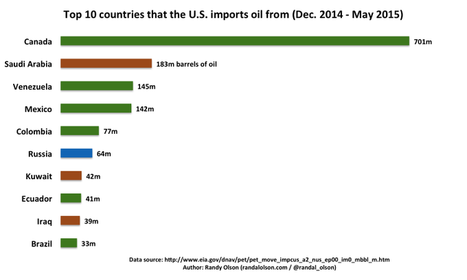
Where the US thinks its oil comes from vs. where it really comes from. #dataviz
http://t.co/clW8HhP1YR
A comprehensive #dataviz of profanity in rap - who has the dirtiest mouth?
http://t.co/ai42iZOyiS
Isochrone Map: Austro-Hungarian Empire Railway Network in 1912: https://t.co/CmQiCMgA11 #dataviz
The World #Religion Tree. #dataviz
Full size: http://t.co/0fVR62g4aq #dataviz
Popularity of #college degrees over the past 40 years.
Source #dataviz: http://t.co/Z3tk33fymF #education


