
Steven Bernardさんのイラストまとめ
@sdbernardFollow @sdbernardさんをフォローする
Follow me on Instagram @stevendb
フォロー数:418 フォロワー数:13112

NEW: Jul 31 streamgraph update
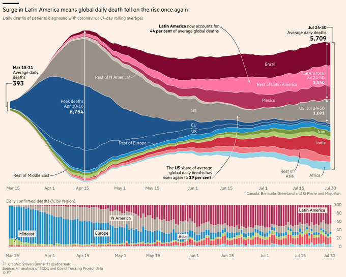
• #Brazil death toll remains stubbornly high, reporting >900/day since May 23. No sign of peak
• #COVID19usa deaths are on the rise, 7-day average back above 1,000 for past 4 days
FREE TO READ-Economic recovery tracker
https://t.co/gI9twsj3IE
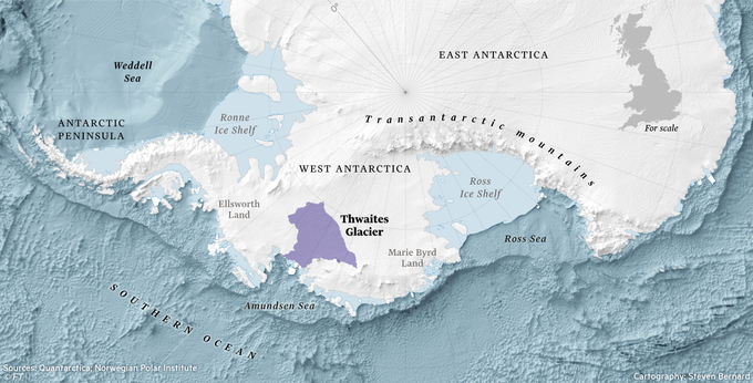

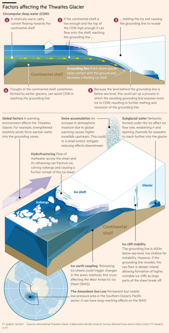
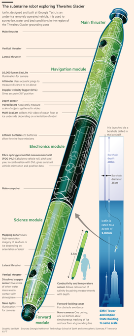
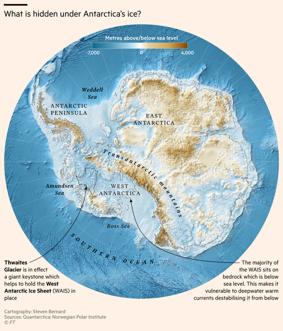
ICYMI: @lesliehook's fascinating if unsettling piece on the melting Thwaites Glacier in Antarctica, and what it means for global sea-level rise.
Beautiful @ian_bott_artist illustrations and #cartography by me
https://t.co/kC9l630xy4
#gistribe #ClimateChange #mapporn #dataviz
2/2 It was very satisfying trying something new and using our serif font in the cartography. It definitely makes the them more aesthetically pleasing in my eyes


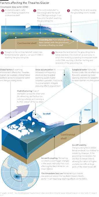

GRAPHICS-FEST in this fascinating article by the brilliant @lesliehook about the Thwaites 'doomsday' glacier in Antarctica. This was a real labour of love, beautiful illustrations by @ian_bott_artist and maps by myself
https://t.co/kC9l630xy4
#gistribe #dataviz #ClimateChange

NEW: Jun 3 #Covid_19 streamgraph
• After weeks of contraction the daily death toll is steadily increasing
• From 7-day average low of 4,029 on May 26 to 4,173 today. Still well down however from 6,766 peak on April 16
Interactive chart...
https://t.co/YTOT7BLtou
#dataviz

First time off in 10 weeks... what to do?
Go all retro with some @BobRossOfficial mountain action on the #iPadPro and #ApplePencil. I just love a big old mountain... ooh that’s nice!

One of most stunning illustrations I have ever seen from the @FinancialTimes supremo @ian_bott_artist explaining the @SpaceX and @elonmusk's first manned commercial space flight.
Read @RichardWaters fascinating article
https://t.co/kDgbabzBwc
#dataviz #illustration

• 7-day average at lowest level for 52 days
• #USA total continues to decline, share of global total below 28%
• #Brazil now accounts for 1 in 5 global deaths, as death toll hits 22,013. Cases 2nd only to US with 347,398
Interactive chart...
https://t.co/YTOT7BLtou
#dataviz

May 19 #COVID19 streamgraph UPDATE
• 7-day average holding steady for past 5 days
#USA total continues to decline, lowest since April 7
#Brazil share of global deaths hits 16%, confirmed cases pass 250,000
Interactive chart...
https://t.co/YTOT7BLtou
