
Simon Kuestenmacherさんのイラストまとめ
@simongerman600Follow @simongerman600さんをフォローする
フォロー数:220049 フォロワー数:260245


The green countries on the map officially claim to be democracies. Only six states admit to be undemocratic: Saudi Arabia, Oman, UAE, Qatar, Brunei, and the Vatican. Source: https://t.co/AjuGf3k66S

Should you play the lottery? This infographic visualises the likelihood in a 6 out of 49 lottery system. Play the lottery for the fun if you want to but don't think you'll make any money ever! Source: https://t.co/hNsCpbDkLQ

What a great tiramisu recipe infographic. (Almost) No words needed. Source: https://t.co/NGyQR8Bu8X HT @1843mag @TheEconomist


This picture by Joseph Keppler from 1904 shows how Standard Oil gained an awful lot of power of society and politics. Eventually the firm was forced to break up. No particular reason that this couldn't happen to a corporate giant today. Source: https://t.co/njI1kiyyKv
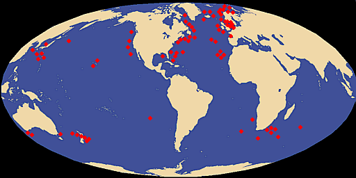
Map shows giant squid distribution. Source: https://t.co/SFrtVrBYwk

What's your favourite landslide? Source: https://t.co/6qY6e5qi7e

Chart shows that more people now live in a democracy than ever before. If you were wondering an anocracy is a regime that mixes democratic with autocratic features. Source: https://t.co/x8sjBTSrYP

Map compares the latitude of North America with Europe and North Africa. Source: https://t.co/thKdTewwmG

Nice short reflection on @GPFutures about the events 30 years ago that changed the global geopolitical landscape for ever. The article featured this clean and clear map showing the former Soviet Union and its satellite states. Source: https://t.co/SYIBMByCyw