
Simon Kuestenmacherさんのイラストまとめ
@simongerman600Follow @simongerman600さんをフォローする
フォロー数:220049 フォロワー数:260245

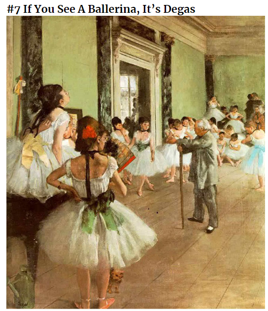
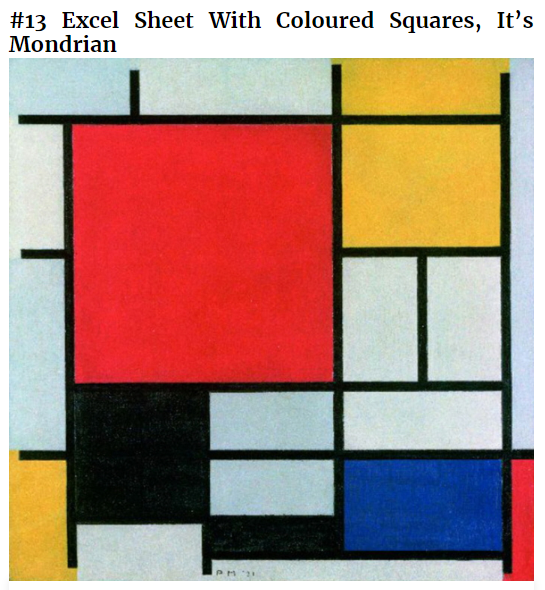
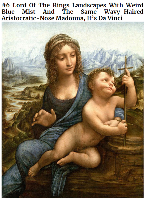

This terribly funny list will help you to identify the paintings of 19 artists. Here are my four favourites. Source: https://t.co/QoyVBAdNFo

The symbols of European air forces in 1938. Somehow I find this incredibly interesting to look at. An Irish YinYang, a Finish Swastika and lots of taunting (?) target signs. Source: https://t.co/jsNH5MuJ9v
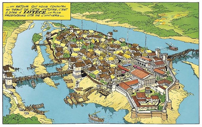
Lutetia (present-day Paris) in the year 50 BC drawn by Albert Uderzo of Asterix fame. Source: https://as https://t.co/0cXpE2DIuT

Map shows the age of global cities. Source: https://t.co/tFzF3PCkCZ
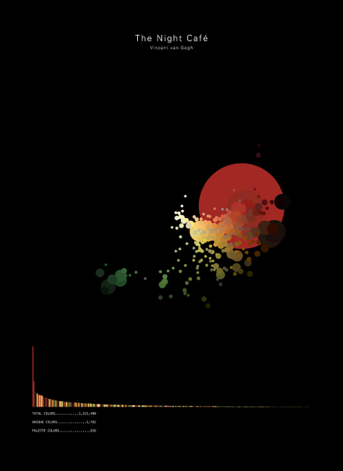

Awesome idea for a #dataviz. The visual shows an adaptive colour palette for a specific piece of art. Here we see van Gogh's night cafe. How great is that!? Source: https://t.co/qOp8lxLhoJ

Map shows the falling religiosity among people in Northern Africa and the Arab peninsula. Data show the share of population describing themselves as "Not Religious" (Arab Barometer surveys). Source: https://t.co/rX7iZlrzVF


It's fun to compare the full world time zone map with the hyper simplified version.
Full map: https://t.co/GIniJlIIsJ
Simple map: https://t.co/dugBpzRmtP

Map shows the centre of population for each country in the world (equal number of people are north and south and east and west of point shown). Source: https://t.co/TQZe1r9sxm

Usage of 'Dang' in the United States. Source: https://t.co/3G6wOARYW2

Map shows global past consumption. Thank god Italy ranks first. I would’ve lost my mind had the result been different... Source: https://t.co/Xcfg8NpTRI