
Simon Kuestenmacherさんのイラストまとめ
@simongerman600Follow @simongerman600さんをフォローする
フォロー数:220049 フォロワー数:260245


Map shows per capita income in the provinces of The Roman Empire in 14 AD in todays international dollars. The relatively rich Roman lifestyle was financed by extracting the resources of the whole empire. Source: https://t.co/dU9TmIpRCy

Bird migration routes from the Arctic refugee towards the South occurs along four major flyways. Source: https://t.co/4bzEciRfl4

Map models potential nuclear fallout across the US in case of such an attack. I for one always loved Oregon... Source: https://t.co/jlt8omNt8v

Europe in May 1941. Half a year before the US entered WWII. This map explains beautifully why (rightfully so) Britain saw / sees itself as the sole defender of Europe during WWII. (Green = allied area; red = soviet area; black = nazi area) Source: https://t.co/0hz8V9adui

"Five Japans" from 1936 is another masterpiece by one of the greatest cartographers of the 20th century, Richard Edes Harrison. Source: https://t.co/EFKzmF94OA
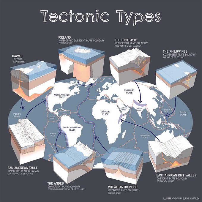
Beautiful infographic teaches us about tectonic features across the globe. I expect @BuzzFeed to produce a "What type of tectonic plate are you?" quiz any minute now... Source: https://t.co/qQ9XMwsnha


This map from a German 1880 atlas shows the "water-hemisphere" and the "land-hemisphere". Excellent geography trivia! Source: https://t.co/MJtnHlK0DH #geographyteacher

This map divides the world into four areas of equal population. Source: https://t.co/m8BFJBS9Cl

“I’ve been sent this lovely chart showing nested synonyms for popular adjectives without a source. Still worth sharing. I love it!” https://t.co/jfbVBkZiuq

In the red countries you can download YouTube videos without having a paid premium YouTube account. Source: https://t.co/rubrLd5hD4