230 件中 181〜190件を表示
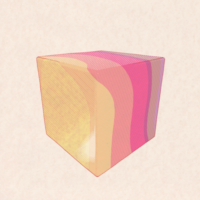
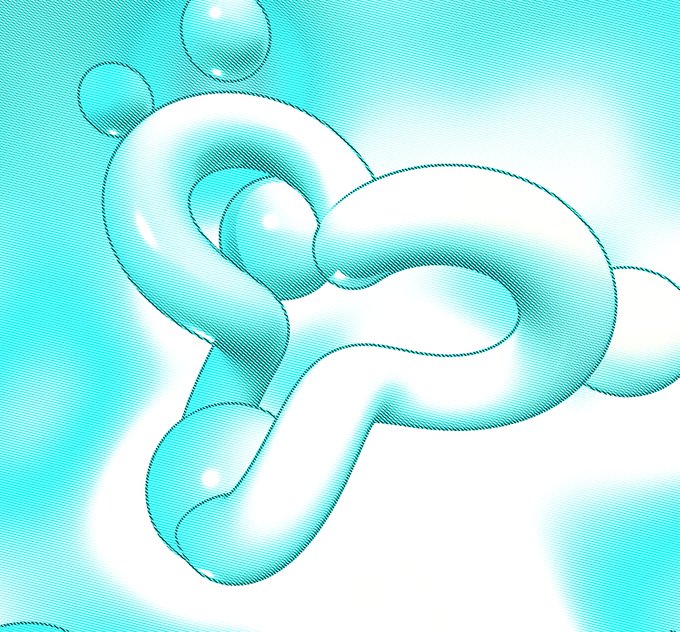
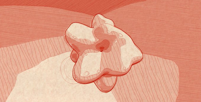
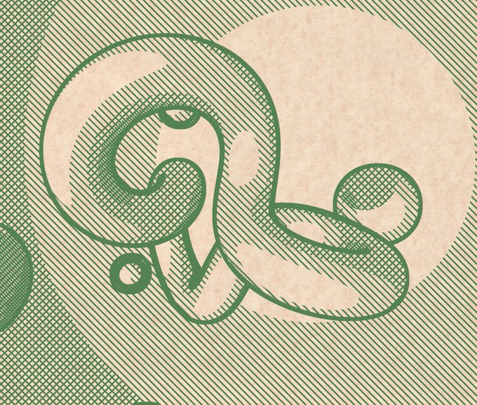
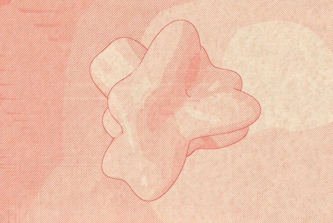
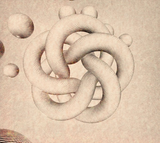
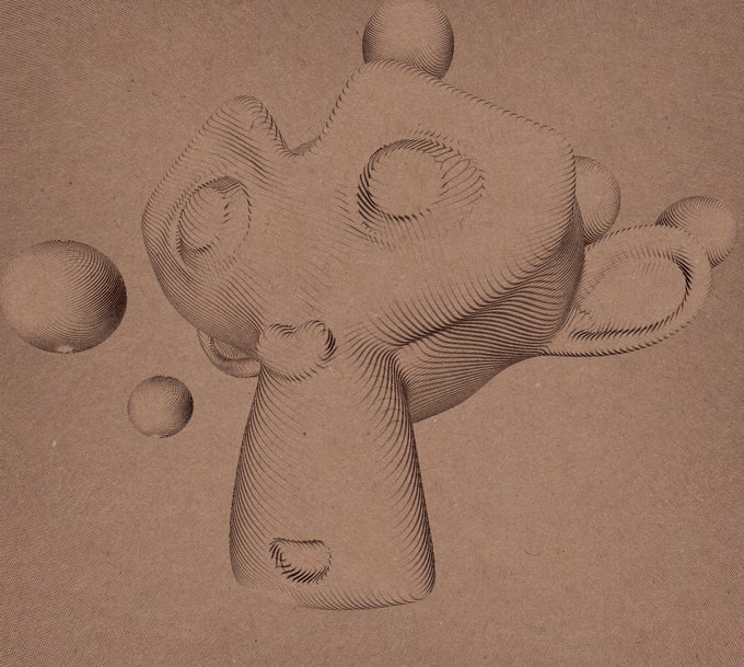
i really like this one. this is the first that looks like what i wanted to do
the hatching lines are right
the contour lines are almost right
the wobbliness is also almost right
1
53
it has some kind of lo-fi charm
the next step is warping the lookups so it looks more hand drawn, or more like scribbles. multiple passes for a CMYK look would be cool, too, probably...
47
504
