datavizのTwitterイラスト検索結果。 253 件中 9ページ目


Hey #datavizsociety members check your emails for this special #Easter gift: data-driven eggs! Thanks to @martintelefont for the inspiration. #datavisualization


The 25 Best Data Visualizations of 2018
- I wonder what amazing #dataviz examples we will see at the end of this year!
https://t.co/hiDXco5im6
@marketcafemag #visualization #DataScience


Meet #DataVizSociety member @yuliakrolik, an information designer and data scientist, working with long time collaborator @o1sound on dataviz, sciart and projection mapping projects as @pixelsandplans. She helps moderate the Best Practices, Data Art and Mapping channels.


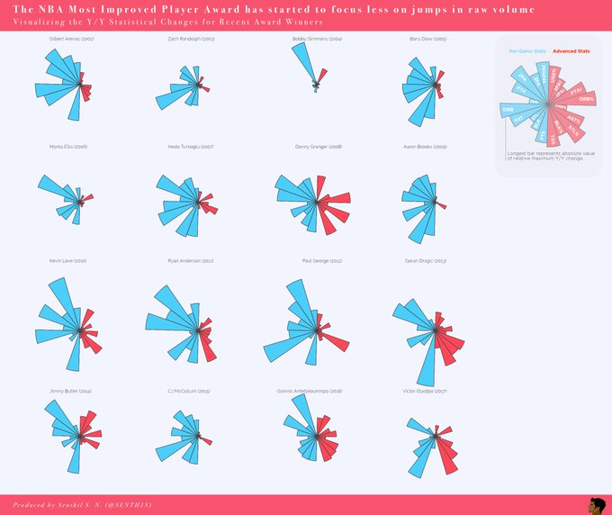
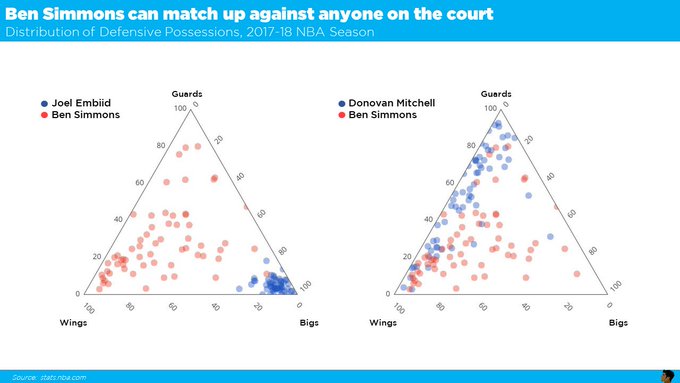
Meet #DataVizSociety member Senthil Natarajan (@SENTH1S), who combines data analytics and data science with visual communication across sports, startups and Fortune 500 companies. #sportsviz #Datavisualization


My #datavizsociety challenge entry: 3500 members of @DataVizSociety represented as Chernoff Adventurers:
Data skill = shield size, Visualization skill = sword, Society skill = hat, latitude = pants color, longitude = shirt. Stacked by hour they joined.
Ended up 10,000 pixels wide


Meet #DataVizSociety member Lilach Manheim (@lilachmanheim), lead analytics engineer at Pluralsight, with a background in art history & HCI. She's a #Tableau zen master & occasional writer on data literacy, UX & art at https://t.co/H1FWNoCCEm and interested in text analytics.


@LeaveEUOfficial This is what your map should look like using the same scale for both leave and remain petitions
#SecondReferendum #dataviz


Meet #DataVizSociety member Guillermina Sutter Schneider (@gsutters), an Argie 🇦🇷 Data Science student based in Washington, DC! She co-authored a dataviz stylebook you can find at https://t.co/2ESA61DmCM and is passionate about best practices & terminology in #datavisualization.


NEW: Questions in Dataviz: Does it matter if shapes overlap in a visualisation? https://t.co/a0C6zzBOYb - features a brief look at the design process behind my recent @DataVizSociety challenge viz with a nod to @ProfDrKSchulte

The Data Visualization Society (@DataVizSociety) now has 3515 members. Here's my latest @tableaupublic viz on what they look like https://t.co/iSkhiWXxxp - if you want a great tool-agnostic gathering of fellow dataviz fans and professionals, sign up now!


Some details from my #dataviz for @sciencefocus: the #periodictable and the elements under threat. https://t.co/G2K6HwT06H The full printed #infographic will be on BBC Science Focus March issue! #Datavisualization


Gorgeous #dataviz by @paukee shows #geography and age of oldest #trees. via https://t.co/5nOK7LhhTm HT @galka_max


Buckle up, North America. As temperatures plunge, parts of the midwest and Canada will feel like Siberia.
#PolarVortex2019 has arrived: https://t.co/kMifXPk015 #maps #dataviz

Human rights violation and protection by country: a detail from my new #dataviz for @La_Lettura, out this week. #Datavisualization #ddj #Infographics


A detail shot - suffering less from compression #generativedesign #generativeart #realtime #dataviz #interactive

Yanlışlıkla saykodelik grafik yaptım. :)
An unintended psychedelic plot.
#randomArt #dataviz #rstats


It's that time of year so I thought I'd share my 4 favourite maps I worked on this year at the @FinancialTimes
https://t.co/SNfKLTNNeH
https://t.co/3C5URvH9TU
https://t.co/sGdAnANgV7 – Manhattan property
https://t.co/mIPEdd48nf – London pollution
#gistribe #dataviz #ddj

Beautiful illustrations in a graphic-led article by the talented @ian_bott_artist and @HornbyLucy about how the Chinese have changed since the ‘reform and opening up’ policy was launched 40 years ago, both physically and in their diet
https://t.co/DiPAbQL9Ko
#dataviz #ddj

#Dataviz narrative layers and #illustrations for The Map of Remote and Literary Islands: https://t.co/pMpo3cJhgD #infographics #datavisualization @La_Lettura
