DatavizのTwitterイラスト検索結果。 351 件中 17ページ目


The World Online: countries scaled to their respective # of Internet users in 2013. #dataviz
http://t.co/VLyVYVbYfz


Vous voulez jouer avec les caractéristiques des super héros ? Foncez sur cette #dataviz 😎 http://t.co/GF5mXcGr5b


#UX : quand visualisation de données prend une nouvelle dimension #dataviz #webdesign :
http://t.co/8yiG8e4I7G


@EoEAlliance check it out our winning interactive dataviz web app http://t.co/L3FaDy3gd5 @SenseableCity


Hot damn, @ffranchi’s #dataviz, design & typography are just fantastic: http://t.co/GsXypihtO0


Interactive map of #obesity across the USA. (Color = estimated % obese) #dataviz
http://t.co/pbcNo7uWqA


Estudo de Opinião Eurosondagem S.A. para @expresso e @SIConline
http://t.co/LE1ZLVfqu3
#legislativas2015 #dataviz


This weeks most memorable #contentmarketing using good data! http://t.co/J7rbZOokEd *30th edition #dataviz #ddj
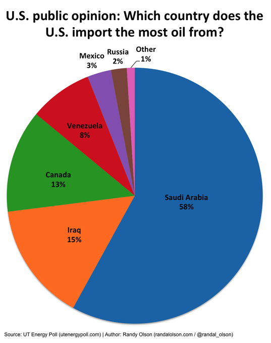
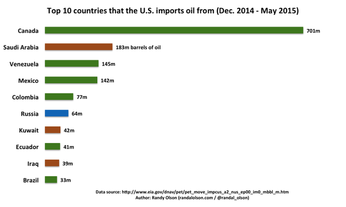

Where the US thinks its oil comes from vs. where it really comes from. #dataviz
http://t.co/clW8HhP1YR


Audio Chips (I). Generative Design.
#generative #code #processing #dataviz #audiovisual
http://t.co/OonahTX5Ls

A comprehensive #dataviz of profanity in rap - who has the dirtiest mouth?
http://t.co/ai42iZOyiS


Amazing @wikipedia galaxy of articles http://t.co/TKnMzsPuht made with #WebGL #javascript #threejs #art #3d #dataviz


NASA visualizes the year of Earth's CO2 emissions | http://t.co/DfehOfasaw via @abuczkowski @geoawesomeness #dataviz

Isochrone Map: Austro-Hungarian Empire Railway Network in 1912: https://t.co/CmQiCMgA11 #dataviz

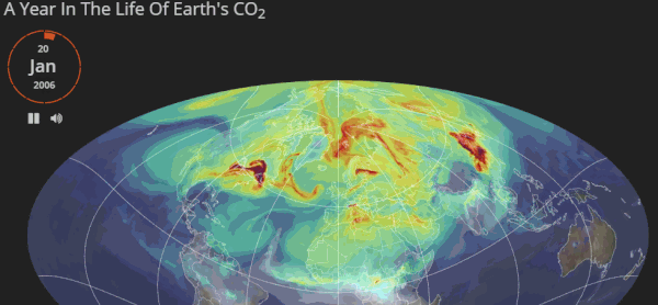
Very nice: one year life cycle of #CO2 by @OSUCartoGroup & @NASA http://t.co/1t4qvkQHg1 #dataviz


A final mention for this post where I encourage you to make grey your best friend in #dataviz http://t.co/ZVh0hLjcTB


@eleanor_lutz breathes life into science infographics using GIF's http://t.co/PSpwrUhy7P #NatHist #dataviz