TypefaceのTwitterイラスト検索結果。 605 件中 17ページ目


Type Design by Designer and Lettering Artist Alec Tear
https://t.co/MWKvFWDzxm
.
.
.
#grafikmedia #graphicdesign #typedesign #typography #typeface


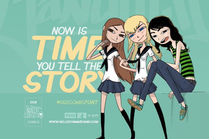
@one_to_read @PaulWat5 @toddstanton1 @FlyingEyeBooks @smithsmm @f33lthesun @KarlDuke8 @StephenConnor7 @sam_creighton @teacher_mr_r @WatsEd @jonnybid @Mat_at_Brookes @MrBReading @Misterbodd @primaryteachew @karen_wallee @eenalol @MissSDoherty @MissNCleveland @Remy_Lai *Really* looking forward to all of these graphic novels too (but they are not for primary school readers). The first book is What the font?! A Manga Guide to Western Typeface.


“Roca” (https://t.co/I8XpuRhWjs) by @mosquitosplace for MyCreativeLand is a retro soft serif display typeface “with a hint of Bookman”. 2 subfamilies each subtly focus on one of the originals: Roca One→Windsor, Roca Two→Cooper Black. That trend is here to stay! #366fonts (228)


OC trivia no one asked for:
Garaon and Vel are a half sibling (same father), their name was taken from classic typefaces, Garamond and Helvetica. Solely because I just started learning about typography in college back then, creative naming there, me. #oc


my 2nd day posting this ✌😁... using my #baybayin typeface. this will be my showcase of this anyway. hope you guy like it 😄...
#BuwanNgWika #CLIPSTUDIOPAINT #AnimeArt #digitalart #illustration #artph


July TypeDigest: "A free typeface from Goldman Sachs (comes with strings attached); a Basque sans serif for a Basque electronic music project, Fontstand in iPads, new font license, Susan Shaw, Kanye West" and many more...
https://t.co/r6X8dITTBM
#typedigest #typetoday


“Antica” (https://t.co/w9L4L27NxY) by @alepaul for @sudtipos is a typeface w/ triangular serifs inspired by Scotch Modern typefaces of the industrial revolution, when type became a distinguishing factor in advertising mass-produced goods competing with each other. #366fonts (217)


.@PeterBilak’s playful, constructible type system "Q" is the lego of typefaces #TypeTuesday > https://t.co/Trc42yhmuL


Belle Story Font Family — Hi-Contrast Display Typeface https://t.co/IIiApEiNQy


“Normalidad” (https://t.co/QysbETlCUr) by @ilyaruderman & @ostromentsky for @TypeTodayNews is a “mechanical sans-serif typeface with semi-closed apertures”, a hint of Eurostile-like superellipses & a whiff of Univers. Innovative “partially variable” font concept! #366fonts (214)

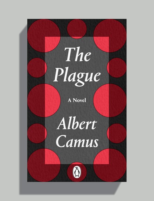
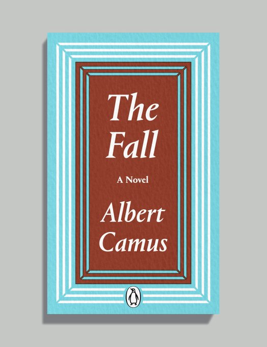

Published today: reissues of three Albert Camus novels, another really enjoyable job for Jim Stoddart (@penguinpressart).
The typeface is Portrait by Berton Hasebe (@bertonhasebe) for Commercial Type (@commercialtype).
Printed on Colorplan Dapple embossed paper (@GFSmithpapers).


Benja Comic Book Free Font - https://t.co/IyzSrhxCLo
#typography #typeface #comic #book #benja #lettering


Base & Bloom | A Response to the Influx of Experimental, Contemporary Serif Typefaces >> https://t.co/iNZq7M7AAy


Summer vibes for a happy Monday! By the very talented #lettering artist Agustina Gastaldi represented by @JSRagency
-
View more: https://t.co/dtIQqFoQrV
-
#bold #summer #happymonday #type #typeface #typography #design #digital #calligraphy #artoftype #typematters #graphicdesign


方正字迹-惊鸿体X电影海报系列
字体设计师:方正字库曹基殿
插画:AIFI矮肥才华有限
#graphicdesign #typeface #handwriting #illustration


New font: CYBERVOX! This four weight robot & android vocal simulation unit is available for half price during our Virtual Comic-Con sale, through July 31st. https://t.co/M1jEMnBIo6 #SDCC2020 #VirtualComicCon #ComicConAtHome #SDCCAtHome #ComicCon #font #typeface #comic #typography

After seeing one of @twopointsnet’s type designs, Nike reached out with a request for its own custom typeface > https://t.co/sq6sAZMM5h


If you can't get enough of Taylor's typefaces, try checking out FINGER GUNS from @thevaultcomics and GREEN HORNET from @DynamiteComics


Some books did avoid using the Young grid: Penguin Illustrated Classics (1938) and the King Penguin hardback range (1939) both used cover illustration, and during the war years a range of slightly chaotic grids and typefaces were used on other titles.