TypographyのTwitterイラスト検索結果。 299ページ目


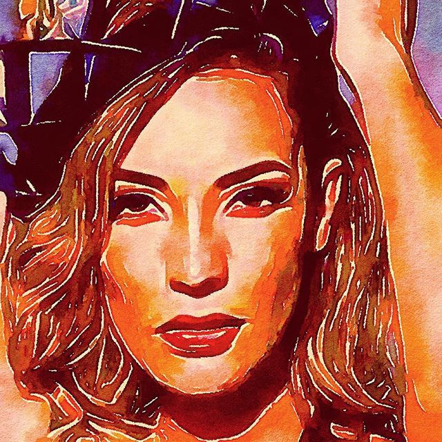
After replacing the typography and adding shadow/lighting to everything, it looks a lot better to me!
Finally: HAPPY #PRIDEMONTH TO ALL OF YOU!
#illustration #digitalart
PS: @Krita_Painting is a lot of fun after getting more used to it!


Gorgeous #lettering by @vietsual https://t.co/qcCJy7WgN5 #typography #type


I really like the old typography, roswellian airbase theme, and 40’s/50’s visual style of 90’s era foo fighters. somehow it just suits the music


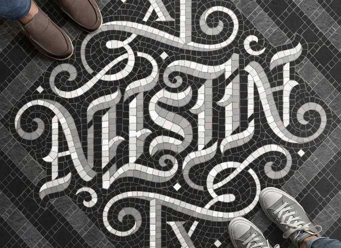
40 Clever Ambigram Logo Designs That Work Upside Down! https://t.co/yzU80YDIRC
#LogoDesign #typography

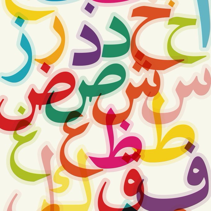
Using colour, layering and transparency to experiment with Arabic letters. At what point does the information become illegible
.
#typography #type #Arabic #arabicletters #letters #Friday #Fridayart #art #artsy #artist #hustle #artistsoninstagram #leicester #leicestercity #magic

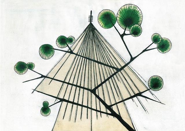


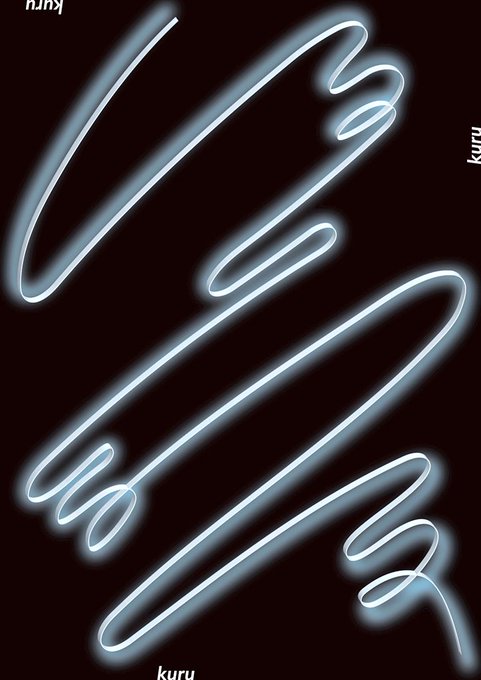


アイ・チョー・クリスティン 霊性と寓意(2018年)のフライヤーをアーカイブしました!2018年8月19日(日)まで金沢21世紀美術館で開催中。
#design #フライヤーアーカイブJP #チラシ #デザイン #flyer #typography
https://t.co/JgUHmn1obN


This experimental typography is by graphic designer @fatihhardal3
As a personal project, the designer wanted to explore creative effects such as blurs and burns which would integrate into his posters. What do you think of his designs? 💡🖌


A colourful illustration for España! #illustrations #illustration #Illustrator #bull #Espana #Spain #travel #travelblogger #travelling #typography #Creative #designer #aoi @theaoi #colourful


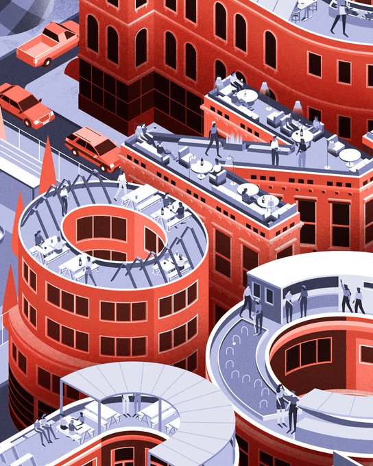
Our cover #illustration for @timeout London. #MUTI #editorial #lettering #typography


Medieval illuminated script page for class with a #Thor theme ❤️ #marvel #typography #graphicdesign #pagelayout