datavisのTwitterイラスト検索結果。 78 件中 4ページ目


Hey all! I've created an article/data visualization on the appearances of X-Men over the past 56 years, inspired by the recent design work of @hellomuller and @JHickman. I hope you all enjoy! https://t.co/VYRh1hGIRI
#xmen #datavisualization #ineedajob


#Metoomentum is Valentina D'Efilippo's @defilippovale latest self-initiated project. This project is a visual analysis of the themes, geographical footprint and key moments of #MeToo. #datavisualisation #infographic #designer #illustration #datadesign #data


Hey #datavizsociety members check your emails for this special #Easter gift: data-driven eggs! Thanks to @martintelefont for the inspiration. #datavisualization


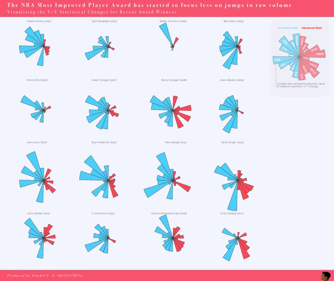
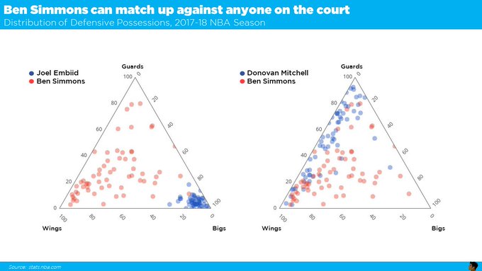
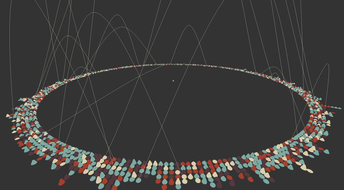
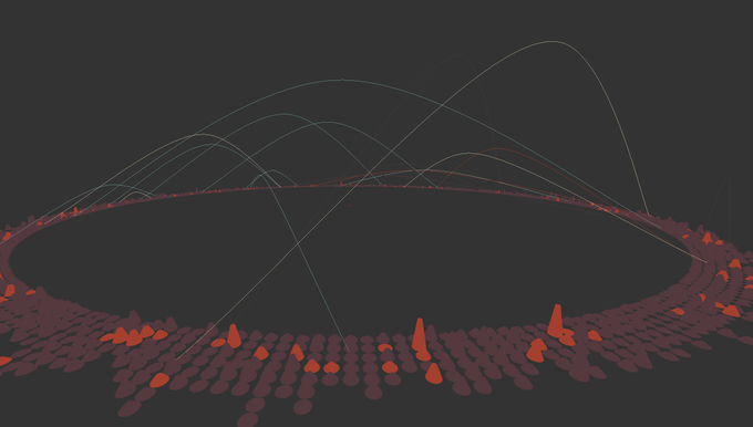
Meet #DataVizSociety member Senthil Natarajan (@SENTH1S), who combines data analytics and data science with visual communication across sports, startups and Fortune 500 companies. #sportsviz #Datavisualization


Meet #DataVizSociety member Guillermina Sutter Schneider (@gsutters), an Argie 🇦🇷 Data Science student based in Washington, DC! She co-authored a dataviz stylebook you can find at https://t.co/2ESA61DmCM and is passionate about best practices & terminology in #datavisualization.


La Visualización de Datos es el resultado de la combinación de Tecnología, Ciencia y Arte para conseguir contar una historia basada en datos fiables y contrastados. #visualthinking #visualnotes #datavisualization #visualizaciondedatos


Some details from my #dataviz for @sciencefocus: the #periodictable and the elements under threat. https://t.co/G2K6HwT06H The full printed #infographic will be on BBC Science Focus March issue! #Datavisualization


A portrait of our 1700 current members (badges based on your responses designed by Data Visualization Society founding member @AmyCesal). #datavisualization #datavisualizationsociety

Human rights violation and protection by country: a detail from my new #dataviz for @La_Lettura, out this week. #Datavisualization #ddj #Infographics

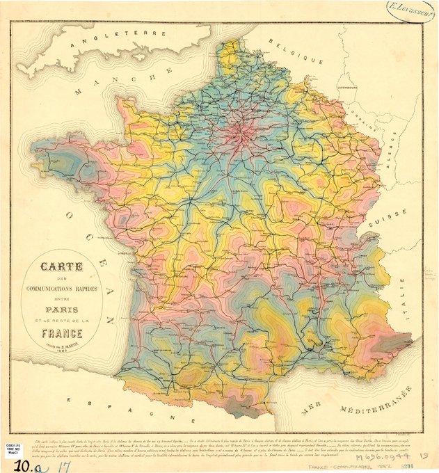
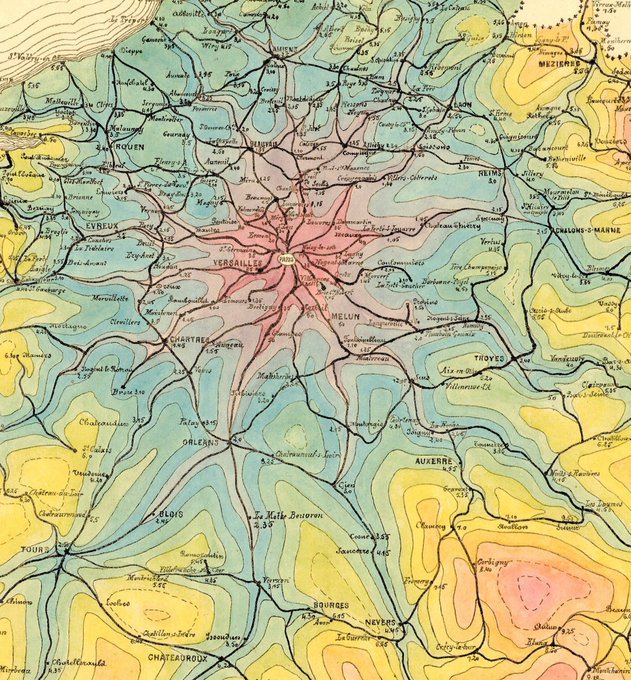
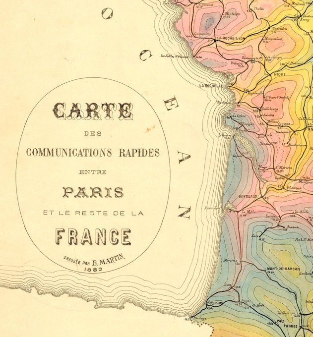
This is my new favorite French #map. Found this one in the University of Chicago map collection. The color choices are not what I expected from a #datavisualization made in 1882, but I'm here for it. This shows the travel times from Paris radiating out into the country.

#Dataviz narrative layers and #illustrations for The Map of Remote and Literary Islands: https://t.co/pMpo3cJhgD #infographics #datavisualization @La_Lettura


My new #dataviz for @La_Lettura is a visual exploration of the world of #MaryPoppins (and it's full of umbrellas! ✨☂️) #datavisualization #infographics


Amazed by our #dataviz workshop students' projects! Working with them was such a pleasure, we had a great week at @unirsmdesign! @francesco_majno #infographics #datavisualization
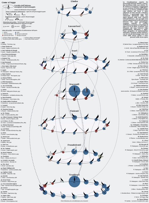
Villains in #literature: my #dataviz for @La_Lettura on #Behance! https://t.co/PAyFhD1H2H #datavisualization


I think @aLucasLopez is one of the very few that does both pictorial and datavis at the highest level https://t.co/MFDV2jiG3V #Malofiej25


Fascinating! RT @manovich: After this #datavis project, film history will never be the same! http://t.co/rdeaSso8xs