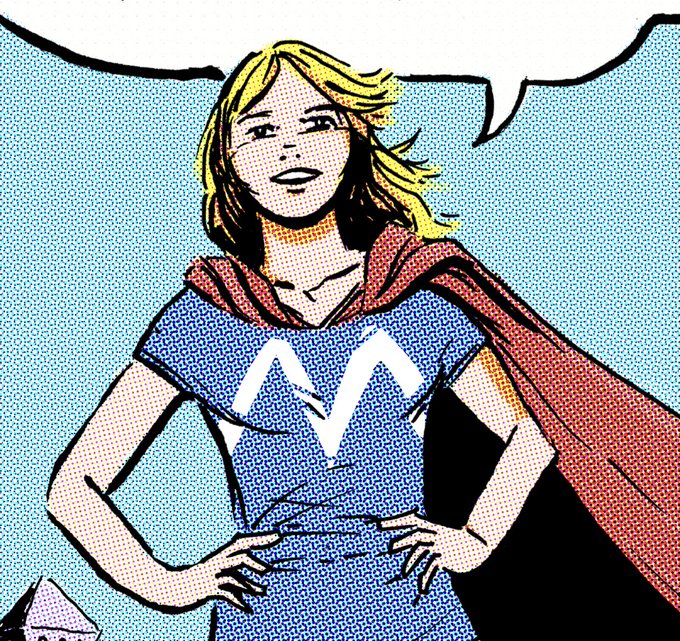
Doing my best take on digital 90s coloring...
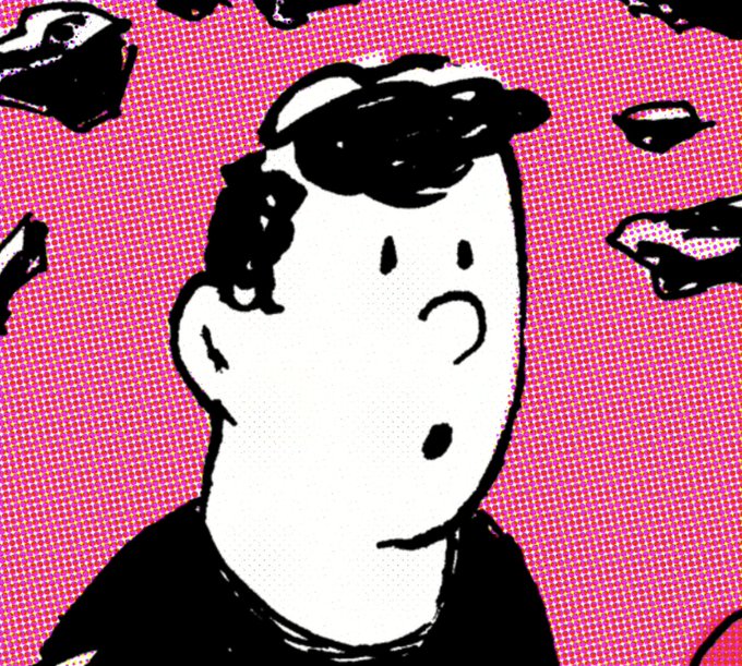
Ever notice how abstract the backgrounds in image comics are? There's always some sunburst pattern like the sun rising or a bomb or... something
The interesting thing is that Disney seems to have completely dropped this style of rendering for their characters, returning to a much flatter way of coloring, with clearer light sources and hard edges.
1990s today
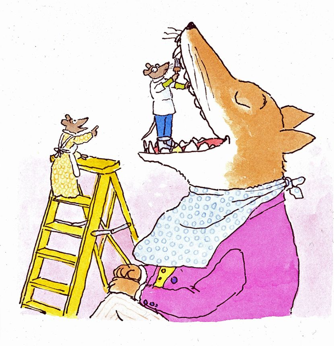
Another great story is "Dr. Desoto" about a dentist mouse who follows his professional code and treats a dangerous predator fox with a toothache.
Dr. Desoto isn't an idiot, there's a real risk, and he has to "outfox the fox" while still treating his toothache.
One of my favorite stories by Steig is "Roland the Minstrel Pig". The illustrations express so much about Roland with such a light touch. They're simple and casual but full of personality.
In the end it's a story about betting on your talent and being rewarded for it.
From Lily: Fall is almost upon us, time to post about over the garden wall :D
#art #artist #procreate #procreateart #fanart #otgw #otgwfanart #overthegardenwall #fall #illustration #illustrator #instaart #greg #jasonfunderberker
About 11 years ago my faces look extremely strange and "off". My proportions are wrong and I wasn't thinking spatially.
Also, it was about 10 years ago that I started to try to work with values and really discovered how chiaroscuro could elevate a drawing.
Even looking at my sketches around this time, I see a sort of breakthrough happening with shape and anatomy.


