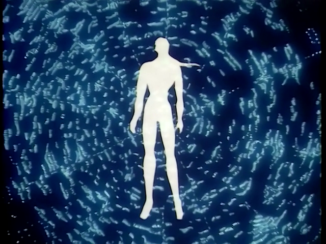
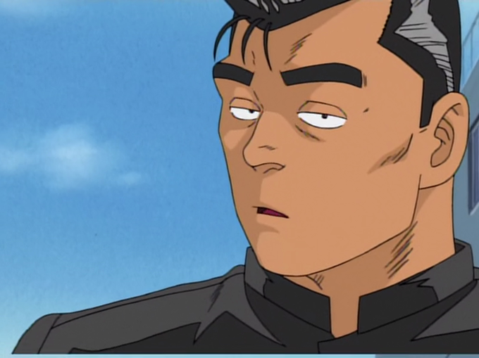
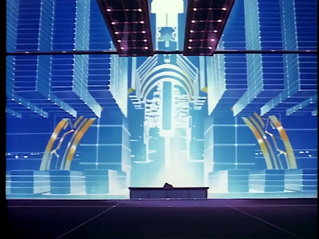
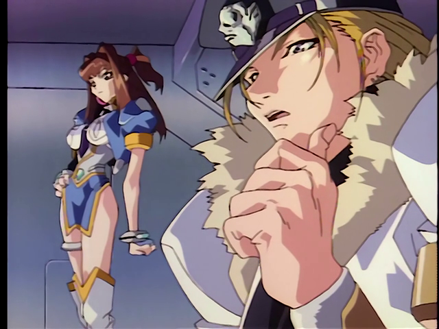
Kazuto Nakazawa's storyboard on episode 5 made things as Shinbo esq as possible. Even down to aspect ratio changes. This show is insanely stylish.
The emphasis on close up eye shots and wide angle shots with monochromatic color particularly feel Shinbo esq. Obari really loves the monochrome backgrounds( often back-lighted) with figures obscured by black shadow, they show up everywhere.
@thaliarchus I suppose the digipaint is more noticeable in shots like this.
@thaliarchus Good take, to the point. I have noticed what seems to be a case of somehow using digital means to paint a cel, which was still photographed on analogue film. I could tell that it was digipaint, and because of a photography error, that it was indeed a cel being photographed.
Watched episode 1 of Virus Buster Serge, I love how edgy everyone looks and the sterile environments. It was more modest on the animation front than I had hoped for, but I've never seen a smear on someone's wrist followed by a wobble from catching an enemy's attack before, cool!
@Jpolgar1 Most people react negatively to Obari's character designs from this period. I'm more into realism - but he went so over the edge on the extreme proportions of the characters that I love them, as monstrous as they are. I can't even imagine the difficulty in making them move.
But Hayama is gone as AD so the draftsmanship is mostly mediocre to bad now. Hideki Hamasu is apparently here, where though? Maybe in these last 10 minutes? They are using digitally painted cels now which really stick out like a sore thumb on the hand painted backgrounds.
