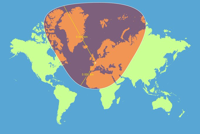
A circle with a 5000km radius centered on Paris with a Mercator projection. #dataviz
Source: https://t.co/RbpvTilzFJ
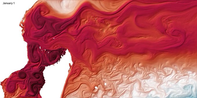
One year of sea surface temperature in the southwestern Indian Ocean. #dataviz
Source: https://t.co/8wQjYqXc6J
Wow. What an eye-opening graphic. This #dataviz shows the distribution of wealth vs. the distribution of people around the world.
https://t.co/CEMbqffCnw
Global map of forest height made using @NASA satellites. #dataviz
https://t.co/7S4SgfoLxp
Coloring #Paris' roads by designation. #dataviz
More cities + #OpenSource code at https://t.co/jUJkMm5uRs
Faithland: #dataviz showing religious adherents as a percentage of all residents. #religion
https://t.co/Eiz3ZTww2o
The United States mapped by over 1 billion acres of trees and forests. #dataviz
https://t.co/yUpT1kfhYG
Image super-resolution through #DeepLearning. #MachineLearning
https://t.co/3308StF8M4
Who needs #music genres when there is data? #dataviz #DataScience
https://t.co/T708SrGTFj
#Cigarette pack sales per capita across the US, 1970-2012. #dataviz
by @MetricMaps


