
Simon Kuestenmacherさんのイラストまとめ
@simongerman600Follow @simongerman600さんをフォローする
フォロー数:215207 フォロワー数:264446

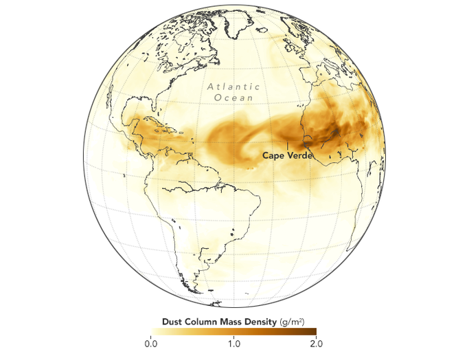
Sand from the Sahara and places as far as Iraq frequently reaches the Americas, reaching as far as Texas. Source: https://t.co/KCO9yWZ6u8
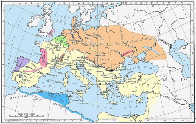
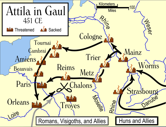
The first map shows the Empire of Attila the Hun as of 450 CE. The second map shows that Attila went as far West as Paris and Orleans.
Wikipedia on Attila: https://t.co/1Nk4Krh2Dd
Map Source:https://t.co/bM313jXqsF
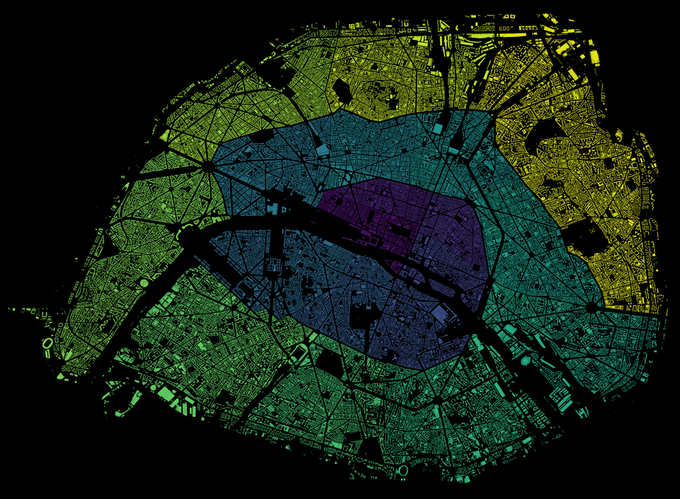
Map shows the 20 arrondissements of Paris. They snail outwards in a clockwise spiral. The colour gradient was meant to emphasize the snail shape but makes it hard to see the borders of the arrondissements. Source: https://t.co/yeoSCnWFHs
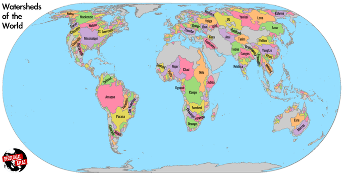
Map shows the watersheds of the world. Source: https://t.co/j6J0imjs7s
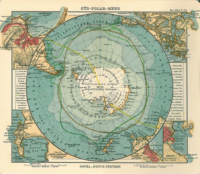
Gorgeous vintage map from 1906 shows Antarctica and the Southern Ocean. Source: https://t.co/lVWJB3GZ4w

Let the data speak. What are the riskiest activities to engage in during the #COVID19 pandemic? Sadly my beloved gym is pretty risky. Maybe gyms with compulsory masks are safer? More charts in the COVID-19 infographic datapack by @infobeautiful: https://t.co/idWJ7n1A6E
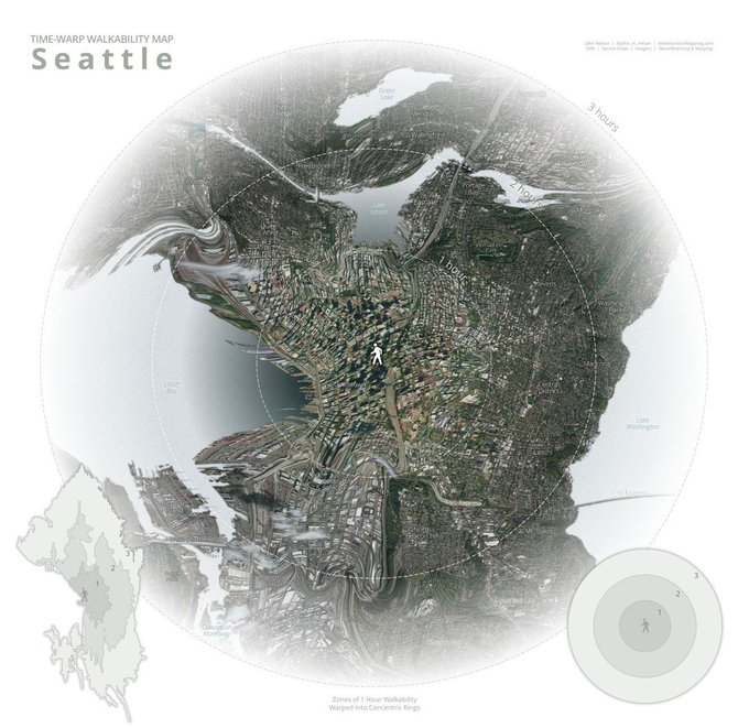
Time warp walkability map of Seattle by @John_M_Nelson. Cool way of displaying data! Source: https://t.co/P6tc0VKd52

Map shows a selection of forbidden books in 2019. The source tells us why the books are banned... Source: https://t.co/7WENgN89ED
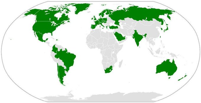
Map of the world showing countries where Xbox Live is available. Does China have an alternative system for online multiplayer games? Source: https://t.co/PIXND9kMNd

Animated map shows wind contours using GFS model data. Looks really nice! Source: https://t.co/DF8Ex6OmWy